|
|
||
|
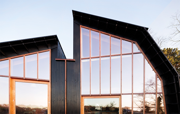
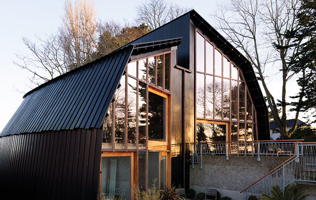
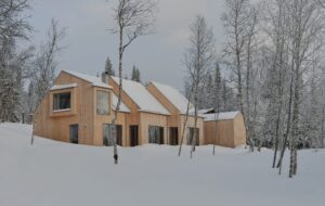
Split-level building reminiscent of an upturned hull scuttles traditional ideas of domestic space, and won a RIBA South West award last month The planners in Poole might have an obsession with protecting existing trees but, I’m told, they are quite permissive in all else. This means the town’s Victorian terraces and Edwardian semis are kept up not with that all-pervasive melancholy so typical of English seaside resorts, but with an almost cannibalistic hunger for modernisation. While this often results in bloated semis with newly replaced glass balustrades, uncharacteristically widened windows, and houses from all periods reclad in broad PVC planks – it can also occasionally enable original and delightful structures. Enter the Houseboat: a holiday retreat designed for architect-turned-developer guru Roger Zogolovitch by Meredith Bowles of Mole Architects. The new house shares a plot with Zogolovitch’s other property, the Boat House, a 1936 structure built around a second-class dining salon and officers’ cabins reclaimed from Cunard ocean liner RMS Mauretania. Or, as the proud owner lovingly puts it: ‘Another oddity has landed on Poole’s shore.’ And what a delightful and well-crafted oddity it is. The scale of the house might be in keeping with its neighbours but its presence is striking, contrasting with both the Boat House, which despite its slightly odd composition does not look at all boaty, and the wholly everyday house next door. It looks as if a storm had thrust ashore and upturned a black hull, which split down the middle as it collided with a rough, concrete sea wall. Yet all this drama is tempered by the apparent domesticity of the setting. Despite the unique formal gestures, it still looks very much an ordinary house: slanted roof, a door in the middle, and square windows puncturing the facade. |
Words Peter Smisek |
|
|
||
|
The form of the house is intended to provide a sense of shelter and enclosure |
||
|
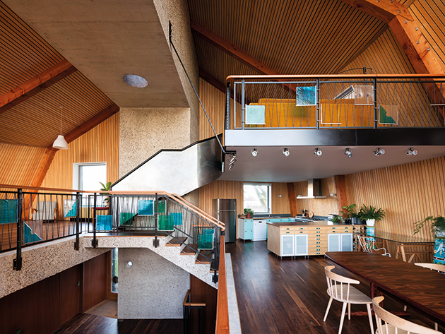
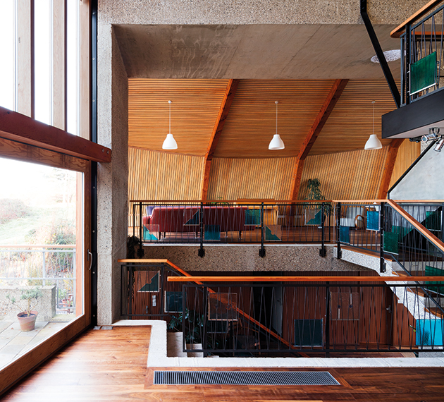
It wasn’t always meant to be like this: two previous plans had been approved for the site, and Bowles half-jokingly suggests that, knowing his client – a ‘serial collector of architecture’ – there may have been more. The schemes, though different in their spatial layouts, called for a modernist house with 1930s nautical touches: a broad expanse of glass leading onto a wide balcony and the odd round window. This didn’t come to pass. By the time Zogolovitch was ready to begin, a few houses in the area had already been built in that style, and the idiom had slipped into the local vernacular. He invited Bowles to take a look at the scheme, which called for a split-level arrangement, one of the trademarks of Zogolovitch’s development company Solidspace. Bowles has taken to the brief with gusto. Stepping over the threshold reveals a different world – a world attuned to Zogolovitch’s quest to shake up Britain’s conservative conception of dwelling. Where, in a run-of the mill house, one might expect a poky hallway, with a corridor leading to one of more reception rooms, the hallway of the Houseboat is more like a platform, around which the house unfolds on a series or levels. On the ground floor, there is an en-suite master bedroom, with children’s and guest bedrooms down one level. This compact arrangement means that, from the get go, visitors are visually connected to the living areas that fan out above. The walls of the central hall, and the area just below, are clad with fluted MDF panels – a reference, perhaps, to the all-wood panelling that now lines the walls of the Houseboat. This draws visitors upwards, revealing a grand arched space, supported by a central concrete frame that rises out from the ground. |
||
|
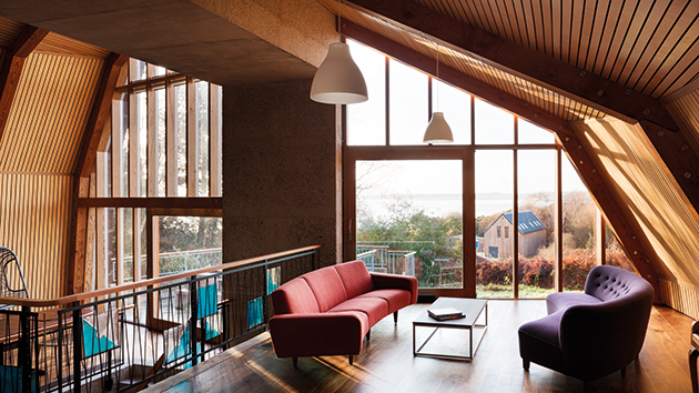
The hallway platform affords a full view of the hull-like envelope |
||
|
‘Roger and I share a love of wooden boats: the idea as much as the appearance,’ says Bowles. ‘The hull represents shelter, a shell, a husk, providing a feeling of enclosure.’ The treatment of the interior, uncluttered by unnecessary divisions, allows for a full view of the curved sloping envelope, reinforcing this idea. The rear of the house takes in the harbour views through a screen of evenly spaced mullions. There is a value in this measure beyond the modest reduction in glare: it preserves the protective gesture of the shell and creates a sense of human scale and privacy. ‘The idea of simply making it glass needed to be tempered, so that the people inside wouldn’t be over-exposed,’ says Bowles. The different levels that comprise the shared social space commune with one another freely, especially the large lounge and kitchen and dining area, which extends outside to form a terrace. The uppermost level is more withdrawn: the stairs leading up to it swap the light-touch balustrade for a more robust, solid-steel railing and the level itself does not extend the whole length of the house. Instead, it hangs suspended from the loadbearing concrete by a single steel ‘strap’. This relative retreat at the end of the architectural promenade through the house creates a welcome bubble of privacy. |
||
|
The glazed rear elevation provides views of the harbour |
||
|
‘We had a very unusual brief: a spatial, architectural brief. People talk about how many bedrooms they want and the budget. They don’t talk to you about the quality of the space they want to create,’ says Bowles. In addition, a client who happens to be a trained architect can contribute more than just helping shape the overall vision: Zogolovitch designed the railings and commissioned a mosaic in the hall. It is this symbiotic relationship and the pair’s wealth of experience – Bowles was the executive architect on MVRDV’s Balancing Barn and the Dune House by Jarmund/Vigsnæs, both for the Living Architecture programme – that has ultimately produced such a successful building. Great care has been taken to combine details and frank use of materials, achieving a rare balance to ensure the house never feels overwrought. The building has a strong formal and material presence, but can absorb a multitude of meanings: the exposed concrete is at once reminiscent of a sea wall, pebbledash or flint walls (the stone is used in the aggregate). The roof can be read as an upturned hull or a barn, and when talking about its gently frayed edges, Zogolovitch conjures up images of finely flaking mushroom caps. |
||
|
The split-level spaces are arranged around a central concrete frame |
||
|
There is very little that is bloody-minded about the architectural vision, and all the better for it. The architecture lets life flow around it instead of being a rigid framework – important in what is essentially a weekend house, as Mrs Farnsworth would surely attest. In this context, even the small secondary bedrooms are hardly objectionable: the focus is very much on the communal experience. Whether the spatial principles can be applied to much smaller dwellings – Zogolovitch has talked about trying to come up with viable split-level schemes for one-bed flats – remains to be seen. Thankfully, the Houseboat is neither a prototype nor a didactic exercise. It is very much its own thing, and a reminder that in the hands of skilful professionals, contemporary architecture can be harnessed to create a place full of soul. |
||

