|
|
||
|
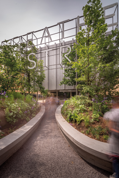
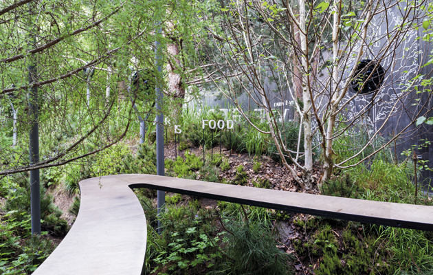
Most nations ignored the organisers’ brief for Milan Expo. But then, the vision of a “global botanical garden”, all under one roof, ignored the competitive spirit that has underpinned Expos for the past 160 years. It is time, at the very least, for a fundamental rethink, argues Tim Abrahams The Austrian pavilion at this year’s Milan Expo represents a strange new building type: the non-pavilion. It’s indicative of problems across the site, which in turn are suggestive of a moment of crisis for the World Expo movement. The pavilion looks relatively normal from outside – a steel box, largely obscured by trees but with a sign that offers the helpful advice to “breathe”. It’s surprisingly unassuming, unlike the massive swooping folds of PTFE cloaking the German pavilion, or the plasterboard citadel topped with a massive basket that constitutes the Qatari effort. But the really odd part of the Austrian pavilion is inside. Once you enter, you find yourself on a ramp rising up into a planted forest. There is no roof. One is effectively moving into an Austrian wooded copse, albeit one augmented by some ingenious signage and by suspended irrigation systems. There’s also a bar. It’s a charming space that provides the weary Expo-visitor with a break from prodding interactive screens in the dark. But, as one walks around, one begins to wonder: what exactly is this building for? There are no banks of complex audio-visual experiences repurposing folk tales in a manner designed to tell some national story, as happens in the Korean and Japanese pavilions. Nor have economic statistics been seared or embossed onto wood, a method particularly prominent in European pavilions. Effectively, the Austrian pavilion is designed to be as unlike the other pavilions at this Expo (or previous ones for that matter) as possible. Yet, in an effort to withdraw from any attempt to represent its country, the Austrian pavilion says nothing. The forest could be anywhere. Perhaps this could be seen as commendable, but in its retreat from cliche, the Austrian pavilion highlights not just the question “what is a pavilion for?” but also the fundamental issue of what purpose the whole Milan Expo serves. It is a question that needs asking. Roberto Arditti, the director of institutional affairs at Expo 2015, believes that the event operates in a continuum that goes back all the way to the Great Exhibition. “Since the very first edition in 1851, Expos have always been an opportunity for participating countries to show the best of their technologies and innovations to an audience of millions of people from all over the world, and thus stimulate human progress,” he says. It is the classic view of the Expo’s role – an image of industrialised and industrialising nations displaying material evidence of their progress and produce to each other in a spirit of competitive inquiry.
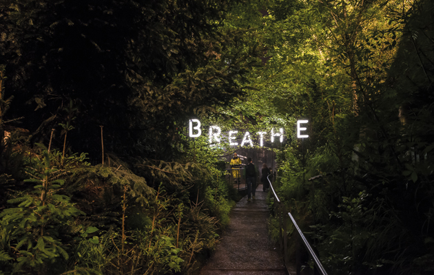
The Austrian pavilion is announced with a large sign that reads “Breathe Austria” The strange thing is that Arditti believes that the Milan Expo is no different. Going back to the Austrians’ enclosed copse, it is telling that they aren’t even interested in showing agricultural production. According to their spokesperson: “The pavilion serves as a breathing ‘photosynthesis collector’ that contributes to global oxygen production.” Austria’s greatest gift to the advancement of human civilisation is the trees that stood before humans even arrived. Far from being a mild evolution of the Expo format, as Arditti suggests, there is much about the Milan iteration to suggest that this is a fundamental rethink of the organisation’s values. This clash of visions explains a great deal about the masterplan and the architecture that has resulted. The site is flat and the layout monotonous, stretched out along one road grandly called the Decumanus after the main east-west thoroughfare in Roman settlements. Strolling down this 50m-wide piece of tarmac, one is reminded less of the Via degli Strozzi in Florence than of Milan’s new trade-show complex designed by Massimiliano Fuksas, particularly in its monotonous length. The thin plots of land on which the pavilions sit are mediated only occasionally by canals (the sad remains of an amibitious irrigation scheme) with charming but apparently pointless locks. Poorer nations have ended up grouped together, organised according to the cash crops they produce. At the foot of the Decumanus is a desultory series of tiny market gardens in sheds. |
Words Tim Abrahams
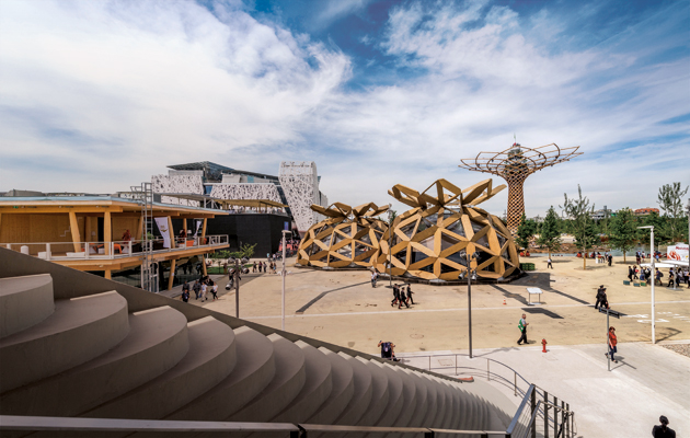
Above: The Milan Expo site with the permanent Italian pavilion, by Nemesi & Partners, in the background
Images: Pygmalion Karatzas/Arcaid Images |
|
|
||
|
Inside, a small-scale forest provides 6.25kg of fresh oxygen every hour |
||
|
These features are all remnants of the original plan, produced by a team led by Stefano Boeri, the Milanese architect given the job of planning the event in 2008. He brought together big names including Herzog & de Meuron, William McDonough (the American designer who helped coin the term upcycling) and Joan Busquets (a member of the planning team for the 1992 Barcelona Olympics). By Boeri’s own admission, the team tried to focus on the content of the Expo, hoping to create a vision of urban agriculture for Milan. They not only wished to create an overarching physical structure under which each identically sized pavilion would operate, but also to provide an overall idea of how their chosen theme should be delivered by each and every participating nation. Presenting his plan in 2010, Boeri told Expo organisers Bureau International des Exposition (BIE) that the “the entire world will come to Milan to take part in the realisation of a huge botanical garden”. The plan designated “a piece of land where each country of the world will be able to cultivate its own agricultural products”, according to Boeri. This was effectively urban farming – the environmentalist movement that hopes to develop domestic leisure agriculture, typified by allotments or market gardens, as a major contributor to a city’s food needs. There is definitely a sense that the plan for Milan Expo has co-opted the values of this movement, which are widely discussed but rarely put into practice on anything other than a boutique level of production. However, it also borrows from a parallel process seen in countries such as China, where massive, often very uneven, expansion of urban areas has resulted in the juxtaposition of agricultural and urban housing types. Expo 2015’s highly aestheticised version of these latter developments was perhaps ill-advised, but such interests are to be expected from a team led by Boeri. His most notable architectural design of late is a pair of residential towers in Milan called the Bosco Verticale, which incorporates over 700 trees as well as small plantings on its balconies, which will cloak the structures once mature. |
||
|
The element of air was central to the design, on the basis that it is “of notable excellence in Austria” |
||
|
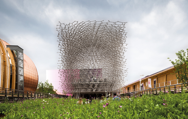
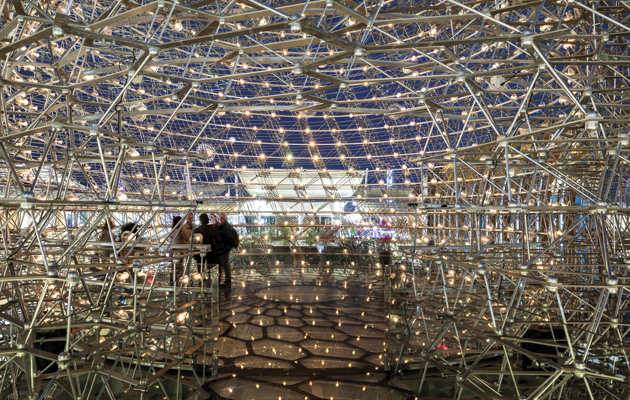
The Expo 2015 masterplan proposed the same approach to land distribution as a medieval village, except with departments of trade or foreign relations from the world’s nations tending the narrow strips of land, rather than peasant farmers. Unfortunately the invited nations either didn’t get the memo or turned up with very clear ideas of their own about how they wished to represent themselves (as the long history of World Expos dictates that they were always likely to do). Certainly, most had no real desire to plant a global market garden to benefit the discerning purchasers of Milan. Boeri held the grandly titled post of “Councillor for Culture, Fashion, Design and the Expo” in the Milan government in 2011, but had the last portfolio removed from him after criticising the Expo’s management for its implementation of his plan. In addition, many argued that Boeri had set himself against the logic of Expo’s own operational rules: the freedom for nations to contribute in their own way. Seen in this light, the British pavilion is a great success. It co-opts the anti-urban rhetoric at the heart of Boeri’s vision and, through the device of a steel-trussed hive, incorporates a narrative telling a story of a modern nation’s industrial production. Yes, it bears a passing resemblance to Heatherwick’s Seed Cathedral from Shanghai in 2010, but the structure operates in a different way: it is effectively a sculpture sitting on top of a box at the end of a raised garden, allowing visitors to contemplate flowers at bee’s-eye level before they arrive at an abstracted, industrialised version of a hive. Hannah Corbett, commissioner of the pavilion, explains: “People who want to come to the pavilion don’t really have time to take on more than two ideas, so we’ve shown them the role of pollination in feeding the planet, while the other idea is about British creativity and innovation – that Britain is a hive of creativity.” A further story about Britain’s agricultural expertise is added through graphics embossed onto the timber structure of the box – the pavilion will host six weeks of trade meetings as part of a co-ordinated series of 200 events around the world, intended to harvest £1 billion worth of trade. Its role is to act as the symbolic heart of this activity, but Corbett is less clear on what role the Expo as a whole plays, deciding that it is “a beauty pageant of nations”. She adds, “It’s industrial nations showing off their advances. It’s all about how you compare with others.” The idea is to look enticing to other countries’ representatives. And Wolfgang Buttress’s sculpture does that very well. |
||
|
The British pavilion, designed by Wolfgang Buttress, is a 17m-high aluminium bee hive set in a wildflower meadow |
||
|
Of course Corbett’s idea of a “beauty pageant” isn’t really a convincing vision of what an Expo should be. An out-and-out competition isn’t sufficient as a structure, and it certainly isn’t enough when it comes to explaining how the Expo operates on an urban level. Hampered by the inability to alter Milan’s planning regime – all the pavilions effectively had to gain planning permission as if they were permanent structures – Boeri was unable to adapt the logic of the event to his more fluid concept. Yet perhaps Boeri did not need to do so in the first place. Jacques Herzog has suggested that previous Expos have left a “wasteland of ruins”. It’s not always the case. The site of Shanghai 2010 is now a fully operational part of the city – so successful was the show that it reopened the following year for a two-year commemorative exhibition, and the Russian, Italian, French and Spanish pavilions are now set to reopen, remaining in situ for the next 50 years. The 18,000-capacity Expo Performance Centre is one of the city’s most popular performance venues; the Chinese pavilion has been reincarnated as the China Art Museum. Similarly, the Lisbon Expo in 1998 was highly successful in opening up the waterfront, and the Torre Vasco da Gama is just the grandest among a host of reused structures. New metro routes, a new bridge and a transport terminal were created – not to mention a new park. Of course there are disasters such as Seville, but sometimes even ruins can be important – Buckminster Fuller’s geodesic dome in Montreal is one of the most poetically significant structures in North America. It is strange too that in Milan, of all places, there has been a lack of faith in the Expo as an urban device, albeit one that can contain bucolic or even pastoral moments. This is not just because of Boeri’s previous role in overseeing the urban development of the city, but because Milan’s development over the industrial period owes a great deal to trade exhibitions and the grounds built for them. No other city in the world has hosted industrial trade fairs on such a regular basis. The Triennale di Milano, which makes its comeback next year after a two-decade hiatus, is the only BIE-regulated Expo that always takes place in the same city. It’s a unique global meeting place between the key players of the design industry and the general public, hosted in a massive, eponymously named institution that dominates much of the city’s cultural activity concerning industrial and applied arts. In contrast, Milan has no publicly funded contemporary art museum. |
||
|
Inside, lights flicker in response to movements in a real bee hive based in the UK |
||
|
In addition, very few cities have used the exhibition site as a driver for development so successfully. The first fairground in Milan was opened in 1906, extending over Sempione Park for ad hoc trade events, before moving west in 1923. Ten years ago, the new Fieramilano opened in Rho in the north-west – the old fairground was partially dismantled and an ambitious new development, CityLife, is growing up in its place, dominated by three towers by Arata Isozaki, Zaha Hadid and Daniel Libeskind respectively. The move of the fairground to Rho has created a new dynamic of urban expansion across Milan, of which the Expo should have been part. Unfortunately, it isn’t. The Milan Expo is a failure, of that there is very little doubt. It is a failure thematically, in that it avoids doing what Expos have always done – showing off innovations in material production and attainments in design. This hollowing out of the whole point behind Expos, as exemplified by the Austrian pavilion, is symptomatic of a wider malaise. But worse, given Milan’s past history of development through fairs, both piggy-backing expansion of essential services and creating infrastructure for world-class events, the city chose to turn its back on an important driver to urban expansion. Designers, architects and planners have to shoulder some of the blame here. While key contributors to the process such as Herzog have criticised the city for failing to stay true to their original schemes, one could conversely point to the plan and ask why an agricultural theme and format was inscribed so proscriptively within it. By rejecting a key organisational structure of Expos – the reality that much of the site is created by governmental bodies from other nations, who understandably have their own agenda – they contributed to this failure. Milan has little to show for Expo 2015 apart from an area at the end of a metro line with some services buried beneath tarmac. Let us hope that the planners’ next move shows greater faith in “the city” as an idea. This article first appeared in Icon 146: Expo. Click here to read more |
||

