|
|
||
|
Los Angeles International was the seminal jet-age airport and its designers William Pereira and Charles Luckman, the first jet-age modernists. It set the model for how we fly today and established the aesthetic for much of America’s military-industrial complex. Los Angeles International Airport is unusual in that it has an official song. It’s unique in that the song was a hit single. LA International Airport was recorded by Susan Raye in 1971, reaching number 9 on the country chart. When the song was re-recorded in 2003 to mark the airport’s 75th birthday, the line “Where the big jet engines roar” was changed to “The great Pacific’s welcome door”, perhaps reflecting 21st-century sensitivities about airport noise. But LAX is where the big jet engines first made their voice heard in architecture. It was, in many ways, the airport that came to define the modern airport. This visionary achievement was the work of Pereira & Luckman, a firm that embodies utopian 1950s jet-age modernism – and which also dealt with the dark side of that dream. The distinctive Californian jet-age aesthetic evolved by Pereira & Luckman – and later, William Pereira alone – is beautifully encapsulated in one structure at LAX. Sitting at the centre of the vast site, the Theme Building is a circular observation deck suspended from two crossed concrete arches. (The restaurant closed in December 2013.) These parabolas are exquisitely slender, their white curves suggesting nothing more substantial than jet contrails against the sky. Such is the suggestion of weightlessness, the eye is tricked away from the sturdy service pillar beneath the discus. The Theme Building was opened in 1961, when Pereira & Luckman completed its reconstruction of LAX for the jet age. It is an optimistic, futurist building, resembling something from The Jetsons, the LA-made Hanna-Barbera cartoon that appeared a year later. We’re now conditioned to see this optimism as naive, but this flight of fancy was embedded in an airport that was incredibly practical and prescient. Pereira & Luckman might have styled yesterday’s tomorrow – but they also designed how we fly today. College classmates William Pereira and Charles Luckman founded their partnership in 1950. Both had gone from studying architecture into very different careers. Pereira had started out designing movie theatres before becoming art director at Paramount Pictures. Luckman was, in the words of his autobiography, a “jet-propelled executive” nicknamed “boy wonder”, who had been the youngest-ever CEO of Lever Brothers. Before being ousted from that role, he commissioned Gordon Bunshaft’s seminal modernist skyscraper, Lever House.
Pereira & Luckman specialised in a singular typology: unprecedented buildings. Its first major commission was the West Coast headquarters for the television network CBS, a purpose-built TV studio complex on a scale never previously attempted. The project won more work for the fledgling studio even before it was completed. In 1952, the year CBS Television City opened, Pereira & Luckman won the contract to redesign LAX, at the head of a joint venture that also included Welton Becket Associates and Paul R Williams. There were no existing examples to draw on. Luckman summed up the challenge in his autobiography: “We were then, in 1955, planning an airport to be constructed in 1960, which was large enough for 1980. We had our work cut out for us.” All architectural design anticipates future needs, but this was a different order: building to accommodate machines that existed only on drawing boards, and which were expected to wreak huge but hard-to-predict changes in global travel. The jets would of course need new facilities, such as longer, tougher runways. But machines themselves weren’t the greatest test the airport faced. “It is neither the number of airplanes, nor the number of operations which is significant,” Luckman wrote, “but the number of people.” Jets could carry more passengers than propeller planes; more significantly, they promised to dramatically reduce the cost of air travel. The prediction for 1980 was 18 million passengers a year. (It turned out to be 33 million.) How would this human torrent get to and from the airport, and on and off their planes, without congestion and confusion?
Pereira & Luckman’s plan anticipated the separation of arrivals and departures into two levels, so each could flow in one direction only. More significantly, they broke away from having a single building – instead, a central complex was surrounded by elliptical satellite buildings. Luckman described the layout as looking like a gigantic horseshoe. “At the open end of the horseshoe we placed the control tower, giving the controllers total peripheral vision of field and sky. Along the outside of the horseshoe plan were the two-level satellite buildings for each airline, which looked like bubbles rising from a sea of concrete.” Dead centre was the Theme Building – a location chosen partly, architectural historian Alastair Gordon suggests, to orient people and help them find their cars in the expansive parking lots that surrounded it. Shielding airport users from the “horrendous noise and intense heat” generated by the jets was an overriding concern, giving the satellites a bunker-like appearance. And the satellites were connected to the central complex by tunnels, freeing up surface space for moving aircraft and further protecting passengers. To fly, first one had to burrow. The tunnels were wide with bright, creative lighting, and were soon made less of a trek by the introduction of moving walkways in 1964. But in creating the satellites and burying the paths to them, Pereira & Luckman had inaugurated one of the most disorienting features of modern jet travel: the fact that it is perfectly possible to pass through an airport, onto a plane, fly, and then debark at the other end without ever seeing the exterior of the machine you have travelled in. Air travel became the disembodied, prosaic yet mysterious, experience it is today; “tubed night”, as Martin Amis called it in Money. The Pereira & Luckman partnership, brimming with volatile talent and ambition, only lasted a decade. Luckman went on to huge individual success, though his brazen style made him a central figure of late modernist hubris: New York’s Penn Station, a beaux arts landmark, was demolished to make way for his Madison Square Gardens complex. Pereira was also prolific. He kept the sunshiny, futurist feel, laying out the planned community of Irvine in Orange County and designing scores more buildings, including universities, libraries, the TransAmerica Pyramid in San Francisco and several other airports, not least Baghdad and Tehran.
In 1965, Pereira was called back to LAX to masterplan the airport again, this time pending the introduction of the Boeing 747, the first wide-body jet (Icon 085). The problem of keeping the hordes moving needed more radical solutions. Pereira suggested, and was given, a new freeway exit to the airport. But his two other grand ideas were not taken up. The first was a monorail link to the city, a common wish for airports. The second was more distinctive and ingenious: an integrated system of signage, which would start to stream and direct airport users while they were still in their car and steer them seamlessly through the sprawling complex to their gate. This system, described by Pereira in a treatise called A Journey to the Airport, went much further than the familiar Helvetica and pictograms that have become the international language of air travel. It immersed the user, and organised the spaces they traversed. “If a particular space required a passenger to slow down, Pereira simply proposed to put a rough surface on the floor,” Vanessa Schwartz writes in Overdrive: LA Constructs the Future. “Signs were located at the sides of throughways in order to divert confused people off of the main paths. In other words, not only did form follow function; it would expressly shape use and passenger mobility.” This was the dream of the frictionless airport, one of uninterrupted, easy motion, a dream now lost beneath the shoeless feet shuffling towards the metal detector. But the dream mattered – the way architects and planners have imagined the airport gives us a precious insight into the ordering of the modern mind. The hospitals and asylums of the 19th century were pocket utopias, microcosms of correctly ordered society; the airport can be seen the same way, a diagram of a modern ideal state. Mika Aaltola, director of the global security research programme at the Finnish Institute of International Affairs, suggests that the global airport system of “hubs and spokes” is “pedagogic”, teaching its users “the central rituals … that are needed to navigate in the Byzantine structures of the modern world order”. “Who feels at home at an international hub? And, who feels out of place?” Aaltola asks. “The airport provides a setting for the expression of the underlying values of being a member of the global community.” Given how influential the cosmos of the airport can be, it’s interesting to see what qualified Pereira & Luckman to take on the LAX job. While CBS Television City was being built, representatives of the US Air Force saw Pereira & Luckman’s sign at the site and approached the firm to lay out Edwards Air Force Base. Edwards had just been designated the Air Force Flight Test Center – it was there that the latest military jet technology would be tested. “[W]e knew nothing about jet aircraft, nor had we done any master planning,” Luckman would recall. “… I spent nights poring over books and technical journals to learn the lingo of jet aircraft so that I could talk intelligently to our client. We had to learn what the air force people thought would be built in the future in the way of jet and supersonic aircraft. We had to plan for planes that had not yet been built[.]” By the time Pereira & Luckman was laying out LAX, the duo probably knew more about jets than any other architectural firm in the world.
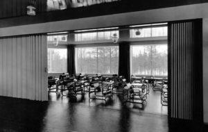
credit Museum Associates, LACMA Aerospace was one of southern California’s most important industries, accounting for one in three jobs. And Pereira & Luckman was completely embedded in that industry. “No architect better captured the exhilarating spirit of southern California’s aerospace era than William Pereira,” Stuart W Leslie, a professor of science and technology at Johns Hopkins University in Baltimore, has written. “Pereira scaled up the residential version of California modernism perfected by Richard Neutra to industrial proportions.” Pereira & Luckman designed corporate campuses for a range of companies whose names ring with futuristic promise: Convair Astronautics, General Atomics, Ford Aeronutronic. The aesthetic developed for these firms sloshed freely into projects outside the military-industrial complex. Pereira’s 1965 Los Angeles County Museum of Art, with its artificial moat, resembles the lobby of Convair Astronautics (1958), where the Atlas missile programme was developed. The ring-shaped campus for General Atomics (1960) – a company that strived to find peaceful applications for nuclear technology – had at its centre a circular building raised on slender stilts, a cousin to the Theme Building. General Atomics now builds drones, including the Predator and the Reaper. In spring 1952, at about the same time Pereira & Luckman won the LAX job, the firm landed another huge commission: to lay out a facility to launch rockets into space at a place called Cape Canaveral in Florida. Luckman went on to complete this job, as well as designing the Manned Space Flight Center in Houston, Texas. The firm was also approached to draw up early plans for Disneyland in Anaheim; though it did not complete this job, it did design the first Disneyland hotel. From the friendly skies to the Atlas missile, and from Apollo to Disneyland, Pereira & Luckman built the infrastructure for the postwar American Dream. |
Image University of Southern California
Words Will Wiles |
|
|
||


