|
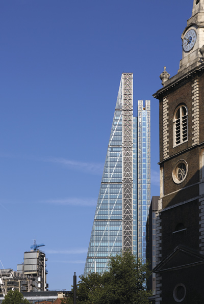
Rogers Stirk Harbour + Partners’ most recent addition to the City of London’s skyline is surprisingly sensitive at ground level for a building that needs to pay its own way, says Douglas Murphy The debate around London’s rapidly changing skyline has been hotting up recently, as hundreds of new towers make their way towards construction. The fact is that most of these are going to be terrible buildings, with no respect whatsoever for the city, conceived purely to take advantage of the continued boom in land values in the capital. But is there another way? RSHP’s Leadenhall Building has now completed a speculative office block which tries to offer far more to its home than what we’ve come to expect. Commissioned more than a decade ago, the Leadenhall Building was one of a pioneering cluster of towers in the City of London which took shape during the pre-crash boom, and was one of the first after “the Gherkin” to receive the now ubiquitous silly moniker, in this case “the Cheesegrater”. Graham Stirk, lead architect at RSHP, proposed a building with just two major conceits: firstly, it would narrow as it got taller, leaving open a protected view of St Paul’s Cathedral. Secondly, it would provide a new public space at the ground level, dragging many of its functions up into the building and giving something back to the city.
Leadenhall viewed from the east The Leadenhall sits across the road from Rogers’ original Lloyd’s building, finished in 1986, one of the most eccentric modern buildings in the world. The differences in the generation that have passed are obvious: where Lloyd’s is gloomy, heavy, almost gothic, the Leadenhall is sleek and colourful, with its giant diagrid “megaframe” structure hidden under a huge sheath of curtain-wall glazing. And where Lloyd’s celebrates its guts in the most visceral manner, Leadenhall has long since tucked them back inside where they can be looked after properly. According to Stirk, this is because a speculative building requires “sufficient neutrality” when compared to a cliented one, but it’s also a sign of the long smoothing out that British architecture has undergone. The two buildings definitely share the same ethos however. The logic of separating out service cores remains, with glazed lifts, stairs and bathrooms kept in a separate tower, and with the main working floors entered via a bridge. The result of this is that the building has one of the most perfect set of floor plans I can recall, barely interrupted rectangles of office space, in this case aimed at the insurance market. In terms of the skyline, the Leadenhall is clearly one of the best towers London will get in this era: refined and relaxed, not trying too hard. But down at ground is also an achievement: “Building tall has allowed us to create a great public space at street level,” explains Stirk, describing the huge loggia created by the gigantic columns at the perimeter, compounded by the receptions being lifted off ground level. The view from this new public space dramatically frames the Lloyd’s building, and while it’s not an area where people go except to work, it shows that even a building so commercial as this is capable of respecting its civic situation. What do you think of the Leadenhall building? Tell us using the comment box below |
Words Douglas Murphy
Images: Richard Bryant courtesy of British Land/Oxford Properties; Paul Raftery |
|
|

