|
|
||
|
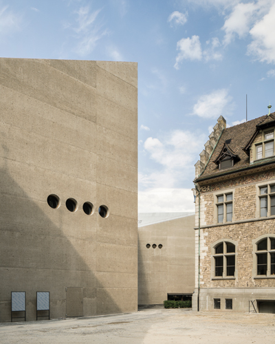
Christ & Gantenbein has landed a sculpted ‘lump of concrete’ next to Switzerland’s beaux-arts national museum. It is at once a provocation, a stunning space and a hymn to the beauty of Swiss engineering It’s been a bumper museum year for Swiss architect Christ & Gantenbein: in April it inaugurated its impressive extension to the Basel Kunstmuseum, while on 1 August – Swiss National Day – it unveiled its long-awaited extension to Zurich’s Landesmuseum which, along with the Château de Prangins and the Forum of Swiss History Schwyz, constitutes the Swiss National Museum. Although completed after the Kunstmuseum, the Landesmuseum is by far the older project, the competition for the extension and revamp of this eclectic 19th-century complex having been held in 2002. Emanuel Christ and Christoph Gantenbein were barely 30 back then, and the design bears all the ardour of youth, even if, in the 14 years since, the project has undergone a considerable slimming down, following a decision to move ancillary facilities to an out-of-town site. Comparing the Kunstmuseum and Landesmuseum extensions is instructive. Both are, of course, reactions to the original buildings, but where in Basel it’s clear that Christ & Gantenbein admired Bonatz and Christ’s 1936 stripped-Romanesque palazzo, and sought to produce a contemporary building that reproduced its qualities, their feelings towards Gustav Gull’s rather kitsch 1898 Landesmuseum were more equivocal. As Christ says, ‘It was a provocation to plonk this lump of concrete down in the face of the old; to say, “Yes we are contemporary, and we leave traces, and we don’t go underground” – because, in theory at least, that would have been an alternative solution.’
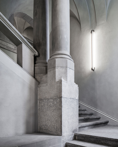
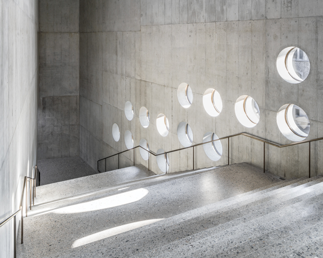
The existing building was also fully renovated by Christ & Gantenbein Sandwiched between Zurich’s main station and the Platzspitz park, where the city’s two rivers meet, the Landesmuseum comprises a beaux-arts quadrangle main building, breached on its northern side towards the park, with a lower structure (originally a school) jutting out diagonally to the south. Christ & Gantenbein’s extension, which provides space for large temporary exhibitions, as well as a library and workshops, links the former school – which has now become the restaurant and main entrance – with the far side of the quadrangle to form a circuit. In plan it resembles a lightning bolt, and it also zigzags in elevation, lifting itself up like a giant Rubik’s Snake to allow a continued relationship between the museum courtyard and the park. ‘The extension is conceived more as a producer of space and less as an object,’ says Christ. ‘It’s not a Bilbao-type building offered up like sculpture on a platform. It hides behind the trees on one side, and its folding makes it only ever partially and obliquely visible from within the courtyard – a little like the original building, which is also a composition of parts and fragments.’ However this ‘sculptural contextualism’, as the architects dub it, is expressed in a language that pulls no punches: sheer and largely blind walls of raw reinforced concrete (whose aggregate is made from the same tufa as the original building) topped with a corrugated Eternit roof (which is clearly visible from the upper galleries of the old museum). ‘You can imagine how we fought for that roof,’ says Christ. ‘Eternit is typically Swiss, and we love it. It’s the covering for the classic shabby agricultural shed in half the fields in the country.’ Also typically Swiss is the exquisite crafting of the concrete, cast with just the right mix of precision and roughness to be at once urbanely chic and craggily elemental. What happens outside is largely what happens inside. The walls are once again in raw reinforced concrete (this time with a different aggregate, since the building was cast as two vertical slabs with insulation in between), as are the floors, which had their top layer stripped off and then polished to give a result that looks very similar to the old building’s terrazzo. Only in Switzerland could this be brought off, and it’s particularly impressive in the extension’s big, bravura internal space, the cavernously dramatic 60-step staircase that climbs up one of the vertical zigzags as part of the architects’ continuous promenade architecturale. The risers of each stair have been left brut de décoffrage, only the treads having been scraped back and polished, and the edges between the two are perfection. |
Words Andrew Ayers
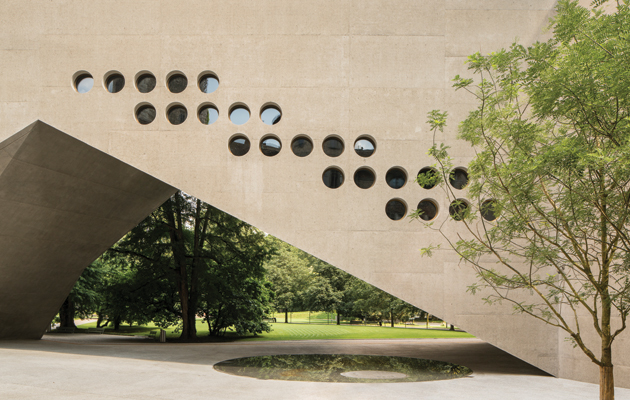
Above: The new wing rises up in the middle to connect the museum courtyard to the Platzspitz park |
|
|
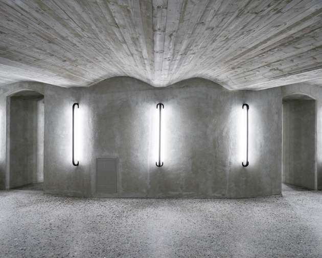
The interiors are dominated by exposed-concrete walls and soffits and polished terrazzo-style concrete floors |
||
| Also rather brut are the ceilings, with all the ducting and technical equipment left exposed, albeit painted a dull, uniform grey to blend in with the walls. One other detail links inside and out − a constellation of small porthole windows scattered across the gallery walls. ‘Typologically, this kind of museum doesn’t need windows,’ says Christ. ‘Curators just want a black box. We thought, “That cannot be. So why not have a small opening, or hole, that’s also technical?” And they are: some suck air in, others blow it out, in case of fire. Like binoculars, we placed them strategically, where the promenade architecturale shifts direction, so you understand the building in relation to the outside landscape as you move round. And the fact that the portholes are so small and deep – the wall is 80cm thick – means you don’t need sun-screening.’
The promenade architecturale in Zurich is very different to the one in the Kunstmuseum Basel. Where the latter provides a series of clearly defined orthogonal rooms grouped around landings, the Landesmuseum extension is an almost continuous sequence of spaces flowing from one to the next, contracting and expanding both vertically and horizontally in angular, irregular geometries as they go along. ‘We were slightly tense about how the first show would come out,’ admits Christ. ‘While technically we’d provided a very performative infrastructure, we were aware of the fact that we’d also perhaps created a problem for the museum, or a challenge at any rate. This non-standard space, that compresses and expands, was partly inspired by the old building, where you go from small rooms to large vaulted halls, and so on.’ (Creating a continuous space of this nature was also technically challenging from a fire-regulation point of view: a whole system of propellers and smoke extractors had to be installed, as well as cleverly hidden firefighter access doors scattered all over the facade.)
The blind exterior walls are punctured with small porthole windows Besides fulfilling Christ & Gantenbein’s mantra that ‘architecture is just space and material and light’, this approach was also a response to the political minefield represented by a national museum (the project was not without its detractors and contesters, and required two referendums to get it through the approval process), since they imagined it ‘as a workshop for negotiating Swiss culture and history in an open, experimental way’. ‘We avoided style, we didn’t refer to a traditional architectural canon, but rather we spoke a language that conforms to what I call “technical buildings” – dams, roadways and bridges in the Swiss Alps,’ concludes Christ. ‘For us there’s huge beauty in Swiss engineering. And of course there was a moment in the 20th century when by far the most spectacular buildings in Switzerland were infrastructure facilities in the Alps. We tried to bring something of that to our new Landesmuseum wing.’ This combination of what you might term ‘neutral technical nationalism’, spatial bravura and exquisite detailing makes for a soberly exciting and beautifully satisfying building. |
||
|
A cavernous 60-step staircase rises up one side of the vertical zigzag |
||

