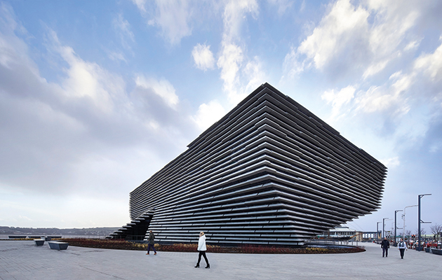
The V&A Dundee has been nominated by ArtFund for its Museum of the Year 2019 award, making up a shortlist of five institutions across the UK. Here, look back at Icon’s interview with the architect, Kengo Kuma, from issue 183, the September 2018 edition.
Ahead of the opening of the V&A Dundee, architect Kengo Kuma spoke to Icon’s editor, Priya Khanchandani, about the role of nature, land and water in his work, the need for intimate space in cities, and how these themes found form in Scotland’s first design museum
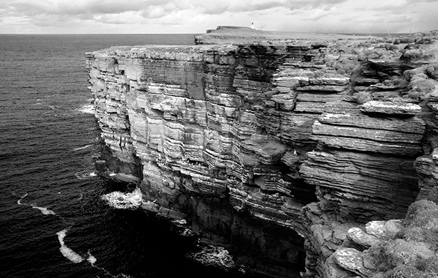
The V&A Dundee opens in September 2018, sharing the London-based museum’s collection of decorative art and design with audiences in Scotland. Designed by Kengo Kuma, the new museum is unusually positioned between land and water, adjacent to the RRS Discovery, the vessel that first carried explorers Scott and Shackleton to the Antarctic. The museum’s design was inspired by the shape of ships and the cliffs of north-eastern Scotland. In a conversation that unfolded at the site itself before the finishing touches were even in place, Kuma spoke to Icon editor Priya Khanchandani about turning a topographical feature into a dynamic structure, about further projects unfolding in Paris and Copenhagen and about urban space as a social and communicative aid.
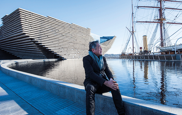
ICON: What were your first thoughts when you came to this site?
Kengo Kuma: I thought the river and the building should have a new type of relationship. If we had designed a square box, the river would not like the box. We made sure to avoid regularity. To have the [RRS Discovery] here is very good for the project. The shape of the ship also derived from the water; and so the shape of this building is a creation of nature and water.
ICON: So the building is inspired by both ships and cliffs?
KK: Yes; the shape of a cliff is designed by the power of water, and the same with the ship. The ship and the building are both floating on the water.
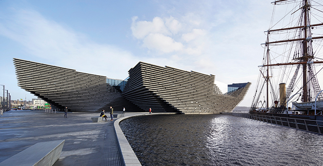
ICON: Was there anything you did consciously to create this appearance of floating?
KK: We tried to integrate water and the building in a different way. In the history of Dundee, people used water as a way to access the world, through the ship trade. We wanted to rediscover the connection between water and city, water and world. The edge of the water has always been important too. We avoided using handrails, but instead placed a step for sitting on.
ICON: The building seems to jut out into the water. How did you deal with building into an estuary?
KK: Often waterfronts are occupied by warehouses and factories, and Dundee was no exception. And in that sense, it’s not just a building but a gate which connects land and water. The ‘cave’ [a space between the two volumes of the building] is really important for the project as it acts like a gate. It goes directly to the main axis of the city, Union Street, and Union Street opens up to this cave.
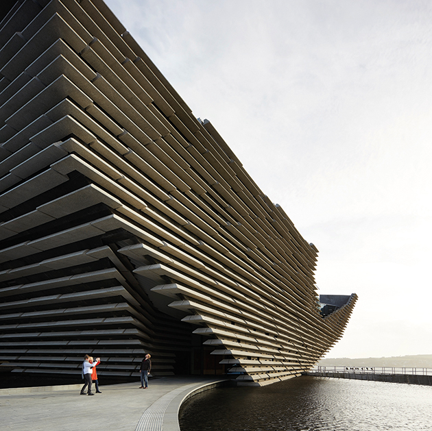
ICON: Are the concrete panels that cover the exterior also intended to echo cliffs?
KK: Yes, Scotland is very pure and wild and I tried to create harmony with the Scottish landform.
ICON: There is also a degree of brutalism in the design of the panels. Would you say so?
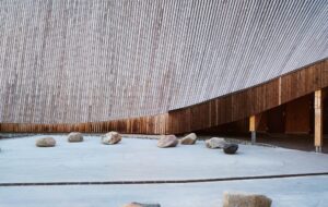
KK: To create roughness is not so easy. There’s a special manner to create roughness. Through using this concrete and the metal we chose; the dimensions vary and also the textures are different. Normal concrete has a smooth surface but here we tried to find a new way of exposing the aggregate.
ICON: Was climate a factor in the design?
KK: The building is protected. The concrete I think is a very Scottish solution. It is very strong, so the building is totally protected against the [elements] by the thick concrete wall.
ICON: Despite its scale, the museum’s interior feels intimate. Was this an important part of the project?
KK: People want to be inside, where the materials and details create the warmth and intimacy. At the beginning of the project we called it a public living room for the community. Museums in the 20th century were for art people – they came to see art – but here we wanted the living room to be for the whole community. Anybody can enjoy this space.
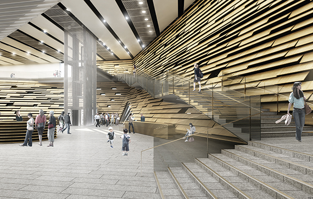
ICON: Why did you choose to create the interior walls with wooden panels?
KK: For every part of the building we tried to avoid straightness and vertical walls. Verticality is related to industrialisation, as practicality and functionality came together. We wanted to go back to the period before industrialisation, when nothing was straight and everything was rough. So we found that solution.
ICON: Were there any museums you looked to as a good example?
KK: I like small museums. In London I like Sir John Soane’s Museum. This is very different to the normal white cube. Many compositions happen in that space.
ICON: Which other museum projects have you most enjoyed working on?
KK: I designed this small museum for ukiyo-e [Japanese woodblock prints] in Tochigi Prefecture, north of Tokyo. Ukiyo-e influenced impressionism, Van Gogh, Charles Rennie Mackintosh and Frank Lloyd Wright. And this museum has a Mackintosh interior, which shows the relationship between ukiyo-e and Scotland.
ICON: Was the decision to create an open atrium left to you, or was that something the V&A wanted?
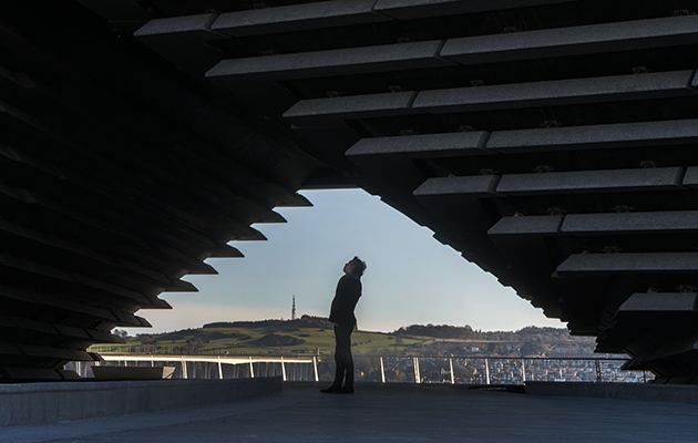
KK: From the beginning of the competition, we said the museum should be a living space in the city, and the jury really liked our idea. They said, ‘You understand the climate of Dundee. In winter people want to have a living room.’ And when I walked through the city, I couldn’t find any public spaces. So we proposed this space that’s protected and close to nature. The foyer space is very unique.
ICON: Is public space something that’s necessary to you when creating architecture?
KK: Every project begins with
a functional purpose, but within each we try to create public space, as this is very much needed in the compact cities of our period. Functionality was most important in the 20th century, but now, intimate public space is very much needed by the community.
ICON: What do you think about how public space is being created in new cities in Asia?
KK: Some of the big cities in Asia are metropolises – the skyscrapers, the big shopping centres – but I don’t think we need more volume in the city, because people buy everything on the internet and people can work anywhere. We don’t need big skyscrapers or shopping centres any more. Instead, people need intimate cosy public spaces, for relaxing and communicating with friends. And museums can work as this kind of communication space.
ICON: Tell me about the project you are working on in Copenhagen.
KK: We are designing a sports complex on Paper Island. Paper Island used to be full of food markets and very active and alive as the centre of the city, but that function has moved to other places in Copenhagen, and instead we were invited to design a new type of sports complex. We got a hint from Japanese hot springs. The hot spring is a place for relaxing; people can enjoy the city view and sometimes swim. That kind of sports centre is not just for sportsmen, it is a type of community space – and communication space – within the city. The project in Copenhagen will be like that.
ICON: Could you tell me about what else you’re working on?
KK: Yes, we are designing the St Denis Pleyel station in Paris. It’s a big station, which connects four metros and one national railway, but we designed the station as a public park. We [created] some slopes to connect the public plaza and the rooftop gardens. The diagonal element is very effective in connecting buildings to the areas around them, as here in Dundee.

ICON: When you were building the V&A, you spoke about making the building part of its environment. How do you deal with the dichotomy of being an international architect and working in a local context?
KK: I work internationally, but I don’t want to push my style on each place. I want to hear the voice of the place. Architects have their own style and they adapt that style for different places and every building by them has a similarity. But in contrast, we try to use local materials and local craftsmanship. We design the building within the community and the result varies according to each place.
ICON: Are there any particular architects or styles that have influenced you?
KK: Frank Lloyd Wright was one of my heroes. He designed the Tokyo Imperial Hotel in Japan in 1923. At that time, internationalism was leading architecture, but what he did was totally different. He tried to learn about local Japanese culture and customs. It’s a very unique building, it looks totally different from his buildings in America. And he was a unique guy. The total mood of the society was going in one direction – industrialisation, international style – but he tried to do the opposite. I have learnt many things from him.
ICON: Are you saying that you want to bridge internationalism with local crafts?
KK: I define internationalism as a challenging spirit. To find new things. Challenge is always the most important thing for an architect, but at the same time we should try to learn something from the place and for that reason I try to bridge internationalism with craft culture.

