|
|
||
|
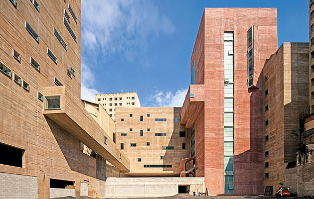
Brasil Arquitetura has continued São Paulo’s proud tradition of brutalist public architecture, creating a massive concrete culture and music complex in a tight inner-city space It’s curious to think that while brutalism in Britain has passed into some kind of architectural nirvana, its exponents vindicated by the listing of such beautiful monsters as Preston Bus Station, the movement is alive and well elsewhere in the world. Most striking of all these survivals is in São Paulo, where a certain kind of brutalism has become the city’s defining architecture. From Lina Bo Bardi to Paulo Mendes da Rocha, the city’s rich history of concrete construction has lent it a unique aesthetic: tough, urbane and resilient. It is also – despite brutalism’s often unhappy social history elsewhere – accommodating, sophisticated and tailored to the needs of its users, yet tough and flexible enough to accommodate change. Bo Bardi’s SESC Pompeia (completed in 1982) has become the archetype – a loose-fit, sprawling blend of industrial found space carefully stitched together into a microcosmic city of culture in a series of sculptural architectural interventions. The natural inheritors of Bo Bardi’s mantle are Brasil Arquitetura, a group of Paulista architects (some of whom, including Marcelo Ferraz, used to work for Bo Bardi) whose most recent work, the Praça das Artes, a music and arts centre in downtown São Paulo, is an extremely deserving winner of Icon’s architecture category.
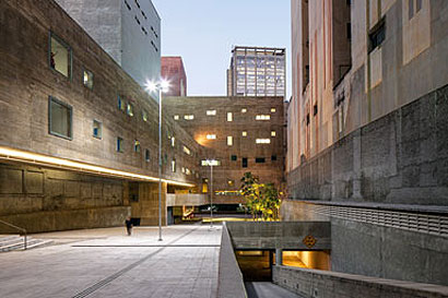
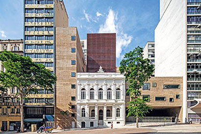
This is a work that is uniquely Paulista and impeccably urban. Its intelligence in stitching together an architecturally and socially disparate site is an exemplar of what architecture can do for a city. The site is in the centre of the city, an area that is slowly regenerating after years of neglect and borders on the quarter known locally as “Crâcolandia”. The police have been making strenuous efforts to shift the homeless and the addicts out – as well as some people who are seemingly just using the space – and have drawn criticism for their heavy handed tactics and a suspicion that this is an attempt at gentrification. “It’s true that the area has problems with prostitutes and the homeless, but because of that it is also alive,” architect Marcelo Ferraz, one of the founders of Brasil Arquitetura, says. “We need to reclaim public spaces for everybody.” The new building embraces a few disparate bits of the existing city including a long abandoned concert hall and the remains of an old cinema. “It was intended to become a base for all the dance and music activity and education for the city, as well as a headquarters for the philharmonic orchestra,” Ferraz says. What is most interesting is the shape of the site itself – a seemingly intractable plan, deep, long and buried in a dense urban block. The architects have managed to prise the block open and, instead of inserting a single, structure, have broken the programme up into a complex composition of discrete elements, each defined by an earth-toned concrete slab. It would almost look like a diagram, if the elements weren’t so viscerally massive. This is a building that refers to the concrete traditions of a city in which the material expresses a public use. It is curious then to see the building in its context as the (very fine) mid-century modern blocks that frame it to either side dwarf the new structure. Yet that sculptural concrete allows it to appear solid, to hold its own. It seems to push back at its neighbours, straining to carve out some public space in the heart of one of the city’s megablocks. “It’s presence in the downtown is very strong, and we decided to incorporate more space than we originally intended,” Ferraz says. “These were empty spaces and we were able to connect three streets and create new public spaces and a new passage downtown.” The individual blocks, which contain mostly education and rehearsal spaces, are punched through with rectangular openings, arranged like some kind of 1960s abstract art work. The architects play games with planes – the huge soffit of the main entrance to the site features more of the same openings, here concealing lights rather than windows, as if all surfaces were equal.
The most compelling aspect of the building for the flâneur, however, is the way it pulls you through into a generous, quiet public space. In contrast to the cocktail of Madison Avenue slabs and run-down fin-de-siècle blocks that characterise this section of the city, these are spaces of clarity and calm, contained in almost monastic solidity. The blocks seem to slide and rub against each other, some jostling for height, others attenuated in their horizontality, stretching right through the plot. One in particular is left open-ended, a squared tube of concrete poking through the site. The interiors and circulation spaces revel in the coarse reminders of the formwork and the sharp light makes the material seem more sculptural and luxurious here than it looks under northern skies. Where historic interiors have been restored (most notably in the concert hall) they have been restored to within an inch of their lives: no shabby chic here – this is genuine bourgeois space with wedding cake mouldings and velvet curtains. This is an extraordinary building, a microcosmic city of culture and a reflection on a strain of Paulista public architecture. It has something of the complexity and skilful weaving of existing and historic elements that made the SESC Pompeia – on which Ferraz also worked – such an admired building, but it also has a touch of Mendes da Rocha’s ballsy concrete robustness. And it has nothing to do with the sculptural expressionism of Niemeyer, the brilliant but once seemingly immortal architect whose death has freed up the market for cultural centres to younger names. “After SESC Pompeia, we didn’t have any great interventions into the central area for 30 years, so we wanted to do something for everybody – in the way SESC became the most democratic space in São Paulo,” Ferraz says. The Praça das Artes stitches some seemingly irreconcilable elements of the city back together – the filigree theatre, International Style office blocks, the cinema facade and the front and back of the block – with deceptive ease. The result is a complex, compelling and rich building that might refer back to São Paulo’s modernist traditions, but also takes them a step further. |
Words Edwin Heathcote |
|
|
||

