|
|
||
|
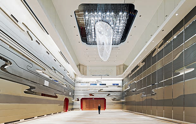
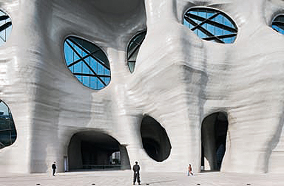
Since the Pudong district of Shanghai was declared a Special Economic Zone in the early 1990s, the former farmland area has been the site of several gaudy new landmarks, such as the Oriental Pearl Tower and the Shanghai World Financial Centre – and the Himalayas Centre by Arata Isozaki is another such building. Described by the developer Zendai as “an archisculptural masterpiece for 21st century China”, the centre is yet another in a series of gigantic mixed-use developments in the country. It contains an art museum, a theatre, shopping mall, office complex (with artists’ studios) and not one but two five-star hotels. Isozaki has placed the hotel facilities in the north side of the building and “the Design Centre Wing” containing offices and artists’ studios in the south, and between the two wings is a vast lobby and central hall, designed to hold up to 2,000 people. The hotel is a 100m-high cube, and the Design Centre consists of four blocks of different heights (the highest is 67m), arranged “like a swastika”. While the upper cubes are enclosed in curtain walls, the facade beneath the two wings is covered in screens that get their patterns from digitised versions of Chinese characters. (Isozaki has redeployed this form of computerised calligraphy in its Qatar National Convention Centre, which incorporates Arabic characters on some of its facades.) The Himalayas Centre’s most striking features are the curving, cavelike forms of the central part of the building. This space with a floor area of 155,000sq m, is claimed to be the biggest hall of its kind in the world. The project architect, Hu Qian, describes the treetrunk forms of the exterior as “an organic forest” and, inside, the smooth, striated surfaces are meant to resemble the form of Taihu rocks. At 16m up in this giant space, a floor has been inserted to make a multi-purpose gallery which connects the three wings of the building. This space is part art museum, part “banqueting hall” and the partition walls means that it can be connected or disconnected from the hotel and design wings. It’s meant to allow flexible transitions from one function to another. But it’s a relatively small gesture, dwarfed by the surrounding structures, which are the profitable parts of the building (and closer to the developer’s heart). This is the same clash of styles, between the eye-catching “organic” forms and the bland, commercial blocks, which can be seen in Isozaki’s convention centre building in Doha. In the case of the Himalayas Centre, this makes overall for a striking but confusing whole.
credit Sergio Pirrone |
Image Sergio Pirrone
Words Fatema Ahmed |
|
|
||

