|
This year, London’s architecture degree shows were as eclectic and artistic as ever, with designs veering between romantic exoticism and precision engineering. The seductive graphics, painstaking models and huge drawings were so good they put the professionals to shame. Here are some of our favourites.
ARCHITECTURAL ASSOCIATION SCHOOL OF ARCHITECTURE
Two pavilions flanked the Architectural Association’s famous doorstep this summer, and the show came complete with a book, a student magazine and a few newspapers. The units were all marked out with aplomb, with rapid prototyping and animations. The garden benches and soft sofas were a nice touch.
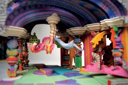
Adam Furnman: The Church of Perpetual Experimentation
The fictive setting for Furnman’s project is the initiation of the third Vatican council where the Catholic Church, lost as a great power in post-industrial Britain, is in search of a way to engage with contemporary society. Furnman’s solution is through an architectural assemblage: a stripy fuzzy spectacle of stairs, cranes and novelty vaults.

Martin Jameson: Project Runway: Thames Airport
According to Jameson, the airport is architecture’s big missed opportunity. The out-of-town, self-contained entity could be transformed to become a centrepiece of a community. The Thames Gateway offers this opportunity, and Jameson produced a sophisticated, criss-crossing bridge-airport.

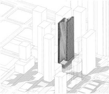
Max Kahlen: Rising Masses
The skyscraper had an iron grip on the 20th century, and the 21st century is determined to offer a new take on the building type, looking at ways to deform it using structural grids and mathematical modelling. Kahlen has offered a gentle and beautiful residential high-rise building, floating within the grid of Singapore’s office district.

BARTLETT SCHOOL OF ARCHITECTURE
Chinese golden lucky cats adorned the walls in another strong year at University College London’s Bartlett. The familiar halls coated in paint and handcrafted installations were the backdrop for the annual summer party on their grand portico.
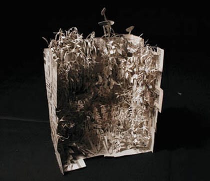
Jasmin Sohi: The Omoide Yokocho Insurance Office
Any insurance office is a centre of risk-taking and nervous paranoia, but for Sohi it’s also where sprinkler clouds drift above combustible gardens of paper, spilling statistics. It’s an office of nightmares, expressed through folds of shredded paper – the anxiety of its self-destructive workers expressed through its uncertain brittle structure.

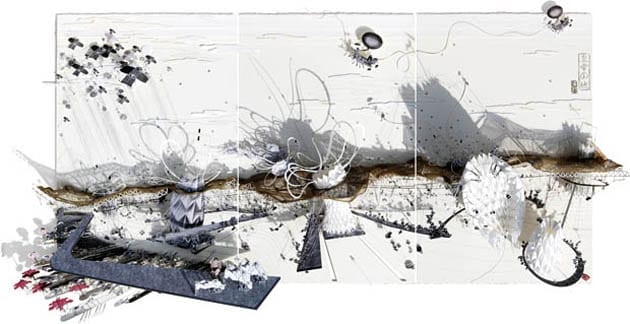
Kumiko Hirayama: Floating Algae Farm – Celebration of Pollution
This is a strange but quite lovely project predominantly based on a huge balloon made of algae that hovers over a lake. The project was created for a fictional world where scientists investigating pollution-absorbing algae were so captivated by the beauty in the colours of the plant that they decided to make their home in its midst.

Tom Hillier: The Emperor’s Castle
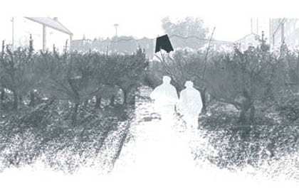
Hillier’s project – an urban theatre in central Tokyo – is based on the metaphor of a mythical, ancient tale, The Emperor’s Castle, hidden within a woodblock landscape by a Japanese Ukiyo-e printmaker. The theatre comprises a series of huge folded origami lungs that breathe in and out, controlled by the Emperor’s army. We loved Hillier’s hand-made origami book.
(top image)
LONDON METROPOLITAN UNIVERSITY
London’s most thoughtful architecture school has units that are relevant and philosophical, and the drawings this year were big, detailed and generous. Crucially, there was the sense that its students could really build something at the end of studying here.
Fran Balaam: Aging in an Urban Landscape
What happens to us when we get old, lonely, hopeless and helpless? Balaam addresses this unhappy prospect head on in a project for a home for the elderly in Bethnal Green, east London. She proposes care solutions using local primary schools and apple orchards. The building plans were inspired by the communal structure of an abbey.

Yin Ho: Flood Adaptation
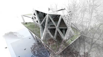
Yin Ho’s project with residential buildings on a floodplain references Asian fishing villages, where simple building strategies involve floating or raised levels with columns to adapt to the sea tide. His triangulated columns and beams, which offer such flexible support, serve as the skeleton and basis for the building.

Awot Kibrom: Landscape as City
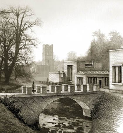
In Florian Beigel’s unit the students imagined a landscape that was both rural and urban, and Kibrom’s proposal was impressive not least because the drawing was 2m high. The project involves a delicate, thoughtful design of a group of buildings that share the qualities of 11th-century Cistercian architecture.

ROYAL COLLEGE OF ART
Amid healthy helpings of product design and fashion, the architecture at the RCA struggled to find its voice this year. Perhaps it was because only final-year work was displayed rather than the whole unit. We usually expect big issues and left-field solutions, but we often found oblique and difficult projects.
Elizabeth Cushen: Speed Nationhood
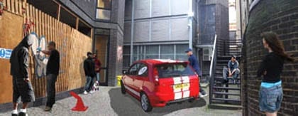
Cushen tackles the invisible structures and territories defined by gang islands in south London, who use graffiti tags and coloured bandannas to identify borders. She offers a residential scheme that can accommodate families and individuals by providing walkways and vehicular ramps.

Ian Douglas-Jones: The Third Bank
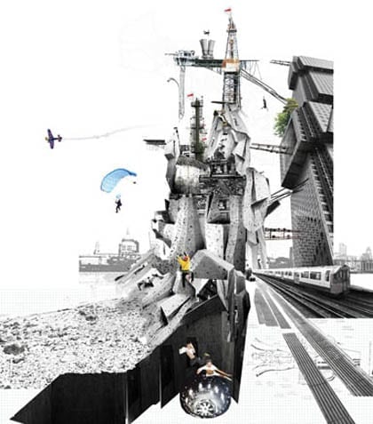
A new island in the Thames acts as an advertisement for pleasure in our cash-rich, time-poor city. A concentrated zone for users to dodge mediocrity away from existing tourist pursuits is proposed at the eastern tip of the island, with a highly calibrated building for extreme pursuits.

Joanne Cooper: Clinical Meadows
Looking at our preoccupations with hygiene and cleanliness in the city, Clinical Meadows envisions a future where we take a lunchtime stroll among an architectural choreography of friendly bacteria. It speculates about future healthcare scenarios where immune systems are boosted by bacteria and dust exposure.

Click here to comment on this article
|

