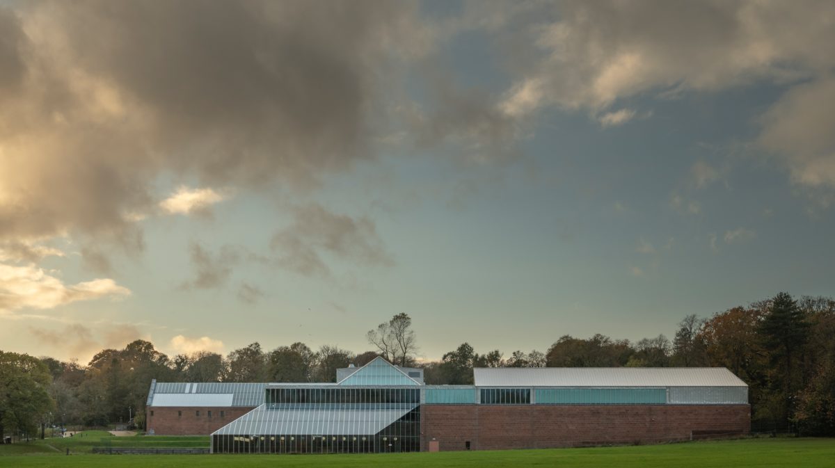
Following a five-year renovation, Glasgow’s noted Burrell Collection has reopened to the public
 Photography by Dylan Nardini
Words by Crystal Bennes
Comprising 9,000 objects accumulated by shipping magnate William Burrell, the collection was donated to the city of Glasgow in 1944. Not until 1983, however, and the opening of a new building to house it in Pollock Country Park, did Burrell’s collection find a permanent home.
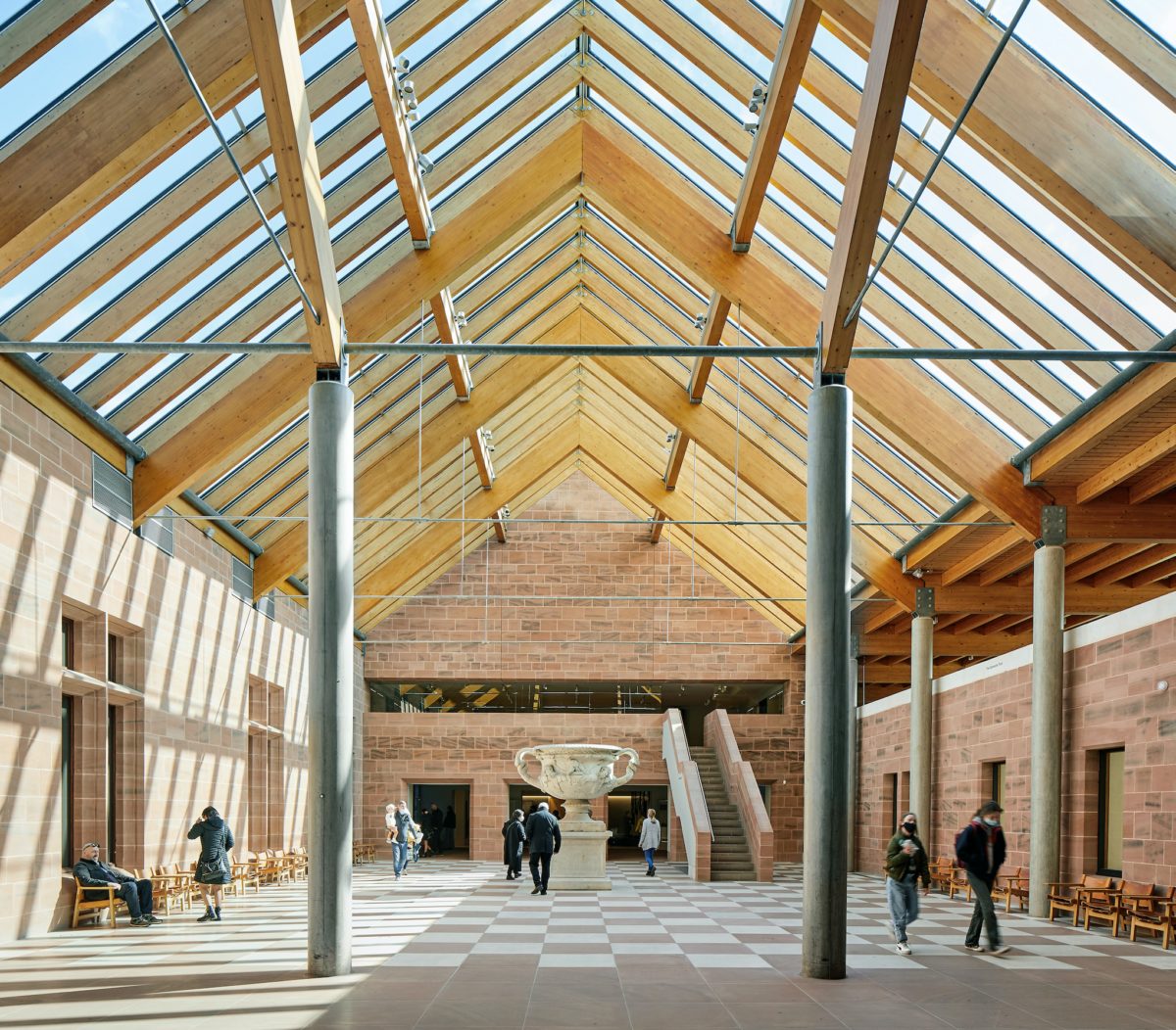
Dreamt up in 1971 by a team of Cambridge architects— Brit Andresen, Barry Gasson and John Meunier—the competition-winning design exploited the park’s natural setting with glass-walled galleries framing sculptures such as Rodin’s Eve after the Fall and a life-size Ming Dynasty ‘Meditating Luohan’ with views to the woods beyond. Spaces crafted from glass, red sandstone, concrete columns and timber beams locked together with large steel plates provide a backdrop that’s absorbing and engaging without dominating the collection’s many splendid objects.
The 2016 announcement that John McAslan + Partners had been appointed to renovate the museum was met with alarm from the architecture world in relation to the scale and nature of the proposed changes. Not least of which was John Meunier, who publicly criticised the plan to relocate the main entrance.
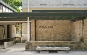
The old entrance—a 16th-century doorway from Hornby Castle set into the end of a pitched-roof wing, no other ornamentation in its sandstone facade—was felt to be ‘too ecclesiastical’ and intimidating, discouraging casual park users from visiting. The new entrance has been shifted to the right by some 50 metres and takes visitors through large glass doors straight into the centre of the building, adjacent to the shop and restaurant.
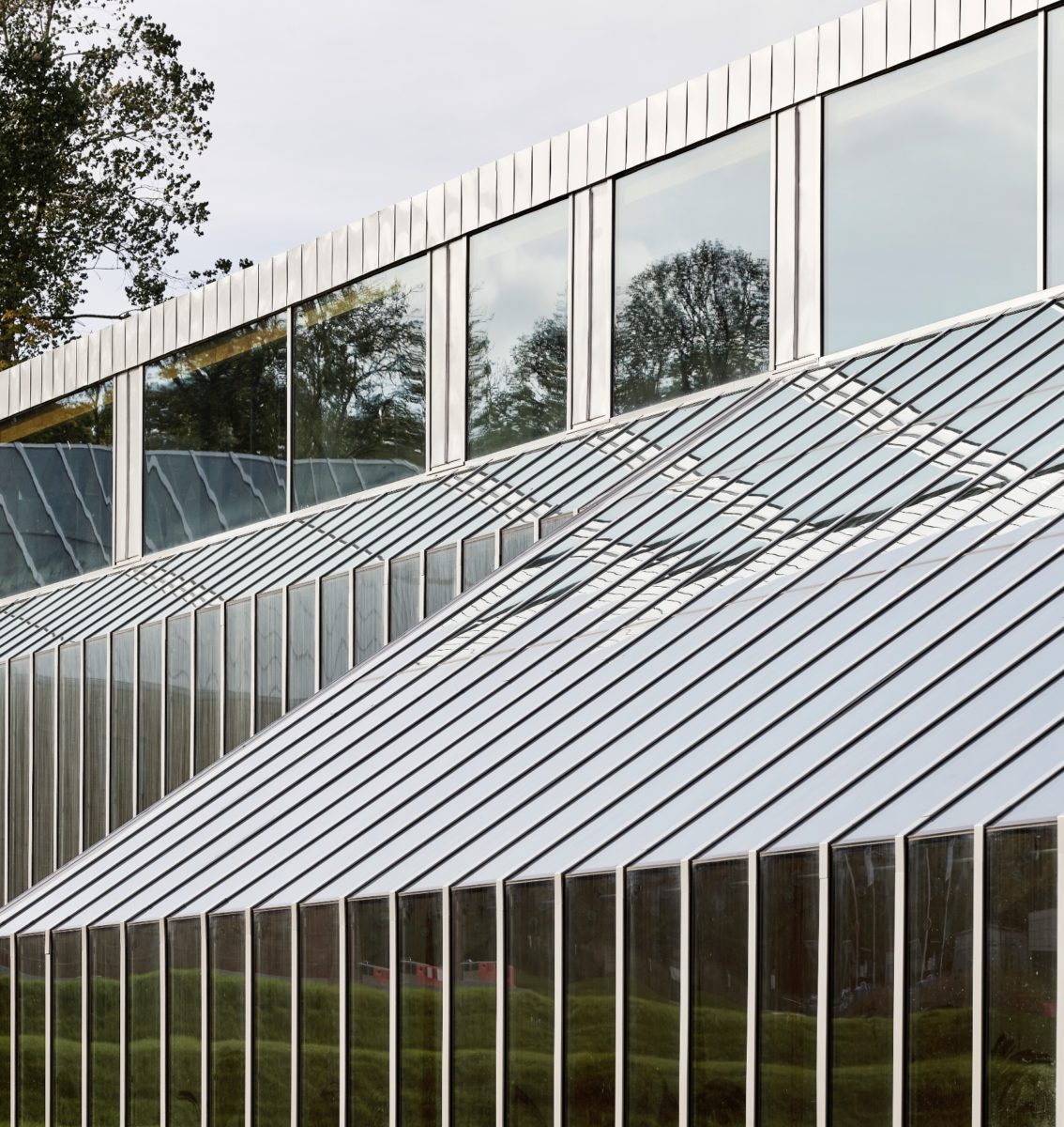 Photography courtesy of John McAslan + Partners, Hufton+Crow, Burrell Collection
Justification for the renovations, according to museum operator Glasgow Life, was driven largely by leaking roofs, improved object conservation and decreasing visitor numbers (from 1 million in its opening year to 150,000 by 2015). New glazing inserted ingeniously into the original system will provide estimated running cost and energy savings of 60%.
Further changes have expanded display space by 35% to allow more of the collection to be seen, created new basement stores—open by appointment to the public—enabling the majority of the collection to be housed on-site, and created a new central area of raked amphitheatre seating that feels like wasted space but might prove popular with tired visitors who don’t want to spend money in the cafe.
Although the changes have made an impact, the feeling of being in the building is largely the same: one of delight. The structural changes, though not ideal, are not as bad as many feared, and because the exhibition displays were listed alongside the building, there wasn’t much that could be done to manifestly change the original concept.
That said, unfortunate decisions have been made and most relate to the new digital-heavy museography. During the press visit two months before reopening, an associate from Event, the agency charged with museography, mentioned that museum visitors speed up after twenty minutes unless a change of pace is presented. Another designer from Event spoke of plans for digital wallpapers and a suite of newly-commissioned video works to contextualise the collection.
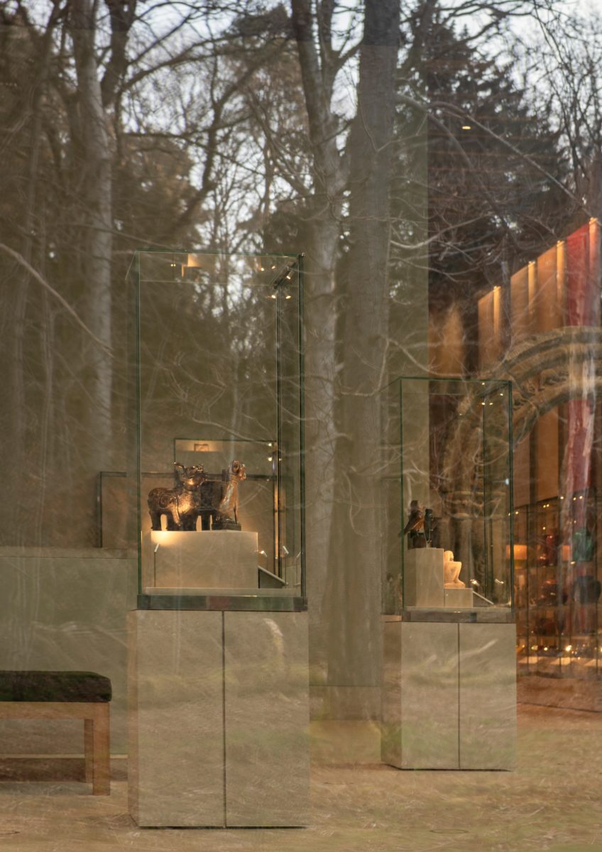 Photography by Dylan Nardini
Frankly, it’s been badly done. In a room of flower-filled still lifes, a 16th-century mille fleurs tapestry hangs above the paintings. Inexplicably, a digital projection of tumbling flowers cascades down the dark blue wall. The projection is distracting and confusing and enhances neither the paintings nor the tapestry.
And this is the least offensive of many similar projections dotted throughout. Maddeningly, display cases with dozens of objects have no explanatory text—instead small digital screens show slideshows of the encased objects with captions that genuinely say things like ‘using brushes to paint vases was an early technique developed by Chinese Potters’.
A more egregious example is the display of the museum’s famous 17th-century Wagner Persian carpet, on show for the first time in years. It’s housed in a room with two large video projections beamed on the wall—3D animations of components of the rug’s ornamental designs floating in space to a droning soundtrack peppered with bird noises and a sporadic, uninformative voiceover.
In fact, there’s almost nowhere in the north-side galleries where you can escape the noise of audio-video projections. The new scenography suggests that the museum has lost confidence in the ability of its collection, accompanied by informative or insightful interpretive texts, to inspire visitors to use their own imagination.
 Photography courtesy of John McAslan + Partners, Hufton+Crow, Burrell Collection
Seemingly terrified of the thought that visitors might only remain for twenty minutes, its solution has been to install screens everywhere—often with pointless animations or silent videos of costumed actors playing the part of Burrell himself or servants polishing silver teapots—in the desperate hope that visitors will spend more time with the collections.
If the videos addressed, for example, subjects such as connections between objects and the British empire or the Atlantic slave trade, or the fact that certain items in Burrell’s collection were acquired as a result of ‘forced sales’ during Hitler’s ascendancy (the museum has so far refused to identify the items) or thanks to the looting of the Summer Palace in Beijing in 1901, then perhaps they would have been a worthwhile contribution. As it stands, they already feel dated, not to mention distracting rather than enriching; a pointless inclusion of technology for the sake of an imagined visitor who loses interest after twenty minutes.
Overall, the renovation project seems to represent a fundamental conflict—in terms of both architecture and museography—between an ability to appreciate difference and subtlety and a very narrow understanding of visitor engagement that leans far too heavily on technology for its own sake.
The renovation of the building hasn’t been an unmitigated triumph, but it hasn’t been a disaster, either; the experience, however, is undermined by the gimmicky over-use of screens and projections when the considered relationship between the superb collections and the characterful building ought to have taken centre stage.
Get a curated collection of design and architecture news in your inbox by signing up to our ICON Weekly newsletter


