|
|
||
|
Is the exhibition’s title, Frank, an honorific celebration of the Pritzker-winning designer or a curatorial pun referencing his honest, stripped down approach, wonders Mimi Zeiger? The Frank Gehry retrospective on view at the Los Angeles County Museum of Art starts out magnificently modest. Visitors enter the Resnick Pavilion and walk through a gallery of recent contemporary artworks gifted to the museum. The architect’s name hangs in capital letters against a navy background and, for a moment, the exhibition signage resembles the work of another Los Angeles master, Ed Ruscha. That fleeting misperception leads to another: Is the title simply an honorific celebration of the 86-year-old Pritzker-winning designer, or is that Frank, frank—a curatorial pun referencing an honest, stripped down approach to architecture? Featuring sketches and models from early in Gehry’s career, the first gallery supports the second thesis. A manually drafted section on tracing paper of the 1964 Danziger Studio and Residence is illuminating in its simplicity – a jaunty dormer window juts out of one of the two boxy forms – and in its authorship. The names of Gehry and longtime collaborator Greg Walsh (think Wozniak to Jobs) appear in the title block. Rough, inartful sketches of the Davis Studio and Residence, which Gehry worked on with abstract painter Ronald Davis, show the architect wrestling to make the basics of architecture into something greater. Corrugated metal and balloon frame wood construction, warped by a two-point perspective, becomes uncanny and sculptural. And, of course, there’s a shanty-like model of Gehry’s own residence in Santa Monica, which he first split open, then Frankensteined back together in the late 1970s. Its radical use of chain link fence, corrugated metal, and exposed framing still startles. Curators Frédéric Migayrou and Aurélien Lemonier argue that Gehry’s use of industrial materials explored in the Gehry residence combined with a fragmented formal language and certain mixed-use and public programmes equates to a kind of urbanism. The concept, which probably closer to assemblage or vernacular contextualism than any comparison to urban planning, holds in some of the subsequent galleries: the village-like Edgemar Development in Santa Monica, the fanciful Fred and Ginger in Prague, or the Guggenheim Museum Bilbao, but it soon wears thin. 66 models are on view in the galleries, each on a freestanding base with limited urban fabric represented. As the calibre of Gehry’s office grew, so did the level of model craftsmanship. Progression through the exhibition becomes more about admiring the proficient assembly of difficult objects rather than understanding a signature design process. Very few study models are on display and there is little representation of the firm’s pioneering use of digital building technologies. You would think that the final gallery would cap the career an architect at the apex of his facilities. It doesn’t. The room is packed with large models of recent projects – Facebook’s headquarters, a new mixed-used development on the Sunset Strip – works that adequately continue a now-familiar approach at an ever-larger scale. Hanging on the wall above the models is a wide-angle photograph of the Gehry Partners office. Models, workstations, and staff seem to recede into an infinite distance. It’s an image designed to draw back the curtain on the act of architectural production, but frankly, it’s about the production of Frank. |
Words Mimi Zeiger
Frank Gehry at Lacma
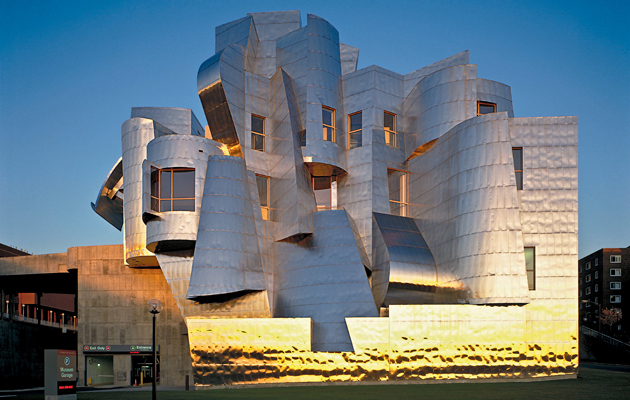
Above: Weisman Art and Teaching Museum |
|
|
||

