|
|
||
|
Despite its gold cladding, the Rem Koolhaas’s latest building in Milan is no temple of ostentatious wealth, says Andrew Ayers. With its galleries housed around a converted distillery, it marks a deliberate shift for OMA away from huge statement buildings towards the preservation of existing spaces and “collisions” between old and new In his seminal 1995 doorstopper S,M,L,XL, Rem Koolhaas discussed the concept of “Bigness”, which he claimed was “ultimate architecture”: a state whereby “such buildings enter an amoral domain, beyond good or bad”, a state whose “subtext is fuck context”. And, judging by OMA’s output since that point, the cynicism of Bigness is where it’s at, in gigantic projects such as the CCTV building in Beijing (2002–12), the Shenzhen Stock Exchange (2006–13) or, in their own backyard, the multi-use De Rotterdam towers (1997–2013). But Koolhaas has long enjoyed confounding expectations, so perhaps we shouldn’t be too surprised to find that OMA’s latest project is a small-scale job of context-specific conservation that is all about the beauty of the details: the transformation of an early 20th-century distillery in Milan into a private art museum for the collections of Miuccia Prada, creative director of the eponymous fashion brand, and the firm’s CEO, her husband Patrizio Bertelli. Asked about this shift in scale by Der Spiegel, Koolhaas replied, “In our architectural firm, we felt increasingly uncomfortable with the obligation to constantly surpass ourselves [in producing huge statement buildings]. Then we embraced the theme of preservation. It requires intelligence, precision and creativity – and there’s no expectation that we’ll be making a huge splash.” |
Words Andrew Ayers
Images: Attilio Maranzano; Delfino Sisto Legnani |
|
|
||
|
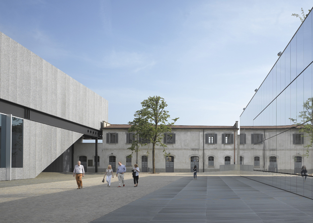
New buildings include an aluminium-foam-clad gallery block (left) and a mirror-clad cinema (right) |
||
|
It is, he says, a generational shift, his age group having “identified with the ideals of the French Revolution, namely liberty, equality and fraternity”, and therefore having been “very interested in new things”, while today’s “generation is more concerned with comfort, security and sustainability. It’s in keeping with this lifestyle that people want to live in buildings with a history.” Consequently, there’s more preservation work from OMA in the pipeline: this June saw the opening of the Garage Museum of Contemporary Art in Gorky Park, which involved the “regeneration of a Soviet-era pavilion” in Moscow for collector Dasha Zhukova, while next year the firm is set to complete the Fondation d’Entreprise Galeries Lafayette, the conversion of a 19th-century Parisian warehouse into yet more gallery space for yet another cultural foundation. “Conversions are more about concepts than effects,” Koolhaas told Der Spiegel, and he was even more specific about who exactly he was targeting with a remark at the Prada opening: “I think that architecture in the past 20 years has been focused way too much on the individual expression of individual architects, and for us, working with this kind of found object … was not only a deep pleasure but also allowed us to explore and to discover things that otherwise we would not have discovered.” |
||
|
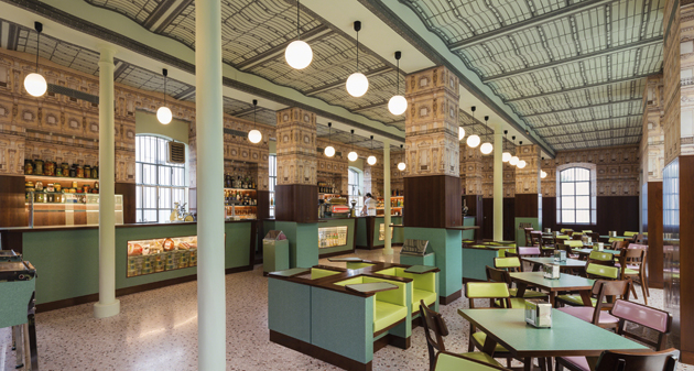
The site also includes a bar designed by film director Wes Anderson |
||
|
So much for Frank Gehry’s recent Fondation Louis Vuitton in Paris, criticised by many for its self-indulgence and flashiness. Indeed the Fondazione Prada is diametrically opposed to Bernard Arnault’s temple of bling, but then that’s hardly surprising given the very different personalities behind the two projects. Where Arnault, France’s richest man, is an aggressive self-made business tycoon heading a giant multi-brand empire, Miuccia Prada, while not exactly poor, is a former communist and patrician heiress of a luxury-goods house that she has developed along intellectual and quirky lines. As is usually the case with these private foundations, costs have not been divulged, but French daily Les Echos claims to have heard talk of €3,000 per square metre for the Fondazione Prada, which at 19,000sq m gives a total of €57 million – hugely less than the estimates (between €100 million and €500 million) given for the 11,700sq m of the Fondation Vuitton. OMA and Prada go back a long way, Koolhaas and co having been quasi-official architects to the catwalk queen for 15 years now. Among the many things that OMA and its research arm AMO have designed for the brand are retail spaces, runway shows, exhibitions, the Prada Transformer temporary pavilion, videos, lookbooks, furnishings, in-store technology and a website. The collaboration is a unique branding exchange between corporate entities that has obvious benefits for both. But while Prada and Bertelli have now asked OMA to work for their private foundation, they’ve been very careful never to mix the art and the fashion, keeping the Fondazione’s activities entirely separate from the frocks. Of course the allure of high culture rubs off on the clothes, but the connection is never emphasised.
New elements collide with the existing fabric in a series of “deliberate accidents” Indeed, in many respects the Fondazione Prada is part of an old tradition of patrician collecting, like the Pinacoteca Giovanni e Marella Agnelli, founded by the Fiat chairman, or the Collezione Maramotti, put together by the head of Max Mara, to name just two Italian examples. Where the Fondazione Prada differs, in the Italian context at least, is in its scale and ambition. Not only does the collection number over 1,000 artworks, its mission includes the commissioning of new, large-scale pieces, as well as an ambitious exhibition programme on two sites – the 18th-century Ca’ Corner della Regina in Venice and the new premises in Milan. Indeed for the Financial Times’s Jackie Wullschlager, the Fondazione Prada has now become Italy’s principal contemporary art institution, ahead of public museums such as Rome’s MAXXI and MACRO. The Fondazione’s new Milan premises are located literally on the wrong side of the tracks (the railway lines in question are currently abandoned and overgrown, “almost by accident a park” in Koolhaas’s words) in a dreary semi-industrial district just beyond the Porta Romana (how different from the haut bourgeois setting of the Fondation Vuitton). Begun in 1916, the distillery buildings expanded over the years to become a small walled citadel in a low-key vernacular of rendered masonry, concrete and pantile.
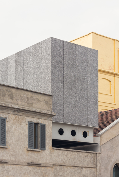
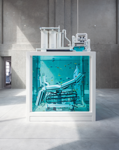
Lost Love by Damien Hirst, exhibited in the Cisterna space As OMA partner Ippolito Pestellini Laparelli describes it, the complex was “almost a microcosm of the city, with different types of spaces and connections between them.” What OMA did was to look at those spaces and add what they felt was missing, leaving the perimeter intact as it was protected by local development regulations. In fact, most of the existing buildings have been preserved, bar one large central structure (in bad condition and not very interesting, says OMA) that made way for an entirely new, two-storey gallery block (goldfish bowl downstairs, closed gallery cantilevered above), and a rear hangar that was partially demolished to allow for a white-concrete tower (due for completion in 2016) that marks one corner of the site. The result, according to Laparelli, is “a narrative of collisions”, where new and old crash into each other in a series of “deliberate accidents”, yet in such a way that you have to look twice to work out what’s original and what isn’t. For instance, while much of the complex was in pretty good shape and required only structural consolidation, the block now housing the cinema had to be entirely rebuilt, but was given the same volume and finish as the original. For the architects, the conversion thus constitutes a “catalogue” (how very OMA) of preservation strategies, from minimal intervention to total facsimile. |
||
|
Aluminium-foam-clad galleries are an act of resistance to the generic white cube |
||
|
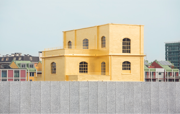
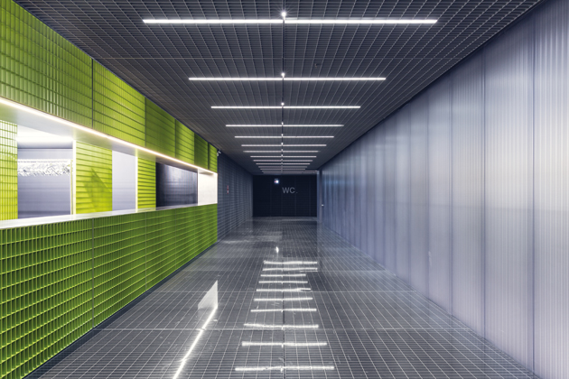
At the press conference, Koolhaas vaunted OMA’s lack of house style – and what, indeed, would tell you that the CCTV, De Rotterdam and the Fondazione Prada are by the same hand? But, going round the art museum, it does start to seem that there is something approaching a Prada vocabulary of materials that OMA has developed for its most longstanding client. The highly soigné finishes are also a response to Milan, city of surfaces, where severe buildings are dressed up in beautifully detailed and sophisticated cladding. Aluminium foam features heavily at the Fondazione, both inside and out, its appearance on gallery walls an act of resistance on the architects’ part to the generic white cube – and recalls the special foams that OMA developed for Prada’s retail spaces. Similarly, the hardnosed metal grating that’s framed several runway shows now covers the largest courtyard and one of the lavatories. There’s also a leitmotif of upright I-beams bracing the walls – a requirement of Italy’s seismic legislation – which have been colour-coded according to location. Clunky wooden setts, sparkling polycarbonate and august black travertine put in appearances too, but the most remarked-on material is the 3kg of gold leaf that covers the exterior of what has been christened the Haunted House – a structure of small, intimate spaces accessed by an old lift and staircase. According to Koolhaas, “We used the gold – and actually it was kind of a last-minute inspiration – to find a way to give value to a small and seemingly not very important element. And with that we tried … to show our respect and enthusiasm for the seemingly mundane and simple, but we also discovered that gold is a very cheap cladding material in comparison to … marble and even paint. But what is for me the most exciting and visible effect is how the reflected light of the gold contaminates almost the entire environment.”
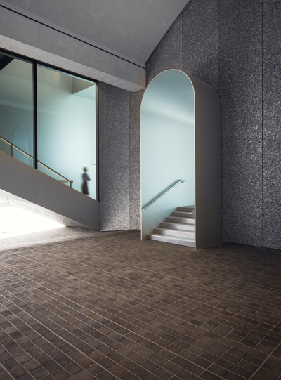
Wooden setts contrast with the artificiality of the aluminium foam The gold is also an example of OMA’s rather dry sense of humour, an ironic comment on luxury and surfaces, and one of many knowing quirks, including the ceremonial stair half obstructed by a pillar, the beam of the gallery block that almost crashes into the north wing, and numerous other “deliberate accidents”. Presumably it’s Signora Prada’s humour that finds expression in the Bar Luce, a beautifully kitsch take on Milanese cafes of the 1950s realised by film director Wes Anderson. Prada and her husband are also represented metaphorically, she by the intimate, golden Haunted House (no surprise, then, to find garment-heavy Louise Bourgeois pieces featuring prominently there) and Bertelli by the white phallic tower. “One is brutal, and one is soft and intimate, one is like the power, the other is maybe the intelligence,” Laparelli explains. This unfinished tower is also part of a strategy to connect with the city outside the citadel – each of its floors will be 1m taller than the one below, culminating in an 8.5m-high top space whose picture window should allow large-scale works to be visible from afar (“somehow art feels different on the ground than it feels on the tenth floor,” as Koolhaas laconically puts it). It will be accessed directly from the other unfinished space, the giant hangar that is set to contain the open reserves. Outdoors is as important as indoors at the Fondazione, and its streets and courtyards, imbued with a pregnant silence straight out of De Chirico, form part of a haphazard promenade architecturale in which, rather than being guided round sequentially, you happen on spaces as if by accident (and it’s easy to miss some). Perception of space can be altered by opening the folding walls of the cinema block to allow the gaze to travel from the cafe (at the front of the complex) through the goldfish bowl, the cinema and the Cisterna (former grain silos converted into cavernous gallery space) all the way to the rear. This is yet another example of the richness and subtlety of a project that, as Koolhaas sums it up, “was a direct outcome of the dialogue” with the Fondazione’s staff in general, and Miuccia Prada in particular. It goes to show that it’s not enough to hire a famous architect and throw in wads of cash: the best buildings also require the close involvement of an exceptional client. |
||
|
The basement cloakroom sets off hard-nosed grating against “luxury” polycarbonate that was specially made in Italy |
||

