|
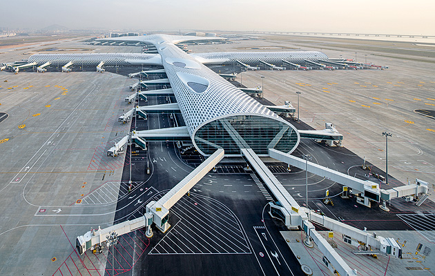
The plan of the main Shenzhen Bao’an airport terminal is cruciform |
||
|
There is a bit of a kerfuffle in the departure hall at the official opening of Shenzhen Bao’an airport. A sizable crowd have gathered on the concourse and are jostling for position, smartphones and cameras primed. This posse of amateur paparazzi is not clamouring for a snap of a pop idol or a film star, but a 69-year-old Italian architect. “I was on TV last night,” says Massimiliano Fuksas over the commotion, clearly enjoying the attention. “This seems to be what happens.” The evening before, Massimiliano and his wife and business partner Doriana presented a lecture to over 1,000 architects and students in Shenzhen. Western architects, it seems, are superstars in China – demand for their work in burgeoning cities with the desire to be seen as “international” is high. Shenzhen, the massive, shabby, nouveau-riche neighbour of Hong Kong, has called upon Steven Holl, Terry Farrell, OMA and now Studio Fuksas to provide buildings in its quest to become a global centre of trade and finance. China is the world’s largest holder of US debt and already a financial superpower; Shenzhen is one of a handful of cities working hard to amass the population and critical infrastructure to be a key location in its dominance. Studio Fuksas should be enjoying its moment centre stage. It has just completed its first airport terminal, and it is monumental in scale. The building cost more than three-quarters of a billion dollars and has a floor space of over 500,000sq m, measuring 1.5km end to end. Inside there are 200 check-in counters, 62 boarding gates and 200 shops.
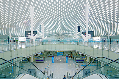
The undulating canopy of the departure concourse This is just the first phase – there are two planned expansions due to complete in 2025 and 2035. In 2007 Fuksas was shortlisted for the design competition, along with Foster and Partners, Foreign Office Architects, GMP International, Kisho Kurokawa, and Reiser and Unemoto. It’s an impressive list from which to emerge victorious. This is about establishing a different identity – there are problems between Hong Kong and Shenzhen,” he says with a mischievous smile. “My friend Foster does Hong Kong and Beijing, but Shenzhen wants something different. I think I won the competition because my design was best – not because I am not Foster.” He pauses. “Well, that’s what I like to think.” Airports are a prestige project for architects – Idlewild, Tempelhof, Stansted, Barajas et al encapsulate the modernist obsessions with speed and flight, celebrating the capability of man and machine. Fuksas, quite bizarrely, has said the appearance of the Bao’an terminal was inspired by a manta ray. “A manta ray morphs into a bird while rising from the depth of the sea and soars through the sky,” states the press release. Arguably, this is evident from above, where the shape of the terminal can best be appreciated. But the aquatic analogy makes no sense, and to describe the building in pseudo-zoomorphic terms does it a disservice.
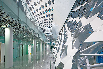
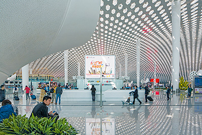
The Hexagon motif runs through the whole building The aerial view does reveal the building plan, with the intersecting spines clearly readable as the departure gates and the bulbous front section as the entrance and exit. The long body of the building contains the departure hall, an epic space that provides drama beyond any of its feted predecessors. Where the concrete shell of Dulles in Washington DC (the first terminal designed for the Supported by conical steel columns, a hexagonal mesh of white steel contorts and concertinas in an audacious design that covers every inch of the terminal. The porosity of the double-skin structure makes it appear lightweight, sitting delicately over the columns and perching on the raked glazing at the building’s extremities. But it plays an important functional role, not only hiding the space frame structure that supports the building, but also working as a thermal barrier, trapping a layer of warm air, to make the terminal easier to heat and cool. “Originally the inner skin was glass, but it was too much,” Fuksas says. From the departure hall, the procession through to the controlled areas of the airport is indicated by the contortions of the roof.
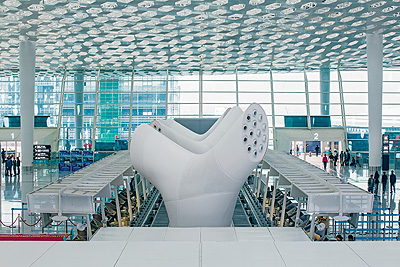
The roof dips beyond the security check to the gates It dips, almost like a vortex, with the hexagonal pattern tightening and closing – seemingly drawing light, air and people into the spine of the building through to the gates and skies beyond. Beyond security, travelators whisk you through the honeycomb shell as it bulges and shifts around you – it seems as if there are no identical sections anywhere in the building. Studio Fuksas has designed almost every part of this building. A project this large is hard to conceive of as a Gesamtkunstwerk, but Fuksas is adamant: “This is the new China, you used to deliver some pictures and they would interpret them. But we were involved here in every decision – from the design of the toilets and check-in desks to the ventilation trees.” The ventilation trees are sculptural pieces They appear like oversized versions of Eero Aarnio’s puppies for Magis, but beyond their practical purpose they are essential in providing a human scale to the giant shell of the building and, again, work as a subtle wayfinding system, having been placed in a linear arrangement that encourages movement through the vast space.
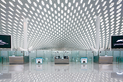
The ventilation trees designed by Studio Fuksas The hand of Fuksas is also seen in the internet terminals, security desks and passport controls, which fracture the hexagon motif in gleaming stainless steel. “It’s better to do a big project,” Fuksas says. “You don’t need a lot of details. There is one retail design – a double-height space. Never do architectural details, but details for necessity. Buildings don’t need details – they need solutions.” Doriana interjects, “Our approach never differs. We do mock-ups and approve them – here they agreed to everything.” The complexity of the roof design belies the simplicity of the building’s organisation. The lower floors are given over to services and the unseen process that ensures that bags and people arrive in the right place at the right time; the upper floor is the departure concourse that funnels passengers from the cavernous departure hall through to the gates and beyond. Sandwiched between the services and the departure concourse is the arrivals floor. It is from the arrivals gate that you get a real sense of the length of this building, and here the relentless presence of the hexagonal motif laser-etched and cut into the walls and ceilings becomes somewhat overbearing and monotonous. This is partly because its effect is amplified by the absence of colour and texture. Indeed, it is startling that the architecture is so devoid of colour: a grey polished floor, the white columns and walls, the stainless steel desks. The aesthetic is evocative of a Kubrick film set.
The roof canopy sits on 25m-high columns “Colours don’t work,” Fuksas says. “We do minimalist scenography. The building is a screen and the people are the scenographers.” Doriana adds: “This is China. This is not Europe where everyone “We began looking at the movement patterns – this is where we have to begin on a project like this,” he says. He cites the diagram of Foster’s Stansted airport, referring to the simplicity of the movement from the drop-off bays, to check-in and on to the gate. “I think it was his best work,” he adds. For an architect who insists that he doesn’t have a style (the back cover of his recent monograph states: “I don’t want one. I have fought against it my whole life”), the building really feels like a culmination of Studio Fuksas’s portfolio to date.
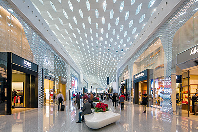
Duty-free designer stores line the route to the gates From the complex geometries in the structures of the New Milan Trade Fair (2005) and the MyZeil shopping centre in Frankfurt (2009), to the monumental presence of Zenith concert hall in Amiens (2008) and the uncompromising space age aesthetic of the Nardini research centre in Vicenza (2004), Bao’an bears traces of many of the practice’s finest works. I ask Fuksas what he thinks his modern airport represents, and his thoughts about Le Corbusier’s statement that “the airplane indicates the city … the airplane instills, above all a new conscience, a modern conscience.” He looks bemused. “No, no, planes, cars, it’s nostalgic. I was born in 1944 – all my life I was never excited for that kind of modernism. What first got me excited was [Yuri] Gagarin and television. Now it is a different age, another world. It is fantastic. I cannot be a modernist, I am a critic,” he says determinedly. “The modernists pray for Corb, for Mies – for what?” This ostentatious terminal will, like its illustrious predecessors, age quickly and be superceded by something even more spectacular. Yet it provides a precedent for the next pieces of global infrastructure. This is a digital reality, with architectural computational proficiency creating a visually complex yet visceral sequence of spaces. It both astonishes and works. Bao’an is a gateway to an aspirational city and country, a symbol of its ability to deliver what it desires, provided by an architect who believes he has looked beyond the jet age and a misplaced nostalgia for the tired ideals of modernism.
|
Words Owen Pritchard |
|
|
||

