|
|
||
|
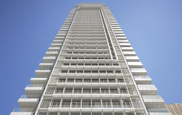
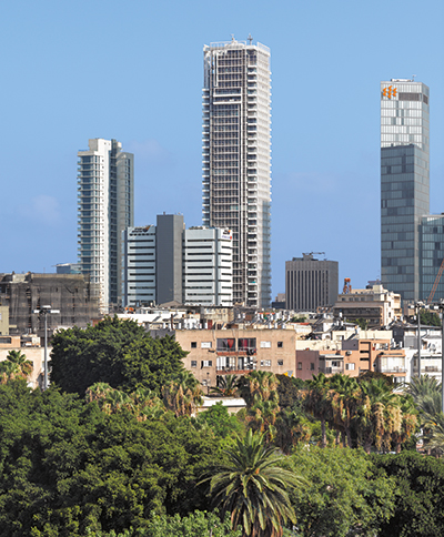
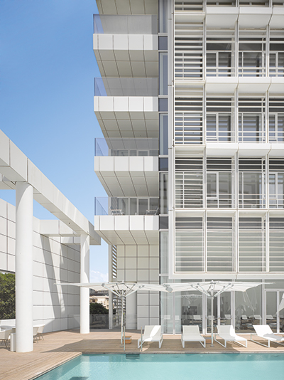
In Tel Aviv, Richard Meier has found the perfect setting for his monochrome modernism In the heart of the White City – Tel Aviv’s modernist centre, designed by émigré architects from the 1930s on – rises Richard Meier’s latest project, titled, with scrupulous honesty, Meier on Rothschild. Sprawling over a corner between the wealthy Rothschild Boulevard and busy Allenby Street, the structure consists of two all-white volumes in an L-shaped plan. In front, a 42-storey residential tower faces the green pedestrian boulevard; behind it, a two-storey volume extends the depth of the block. The project is a first for Richard Meier & Partners in the Middle East, and has been ten years in design and construction. The tower contains 147 luxury apartments, while the horizontal space to the rear is semi-public, with a food market on the ground level, which replaces a once popular but now outdated shopping arcade. The floor above is dedicated to leisure amenities for residents, including a large outdoor sun deck with two pools, one of which is half-Olympic sized, the other shaded for children. The open deck also acts as a transitional open space, leading into the tower’s lobby, which contains spacious business and leisure lounges, and then to an indoor gym and spa beyond.
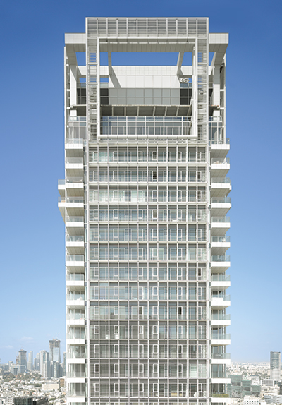
The tower rises 42 storeys above the modernist White City neighbourhood The tower is tight to the street corner; its glazed curtain wall is offset behind columns, and curves to wrap around the ground floor, exposing the grand double-height lobby. A geometric screen of louvres, which stretches across the bulk of the four facades, stops just above, but drops down like the hem of a garment, overlapping with the top band of the lobby’s glazing. Otherwise, the monolithic glass tower is clothed in this pixelated screen of white louvres, inspired by the loose, enveloping clothing once customary in this hot desert climate. The external screen blocks direct sunlight, so the glass body of the tower stays cool while its interiors are flooded by natural light. This screen is the most important sustainable element of the project, although water-saving features and a smart-home system to control energy use have also been incorporated. Reaching the tower’s peak, with its penthouse apartments, there is a substantial opening in the screen to provide the long terraces with expansive, unimpeded views to the sea. Such balconies are a well-established ingredient of luxury living in Tel Aviv, and this careful intervention in the tower’s facade is an intelligent, and potentially lucrative, response to the realities of the real-estate market. In addition, the geometry of this ‘urban window’, and its cut-away to the glass skin behind, relate to the forms of Meier’s early domestic projects, providing a sense of scale in the infinite grid of the tower. Reynolds Logan, associate partner at Richard Meier & Partners, explains: ‘The modularity gives the building enough delicacy so that it doesn’t overwhelm the neighbourhood. In the end, our design was inspired by scale: this is a big building, and we made it our primary goal to keep this bulk down somehow. This inspired our goals of lightness and transparency, which reveal the true scale of the people and spaces inside.’
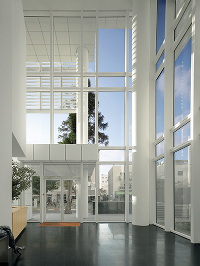
At the tower’s peak, a large ‘urban window’ is cut into the facade The screen follows a strict 360cm x 360cm grid, reflecting the interior layouts of the apartments behind. This is also the basic unit for each room, which gives the plan significant flexibility – for example, it can be doubled to provide a good-sized living room or master bedroom. The floor-to-floor height is also 360cm, thus creating a perfect three-dimensional cube, with each of these modules containing one accessible, opening window. A typical residential floor stretches over 750sq m – much of this is taken up by core and services, but with sufficient space for a single room unit on all sides, and for the circulation routes and services circumscribing the core. This relatively shallow usable space between the core and the glass casing ensures that all the rooms abut the facade, leaving almost no windowless interior spaces. The interior architecture of Meier on Rothschild is designed to provide a consistent geometry at a smaller scale, resonating with the architect’s past projects, such as the Douglas House (1973) above Lake Michigan. The play of hidden and revealed external views invites the eye to wander, while the luminous nature of the interiors gives a feeling of being outdoors. Similar effects are achieved by the positioning of a white balcony – a familiar Meier trope – overlooking the main lobby, enhancing the sense of space, and also by the use of natural materials throughout the interiors. Black marble floors and wooden panelling contrast with the stark white facades, but also complement them, providing rooms that are at once calm and warm.
The two-storey building is topped with a sun deck and two pools White has been a dominant feature in Meier’s work for half a century. Paired with glass, it has become virtually synonymous with the Pritzker-prize winner. But, in this instance, Logan feels its use is particularly appropriate: ‘The colour white has so much more meaning in this context – the White City is already white, so the building is integrated automatically into the fabric and texture of its surroundings. It made everything so much more interesting, because there is already a calm setting for the building to be white in. Now, as there are no distractions, one can really focus on the elements of the building, the space and the light.’ Usually, given this strong colour and Meier’s geometrical designs, his buildings stand in contrast to their settings, whether such early projects as the Smith House, in its lush green landscape, or later works, such as the Barcelona Museum of Contemporary Art (1995), in the midst of an eclectic historic neighbourhood. In Tel Aviv, Meier does not have this tension with the context – instead, his all-white, louvre-covered tower, along with its horizontal extension, exists in a harmonious dialogue, both visual and cultural, with the environment.
Black marble floors in the double-height lobby contrast with the white exterior In 2003, the White City was declared a UNESCO world heritage site for its outstanding ensemble of modernist architecture. Meier’s work relates to this cultural context, yet, as the highest residential tower in a still-rising city, succeeds in transforming its surroundings in a dramatic way. ‘We were inspired a good deal by the city,’ says Logan. ‘The Bauhaus buildings from the 1930s and 40s have a certain economy and simplicity to them so, for us, to be working in this neighbourhood is like being with family, having a conversation with Le Corbusier and Mendelsohn, working in sympathy to things that are already here.’ It is safe to say that Meier’s white tower in the White City is rather more than just one more poetic gesture added to his five-decade body of work. Rather, the project has allowed the firm to formulate an entirely new expression, exploring the potential of the all-white structure when integrated within white surroundings. Interestingly enough, soon after completing Meier on Rothschild, the architect unveiled his designs for an all-black residential tower in his firm’s hometown, Manhattan. The contrast between the two projects promises to be intriguing. |
Words Hila Shemer
Photography Roland Halbe |
|
|
||

