|
|
||
|
The 1986 Big Bang led to an explosion of postmodernism in the City of London. Now these buildings are tumbling down, John Jervis asks: should we care? This article was intended to be pro-PoMo, defending its ageing icons from demolition. Largely an architecture of finance, postmodernism’s pedimented offices have now lost their glamour for tenants, making redevelopment commercially attractive. And, not coincidentally, architectural fashionistas are belatedly adopting the period, tired of brutalism’s ubiquity, and of the self-congratulatory tone of its supporters. But then I made the mistake of walking around the City of London. Over half of the Square Mile’s office space was rebuilt in the wake of the Big Bang in 1986, most of it in postmodernist garb: this is the movement’s Acropolis. Yet, despite the style’s supposed populism, the resulting buildings are mediocre and the environments they create miserable. Definitions of postmodernism are messy. As early as 1975, the movement’s self-appointed guardian Charles Jencks tied himself in knots when identifying six broad schools united by their ‘double-coding’. In practice, the term is usually applied to a subset of architects who engaged in visual historicism, few of whom proved willing to accept the label. In corporate Britain, postmodernism’s vaunted complexity and contradiction were pretty much absent – its aesthetic was derived from the drawing boards of American colleges, with a touch of Italian rigour thrown in. The City facades of the era are eclectic exercises in pattern-making, embracing the blocky neoclassical porticos, rusticated granite and belvedere towers of the Renaissance palazzo; art deco spikes, clocks or coloured banding; an Egyptian column or Mesoamerican detail; even occasional high-tech borrowings – a glazed rotunda or atrium – all combined with strips or gridded squares of dark glazing. And, more often than not, a superfluous balcony or shallow bay window thrown in to provide the semblance of depth. Postmodernism, in this guise, was not a critique of modernism’s abstractions, nor an expression of a humane urbanism. These buildings rarely possess irony when adopting the vernacular, despite chiming with the concerns of a conservationist era. Instead, they are the faint echo of an intellectual proposition over a decade old, repurposed to answer an upsurge in demand for office space. In 1989–90 alone, there was more development in the City than in the entire previous decade, and more American banks than in Manhattan itself. Incorporating signifiers of contemporary capitalism was imperative for these new clients. |
Words John Jervis |
|
|
||
|
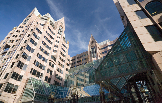
Minster Court, Mincing Lane, by GMW Partnership (1988–91) |
||
|
This isn’t to condemn postmodernist architects as fellow travellers of capitalism, thriving on the warm corpse of the Gaitskellite consensus. They were working at the highpoint of Thatcherism and, like their predecessors, took the jobs on offer – in short, office projects rather than public housing. And to label the style itself as reactionary is risible – high modernism proved grossly effective at expressing financial power in the 1960s; an unthreatening Fosterian style has done the job extremely well since. Venerable modernist practices like GMW, Fitzroy Robinson and YRM were merely keeping themselves afloat as fashions changed. Sadly, what they produced was not very good. New rules concerning sightlines, street patterns and conservation areas, and the final rejection of Peter Palumbo’s Mansion House Square scheme in 1985, confirmed that the era of skyscrapers was over. Deregulation – and the consequent merger of banks and brokerage houses – led to increased demand for substantial footprints and large, uninterrupted dealing floors with double-height ceilings on the American model. Plot ratios were tweaked, and a new breed of groundscraper emerged to maximise available space. Floor-to-ceiling heights increased for the cables and climates of the computing age, with semi-accessible ducting underfoot to accommodate open-plan layouts. There was a genuine belief that these groundscrapers could act as extensions of the computer – and provide statements about a company’s prestige – in a way that the skyscraper could not.
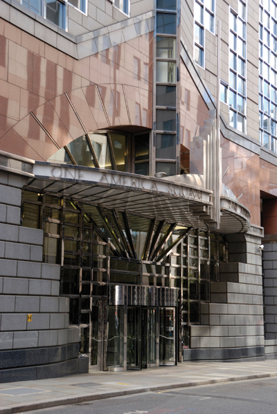
Alban Gate, 125 London Wall, by Terry Farrell & Partners (1988–92), with low-rise housing in the foreground The result was bulk and homogeneity: sheer, unarticulated facades built using shell-and-core construction, butting up against the edges of sites, towering over narrow pavements, with few retail or restaurant spaces. Some gestures still raise a smile: a triple test-tube of external lifts at 55 Mansell Street by Trehearne & Norman, Preston & Partners; a triumphal arch at 60 London Wall by Fitzroy Robinson; the cocktail-bar art deco of One America Square by the otherwise abject RHWL, renowned for its monstrous portico at nearby Beaufort House. But such devices fail to redeem the monolithic postmodern aesthetic. At lower levels, speckled kitchen-counter granite predominates, often in a distasteful dark puce, or porn-star black, or ‘sophisticated’ fawn. The resulting opacity is compounded by wide, flimsy window frames holding reflective glazing, often finished cheaply once recession bit in the late 1980s. Current breast-beating about privatisation of space pales in comparison to past abuse of public areas and rights of way, furthered by the use of dingy granite in place of today’s plate glass. And the chutzpah with which service doors and ducts were slammed into the public domain remains astonishing, despite their desultory Renaissance coverings.
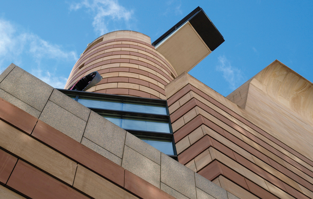
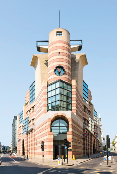
No 1 Poultry, Mansion House, by James Stirling, Michael Wilford & Partners (1994–97) Today, postmodernist offices are being redeveloped or reclad as their 25-year leases come up for renewal. Owners are pursuing better returns, or fretting that the existing structure may be listed under the 30 Year Rule. Smart technology is cited to explain such demolitions, or internal flexibility, or natural light, or cross-ventilation, or raised cores, or bike storage, or interplay with the public realm at ground level, or even the advent of the sky garden. Yet most 1980s offices have good fundamentals: in this fashion-driven market, it is their aesthetic that is the key problem. The postmodern groundscraper lacked personality inside and generosity outside – and, most importantly, its appearance is now anathema to global companies. The need to maintain the City’s appeal to such firms is paramount, so these 1980s buildings are disappearing with astonishing rapidity: they are easy, unprotected, low-rise pickings amid a messy urban fabric. Fitzroy Robinson’s 80 Bishopsgate and 82 Fenchurch Street, Whinney Mackay- Lewis’s 30 Moorgate, GMW’s Winterthur House, 87 Moorgate by Chapman Taylor, Elsworth Sykes’s 60 St Mary Axe and EPR’s |
||
|
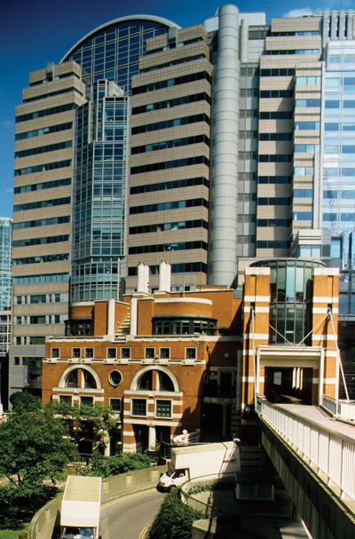
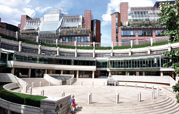
Broadgate Circus, with Peter Foggo’s 4 and 6 Broadgate (1985–87, now demolished) |
||
|
More worryingly, Terry Farrell’s 36 Queen Street, credited as introducing the Viennese Secession to London, has a bland new facade, while his likeable 76 Fenchurch Street has had its entrances ripped out. But it would be hard to pretend that even these are substantial works on a par with Mario Botta’s Union Bank in Basel or Ricardo Bofill’s Banque Paribas in Paris, and certainly not with Richard Rogers’s Lloyd’s Building around the corner. Farrell’s sole mega-project in the City, Alban Gate, was an earnest if compromised effort to repair previous generations of urban planning, yet its two towers are ponderous exercises in oppressive vaulting and pedestrian disorientation. As at Vauxhall Cross and Embankment Place, the contrast between the original sparkling perspectives and the cumbrous reality is telling. The latter two at least have the benefit of iconic profiles. Here, the low-rise housing alongside is the one saving grace.
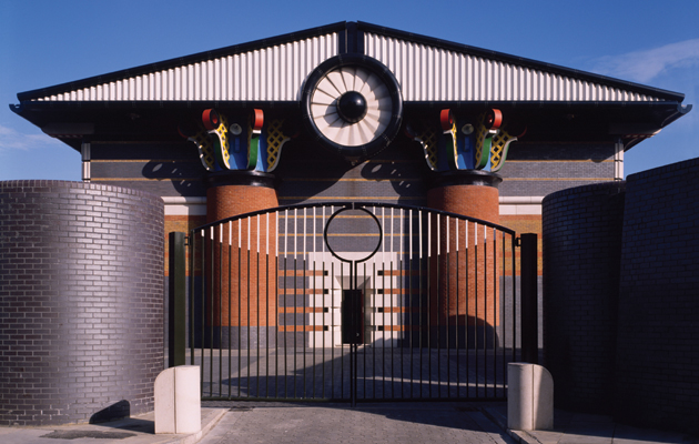
Entrance to One America Square, 17 Crosswall, by RHWL Architects (1987–90) So what is worth preserving? The sad truth is that postmodernism has left the City with little of value. It was a failure of patronage and of government: it is shameful that DIY stores, private and public housing, TV studios and even pumping stations achieved more in these straitened times. Occasional gems emerged, such as John Burnet, Tait & Partner’s 2 America Square (described by Pevsner as ‘a shockingly tawdry exercise in postmodern pattern-making’), and of course Stirling’s belated No 1 Poultry, with its complex geometry, fine forms and rich limestone. Perhaps GMW’s Minster Court deserves to live on – its articulated curtain wall, complete with expressionistic Gothic affectations, was a genuine attempt to reflect the character of the City, even if it achieved neither theatrical panache nor a dialogue with the surrounding streets. The only major development of real quality was Broadgate, which had the huge advantage of virgin ground, allowing a more generous approach to private-cum-public space. Yet its single listed building, Peter Foggo and Arup’s anodised bronze 1 Finsbury Avenue, was the first to be completed, and least resembles its peers. Much of the rest boasted tight grids of granite cladding added at the insistence of developer Stuart Lipton; their demolition or recladding has already begun. |
||
|
Pumping Station, Isle of Dogs, by John Outram (1987–88) |
||
|
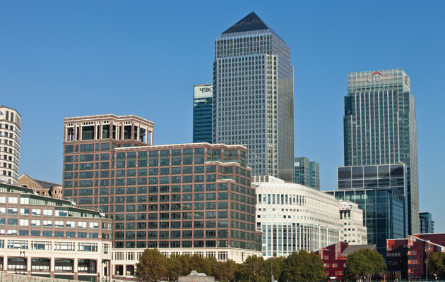
The real icon of British postmodernism is a shimmering cluster to the east: Canary Wharf, conceived by American developer G. Ware Travelstead, masterplanned by SOM, and completed by Canadian firm Olympia & York on the model of its World Financial Center in New York. British architectural critics showed a xenophobic eagerness to will its failure, yet its first phases (1988–91) have proved more considered and lasting in their streetscapes, in the quality of their architecture, and in the diversity of urban life than anything the City offered. Should we just discard the rest of financial PoMo? Pevsner did admit that these offices were often an improvement on their modernist predecessors, particularly the piecemeal projects of later years. And they did play host to the City’s economic rebirth in the 1980s and 90s. Even so, offices of equal or greater quality from the 1950s – New Change, Atlantic House or the 1958 Lloyd’s Building – have been torn down with barely a backward glance, lacking the requisite fashionability. |
||
|
Canary Wharf in 2005, with work by Farrell, SOM, César Pelli, Kohn Pedersen Fox and Norman Foster all visible |
||
|
Undue artistic import should not be forced upon postmodernism because it reminds us of our youth, or because a generation of young academics needs new PhD topics, or because retired architects are still around to lobby for preservation. Its commercial expressions deserve to find their own fate – and perhaps even eventual listing – as expressive remnants of an intellectual, architectural and economic moment. Some will indeed survive, to be seen as interesting, even attractive, in the manner of a Victorian warehouse or a minor Wallis, Gilbert & Partners factory. This is the remorseless logic of City planning today. Iconic architecture removes a valuable parcel of land as a potential location for corporate headquarters, and as a financial asset for transnational investors. The former chief planner, Peter Rees, described the Square Mile as a ‘vegetable patch’, with buildings to be harvested and replaced. Current incumbent Gwyn Richards has voiced strong concern about both iconic buildings and ‘a laissez-faire approach to listing 20th-century buildings in parts of the City that have to regenerate, that have to remain vibrant’. This language of architectural conservatism may be disappointing, but it would be bolstered by listing the manifestly second-rate products of postmodernism. It’s more important to ensure that their replacements succeed where they failed. And they did fail. This article first appeared in Icon 156. Subscribe to the magazine for more like this |
||

