|
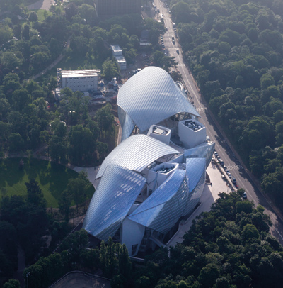
The meeting of two creators of luxury objects in the Bois de Boulogne in Paris has resulted in a suitably extravagant, and sometimes exquisite, art gallery Rearing up from between clumps of pine trees, appearing like a sailboat frozen in an ice storm, or a huge Boccioni sculpture rendered in glass, is the latest completed building by Gehry and Partners. The Louis Vuitton Foundation is a public museum of contemporary art, built as a gift to the city of Paris, a glittering ornament for a city already bedecked in architectural jewels. The project comes, like many of this type of glamorous cultural building, from an encounter, in this case between Frank Gehry and Bernard Arnault, the multibillionaire CEO of the Luis Vuitton Möet Hennessey group, a global leader in the luxury goods market. In the late 1990s Arnault had previously commissioned Christian de Portzamparc to design LVMH’s headquarters in Manhattan, resulting in a crisp and elegant tower that enlivened a rather dull period in the architecture of NYC. This time however, Arnault was looking for a legacy project, and as a significant collector of contemporary art (he and his wife Hélène are in the “top ten” of collectors worldwide, based upon the untold millions they spend each year), it clearly made sense to him to create a public museum of modern and contemporary art, set in a building designed by the very best in the business. Arnault and Gehry first met in 2001, an encounter that set the ball rolling for the commission, which was made public in 2006, and was to be situated in the Bois de Boulogne, among the luxury flats and embassies of the wealthy 16th arrondissement. Like so many of these object buildings down the years, the Louis Vuitton Foundation comes with its own easily digestible origin myth. In this case, Gehry is said to have regaled Arnault with his thoughts on Marcel Proust, who was brought up nearby and would have spent time in the park a century ago. Such reminiscences drew Gehry on to the legacy of the iron and glass buildings of the late 19th century which once were dotted all across the city, from the still-standing Grand Palais and Bibliotheque Nationale, to the long-gone Jardin d’Hivers, Galerie des Machines or the large greenhouses of the Jardin d’Acclimatation, the pleasure garden whose boundary constitutes the site of the new building. It’s an evocative claim, but whether it actually says anything about the new building is another matter.
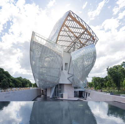
Twelve curved glass sails envelope the galleries The building itself can be divided into four distinct sets of elements, each layered around the other. At its heart is a series of 11 stacked gallery spaces, of different sizes and scales, most of which are lit by rooflights, and which restrain themselves to orthogonal geometry for the sake of an easy and versatile hang. These boxes, along with the usual auditorium, restaurant and gift shop, are transformed into moulded objects by a crisp white layer of a fibre-reinforced cladding material called Ductal, creating forms somewhat incongruously known as “icebergs”. The next layer is that of a winding collection of circulation spaces around the galleries, weaving inside and outside the building, complete with folding staircases and roof terraces, which provide views above the trees and Paris’s Haussmann-era roofscape. Lastly, the whole building is enveloped by 12 “sails” – huge glass panels installed upon giant frames of glue-laminated timber beams, connected back to the building by a forest of steel members, all of which creates a not-quite internal, not-quite external space around the whole ensemble. The glass panels are all smoothly curved, and are printed with a dot-matrix pattern that gives them a milky appearance, their seams delicately folded into each other like one of the luxury bags of the building’s patron. The foundation is mostly in very pale materials – the white of the “icebergs” and the plasterboard within, the paleness of the “sails” and the pinkish stone on the floors, the stainless steel doors and window frames. It’s clearly the most “tailored” Gehry yet, and the overall effect of the building is admittedly rather exquisite in its garden setting, set above a water feature which cascades down underneath its billowing forms. The foundation follows the design process we’ve come to expect from Gehry: the willowy initial sketch, followed by intense model-making exercises (well documented in one of the first exhibitions in the building), as an army of elite-educated young architects work themselves into the ground churning out endless variations of the form. Eventually, a model is agreed upon, and is then 3D-scanned and introduced to Digital Project, Gehry Technologies’ development of the French CATIA software that has been the office’s working tool for over 20 years. This early example of “BIM” software allows for the entire design team to integrate their efforts, and helps generate all the work which would otherwise be prohibitively time-and capital-intensive: structural design and analysis, cutting patterns for all the cladding materials, moulds for the myriad objects with complex curvature. The results are, as usual, both sublime and ridiculous. The forms created through all this technology are supple and exhilarating, and despite their size, feel “organic” in the sense that they have clearly been shaped by hand, rather than generated algorithmically.
A water feature cascades in front of the building Unlike some digital architects, Gehry’s work has never attempted to hide its method of construction, and so instead of a single seamlessly sheathed form there is juxtaposition of register, and the effect of passing through the external envelope to reveal the thickets of steel within is typically dramatic. But within all these awe-inspiring shapes are details so sketchy that they’d be unforgivable on a “normal” building: jarringly aligned panels, steel beams half-buried in plasterboard walls, stair nosings clashing awkwardly across the joints of the flooring. That said, these individual architectural “mistakes” are rendered irrelevant by the overall complexity of the project and its forms. The comparison to iron and glass architecture may be a Parisian platitude, but it has some interesting implications. Gehry’s career has to a large part been defined by his developments in the technology of digital architecture, a vanguard which is to some extent comparable to the 19th-century achievements of Labrouste, Dutert and others. But where the new industrial buildings of a century ago enacted a radical process of reduction upon architectural form, eliminating the monumentality of architecture to almost nothing, Gehry’s building is almost completely redundant, consisting upon layer upon layer of extravagant shapes set against each other, which perform almost nothing apart from embodying the architectural “vision” (you might say “brand”) behind the project. So while the nudity of iron and glass seemed to imply the disappearance of architecture, this Gehry building is an efflorescence of architecture, the useable space itself dressed in fold upon fold of decorative structure and surface. Across town, inside the similarly contradictory Centre Pompidou, which also attempted to channel the spirit of iron and glass while inadvertently monumentalising it, there is an exhibition dedicated to Gehry’s career. In his earliest days Gehry worked for Victor Gruen, the Viennese émigré socialist who invented the shopping mall, and it is fascinating to trace Gehry’s development from 1960s modernist, to the designer of Californian suburban houses experimenting with projective geometry, to the “deconstructivist” architect of bricolage and surreal juxtaposition in the 1980s, before the computer’s arrival enabled the blossoming in his work which led to the game-changing Guggenheim Bilbao, finished in 1997. It’s now 20 years since that great titanium fish appeared on the scene, and looking back from a generation past, it’s easy to call it the most influential building of that whole era, not only in terms of its formal innovations, but also its galvanising effect upon the fashion for “iconic” buildings: cultural institutions by a renowned architect, conceived as a necessary move in a global competition between cities for tourist money, regeneration opportunities and investment. So many cities around the world have been markedly changed by the success of Gehry’s Basque miracle – sometimes for better, but mostly for worse – that it helped to fuel a whole mysterious culture of property speculation in recent years. It’s easy to forget that Gehry was already in his sixties by that point, and at 85 now he’s been dropping hints at taking more of a back seat in the firm, and his acceptance of a “retrospective” exhibition is a symbol of this. |
Words Douglas Murphy
Images: Iwan Baan |
|
|
||
|
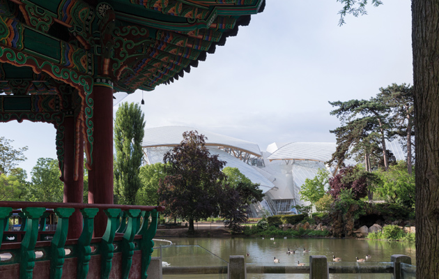
Gehry was inspired by the park’s 19th-century heritage |
||
|
One of the main themes of the exhibition is an assertion that Gehry is not just a creator of beautiful objects, but a genuine urban designer. From his post-grad in planning at Harvard in the 1950s, through his early masterplanning work with Gruen, and on to his wider redevelopment schemes, there’s a tension between the singular, spectacular buildings for which he is famous, and a more deeply considered attitude to place-making which he seems concerned about making an integral part of his legacy. The fact of the matter is, however, that a building such as the Louis Vuitton Foundation only works because of its withdrawal from the urban context. As a pavilion in the park (much like a 19th-century greenhouse), it need not take part in the more complicated and subtle relationships that it would have to on the street, and thus its excess and spectacle do not detract from the civic context in which it finds itself. Indeed, on its own, surrounded by trees, it’s a superlative architectural object, a stunningly resolved structure of great complexity, posing photogenically for the crowds, who will no doubt add it to the already bulging list of Paris landmarks. But buildings like this can be extremely harmful: they can deafeningly insult their civic context, they can promise economic benefits which turn out to be snake oil, they can swallow up vast sums of money in the pursuit of wanton shape-making. As architecture, their worth is at best debatable, but as bespoke luxury objects for public enjoyment, Gehry’s work is unsurpassable. |
||

