|
|
||
|
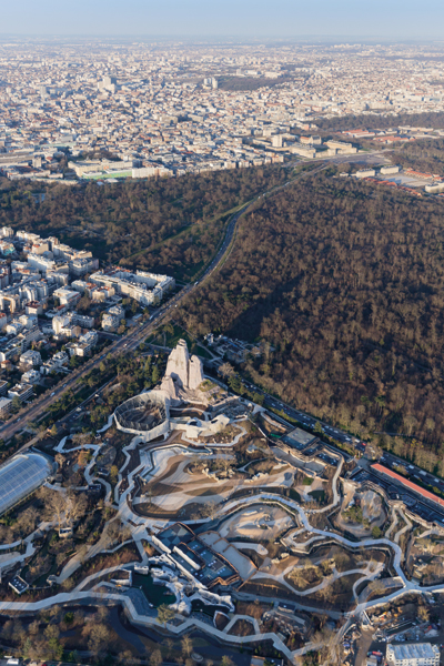
The venerable Parc Zoologique de Paris has been redeveloped to provide larger, more natural habitats for its 1,000 residents. But architects Bernard Tschumi and Jacqueline Osty’s design also revels in the mechanics and theatre of these fake wilds Building a new zoo is a tricky enough business at the best of times, but what if you have to do it on the ruins of an old zoo, with a brief to cram six “biozones” into a site of only 14.5 hectares in just 27 months? This was the challenge facing landscape designer Atelier Jacqueline Osty & Associés and Bernard Tschumi Architects at the Parc Zoologique de Paris, which reopened last April, 80 years after it was first inaugurated. A state-of-the-art facility back in 1934, it was falling apart by the early 2000s after years of underinvestment, and had become difficult to reconcile with modern ideas of what a zoo should be. Faced with the choice of either closing it for good or rebuilding, the Muséum National d’Histoire Naturelle (MNHN), its operator, launched a €167m public-private reconstruction partnership with industrial group Bouygues in 2008. The zoo’s origins date back to the 1931 Exposition Coloniale, for which all sorts of exotic buildings were erected in Paris’s Bois de Vincennes. Among the attractions was a temporary zoo, set up by the German Carl Hagenbeck, which proved so popular that the authorities decided to build a permanent one. Conceived by the MNHN and the architects Charles and Daniel Letrosne, the new facility was strongly influenced by Hagenbeck’s 1907 Tierpark in Hamburg, which had revolutionised zoo design by doing away with cages, bars and pens in favour of naturalistic settings separated from the public by ha-has, ditches and fences. The approach was all rather theatrical, which, in Paris, was even reflected in the language used to describe the zoo: the spaces where the animals were visible to the public were known as plateaux (stages), while those in which they slept were called loges (dressing rooms). Indeed the spectre of the circus was never far behind, with keepers pushing or enticing their charges out onto the plateaux so that there was always something to see. Equally theatrical was the zoo’s scenography, with a welter of false rocks (another feature borrowed from Hamburg) culminating in the 65m-high Grand Rocher. Hollow underneath its cement surface, the mock mountain allowed both sweeping Parisian vistas and an aerial view of the zoo itself, the animal enclosures seeming to float like islands in a sea of cement-covered pathways. |
Words Andrew Ayers
Images: Martin Argyroglo, Iwan Baan |
|
|
||
|
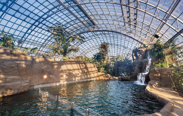
A 25m-high glasshouse contains the Madagascar and Guyana biozones |
||
|
Today the Grand Rocher is almost the only surviving element from the original zoo. Gone are the island enclosures, replaced by “biozones” that are intended to replicate different environments and their ecosystems. Five are currently open to the public – Europe, Patagonia, Sahel-Sudan, Guyana and Madagascar – while the sixth, Equatorial Africa, is to be realised at a future date. According to Thomas Grenon, director of the MNHN, “This 21st-century zoo shows and talks about biodiversity, and the animals live together as in their natural habitat.” In contrast to past practice, he explains, “the animals are not exhibited. You don’t see them close up. For conditions of animal comfort, we wanted much larger spaces, including places where they can curl up and hide like they do in the wild.” As a result, you may have to wait quite some time to see them. “We wanted a practice of observation, very close to what you do in the wild when you observe animals,” Grenon recalls. Numbers are much smaller than in other urban zoos, with just 1,000 subjects drawn from 180 different species, in contrast to London’s 16,800 or Berlin’s 20,300 animals. For Grenon, the zoo “is not a theme park. It’s a tool for propagating a culture of science and natural history.” The MNHN also makes much of the zoo’s activities in conservation and research. It fell, of course, to the architects and landscape designers to make this approach a reality, and their first challenge was to work out how to organise the space. In order to maximise the site’s potential, most of the buildings were moved to the periphery. This allowed an access road around the perimeter, meaning keepers could be kept out of sight, which was essential if the illusion of natural landscapes was to be preserved. In the old zoo, keepers and visitors all used the same very wide paths, but today 40 per cent more space is given over to enclosures and landscaping thanks to longer, narrower, visitor-only pathways. Mikaël Mugnier, project leader at Atelier Jacqueline Osty, points out that the new visitor layout is similar to Ikea, with a principal circuit linked by subsidiary pathways that provide shortcuts from one zone to another. |
||
|
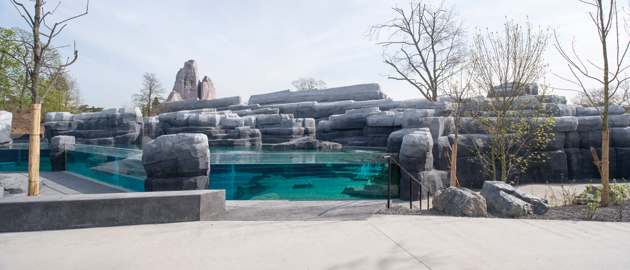
There are two pools – one each for penguins and sea lions |
||
|
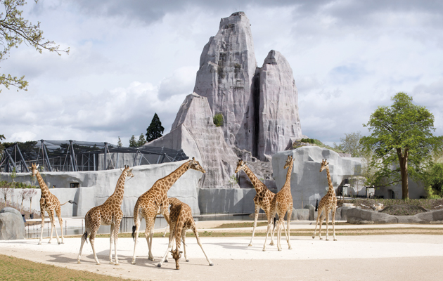
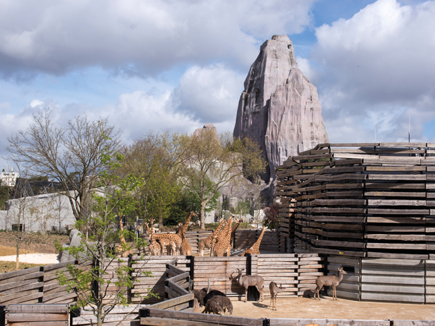
When describing their approach, the landscape designers use the same vocabulary as the creators of Disneyland – the terminology of the cinema. The 4km-long main path is thus “a tracking shot”, which “unfurls the landscape” like a roll of film, the “vision bays” (large glass screens that focus on particular views) act as “zoom lenses” that plunge the visitor into the action “like Cecilia in The Purple Rose of Cairo”, while the landscapes are film sets in which all disturbances – neighbouring houses, technical equipment, other biozones – must be hidden from sight. The largest and most visually impressive is Sahel-Sudan, whose giraffe-filled plains are set against the picture-postcard backdrop of the Grand Rocher (a “long shot”). As the landscape designers explain, “The amplitude given to the landscape relies on tools that combine the art of theatre with the art of gardens: a sequence of frames, elements on stage and in the wings, the visible and the hidden,” adding that “these ‘natural’ landscapes call on a fifth dimension: the mental landscape we all carry inside us … our imagination full of memories, travels, books we’ve read, films and photos we’ve seen”. While the old zoo may have lost most of its structures, it lives on through its trees, 800 of which have been preserved out of the original 1,500. A big challenge where planting was concerned was finding “extras” to stand in for the vegetation of another continent. Sometimes there were direct European equivalents, but these were not always suitable. In the African savannah, giraffes graze on acacia trees, but European acacias are toxic for them. Instead, honey locust was used, which has a similar form and silhouette, but is not poisonous. Then there was the problem of seasons. This led to a judicious use of evergreens, and tricks like not cutting the grass in winter so that, even if dead, it would stand in for savannah grasses until the spring. It also meant accepting paradoxes. “Bizarrely, the emblematic view with the Grand Rocher is the most incoherent,” says Mugnier, not just because the grass is only the right colour in freezing winter, but also because the landscape designers left in a stand of Austrian black pines in an African landscape. “But it works,” he adds. |
||
|
Pathways have been narrowed to give more space to enclosures |
||
|
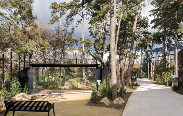
For the architects, there was the question of which materials to use in a zoo that had to be built rapidly on a tight budget. According to Véronique Descharrières, the partner in charge of the project for Tschumi, it was speed of on-site assembly that prompted the use of prefabricated metallic structures, all painted black to provide a “completely neutralised backdrop”. Some are partly disguised by thick wooden timbers, but the subterfuge is frankly admitted, all the struts being exposed. It was a question, says Descharrières, both of ensuring the “total immersion environment” called for in the brief and of being honest about the enormous technical necessities of a zoo – which, as Mugnier points out, “is a huge piece of machinery, a farm” where you have to “deal with all the poo”. There was also a desire to avoid the anecdotal – no mocked-up indigenous villages or ancestral woven fencing – and find a general vocabulary to unite the zoo as an ensemble. Both architects and landscape designers felt that attempting to imitate nature was not the solution; better to go for the sharply but discreetly designed. Thus the main path is not curved but angular, in light-coloured concrete, and the animal houses and aviaries are equally sharp-cornered. “Technically it’s easier to produce a beautiful straight line,” says Mugnier, adding that, since everything in the landscape undulates, “a few angles help set that off, giving contrast, and avoiding the risk of general flaccidness”.
The zoo occupies 14.5 hectares of the Bois de Vincennes For Descharrières, it was also a question of reflecting the fact that the zoo is a scientific tool. And if the metal sheds and aviaries have a certain stark carcerality, she candidly admits that a zoo “is a bit of a prison, a clinic, a museum”. Describing the giant glasshouse containing Madagascar and Guyana, she says, “We wanted it to be as abstract as possible and to avoid any effect of sculpture or monument. It was essentially about creating a climate. We looked for the form that with a minimum of materials would offer the greatest volume … a bubble, à la Buckminster Fuller.” But this ascetic approach doesn’t mean that the new Paris zoo is entirely devoid of fantaisie. In homage to the historic zoo, fake rocks are back in abundance, although the trickery is now made very apparent. The lemur house is only half-covered in cement rocks, while the giant aviary next to the Grand Rocher appears to stand on a rocky outcrop, but inside, explains Descharrières, “you enter the reverse of the décor … and see how it’s all constructed”. The design team clearly had fun in Patagonia, where an abundance of stylised rocks surrounds the penguin and sea-lion pools – fake rocks came in handy everywhere for hiding equipment. There are even heated rocks in the lions’ enclosure to encourage them to come outside in winter and sleep in full public view. Which proves the point that, even if Grenon won’t admit it, a zoo’s primary function is to entertain the crowds. Conservation and research, as historian Éric Baratay has pointed out, are screens to obscure this central fact in today’s climate of guilt about man’s domination and destruction of the planet. The architects address this ethical problem in their design by using exactly the same architectural vocabulary for visitor buildings as for animal enclosures. “What interested us,” says Descharrières, “was putting everyone on the same footing and playing with the architectural language so that humans would enter aviaries just like the birds – so that man himself would also feel like an endangered species in need of preservation.” A fate, she concludes, “that may not be so far from the truth”. This article first appeared in Icon’s February 2015 issue: Zoos, under the headline “Cage craft”. Buy back issues or subscribe to the magazine for more like this |
||
|
The metal enclosures are loosely clad in wooden slats |
||

