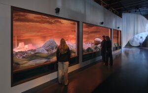
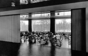
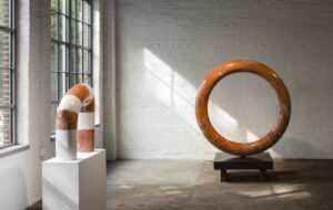
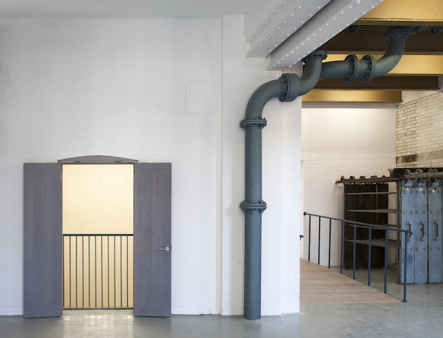
 Inside Goldsmiths CCA. All images courtesy of Assemble.
The Turner Prize-winning collective’s contemporary art centre in south London makes inventive use of its muscular iron-clad structure, writes Alice Bucknell
London’s cultural sector is no stranger to industrial chic—the ex-furniture factory digs of Victoria Miro and the epic expanse of Tate Modern’s Turbine Hall are just two of many venues hitting those gritty glamour highs. But as repurposed lofts, factories and warehouses become ubiquitous sites in the art world (one could argue their incumbent position as the next white cube template), converted galleries that have treated their inherited architecture as an active tool will prove the most hospitable to emergent and not-yet-conceived forms of art practice. The Goldsmiths Centre for Contemporary Art (CCA), alchemically transformed from a Victorian bathhouse by the Turner Prize-winning collective, Assemble, has done precisely that.
If you think about it, the aquatic architectures of bathhouses and spas are perfectly poised for the ponderous and ambling environments necessary for exhibiting contemporary art. Designed as places to relax and unwind, or as community service centres for scrubbing up and coming clean in Victorian times, bathhouses can also prompt deep critical reflection (who can’t attest to the mid-shower epiphany?). Filled with unique finishes, including the now-trendy grouted tiles, deep subterranean enclaves for colossal water-warming hardware, pitched ceilings and angled light streaming in from clerestory windows, as well as smaller closed-off changing rooms, they are also ideal for a variety of art forms, from dramatic performances to intimate film screenings.
That’s not to say Assemble had it in the bag when they were selected, from an open competition with some 80 applicants (including established bosses of gallery architecture such as Jamie Fobert and 6a Architects), to conjure a new centre for contemporary art from an idiosyncratic bathhouse back in 2014. Working with an industrial Victorian building was far from easy, says Paloma Strelitz, who led the project with Adam Willis, but afforded the multidisciplinary crew of 17 their first opportunity to develop a large-scale, permanent architecture – and fit it out with many of their own DIY designs.
Reframing the hefty musculature of the Laurie Grove Baths’ plant works and water tank rooms to accommodate a variety of contemporary media and events programming required more heavy-duty reconstruction than the group initially anticipated. Ceilings needed to be transplanted and entire floors were removed to free up space, while two centuries’ worth of pigeon poo had to be hand-chiselled away from the once-inaccessible cast-iron water tanks resting on top of the building. ‘It was important for us to work with the existing architecture to produce a material and spatial variety throughout the gallery,’ explains Strelitz. ‘We were not interested in becoming another white cube space.’
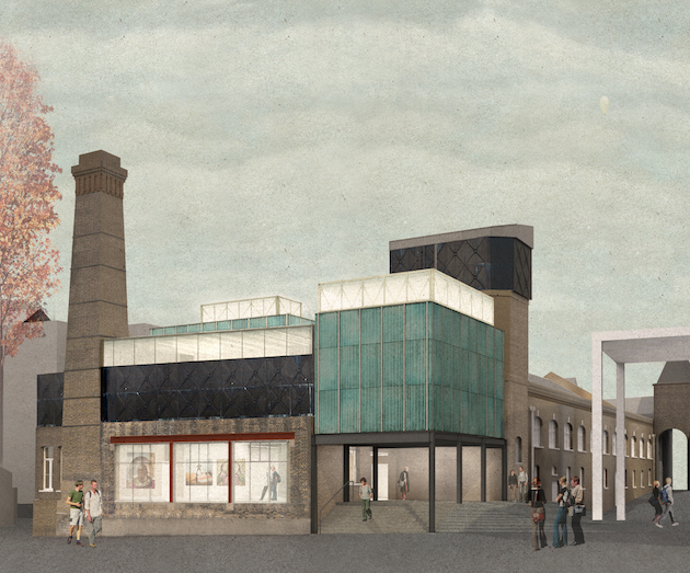
Still, there are far more carefully calculated interventions and excavations than full-sweep subtractions; working with a small space of 1,000sq m and an equally small budget of £4.2 million, Assemble’s approach was more Rubik’s cube than battleship. The building’s insides are carefully peeled back in places to expose the textured layers of history beneath, and transposed in others to enhance the found qualities of the space. Juxtaposing the inherited ‘rough and ready’ aesthetic are two sparkling new white cube galleries on the top floor, complete with skylights and oversized trusses. The result is a lyrical combination of precise functionality and decorative delights rediscovered among the original architecture – plus some idiosyncratic fittings of the collective’s own doing.
Upon entering the new 8m-tall lobby, an impressive ray of light pours in from the adjacent Jacobethan main baths building, which has housed undergraduate studios since Goldsmiths acquired it in 1994. By removing the original 2.5m ceiling and relocating and renovating the roof light from next door, Assemble has transformed the once-grim grotto into a welcoming first impression.
Cheeky gallery signage by Kellenberger-White, the project’s graphic designer, perches on the walls of each gallery; the rough masonry is a surprisingly good fit for the custom 8-bit-like typeface. The font was developed when Kellenberger-White’s team visited the CCA during construction and observed the worm-like drill holes that Assemble had made to fit the ground-floor galleries’ new radiators. ‘We let them know the real purpose of those holes, but the idea had already stuck,’ confirms Willis. Not one to shy away from saturation, Kellenberger-White’s chameleon-like plaques change colours between rooms, helping to signpost the eight galleries.
New spaces look old and old spaces look new, resulting in a fun quiz awaiting any visitor who does not consider herself an expert in Victorian bathhouse architecture. In its oft-cheeky and super-saturated style, Assemble has added surprise details to each room—many of these inserts are handmade by the eclectic collective. Moving beyond the welcome desk, which is clad in pink-hued ridged cement tiles produced in-house, a blinged-out golden ceiling reminiscent of OMA’s Haunted House at the Prada Foundation in Milan hangs over the first gallery, which flows into the cafe.
Here, original drying racks for bathers’ wetsuits mingle with a series of eight speckled light pendants produced by Granby Workshop: the innovative ceramics manufacturer in Liverpool initiated by Assemble, and the project that won the collective the Turner Prize in 2015. The contrast in both function and style – not to mention the unique art-first, coffee-later protocol derived from making the first gallery the entrance to the cafe—testifies to Assemble’s precise vision for the space, which goes beyond design and into a broader imagining of how the gallery may grow with time.
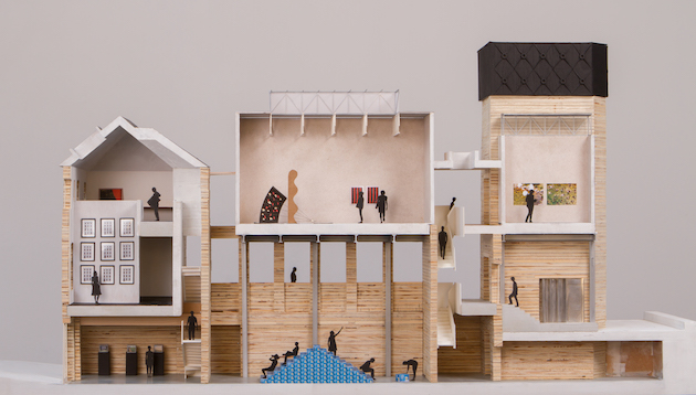
A mysterious set of wooden doors coated in a hypnotic pre-dyed pale blue veneer opens out onto a Juliet balcony, from which the pièce de résistance of the gallery can be seen. By cutting out a chunk of the existing floor plate, Assemble has created a double-height performance venue that oozes theatrical charm. The raw walls intimate the unique historical function of each floor as polished bath tile abruptly melts into exposed masonry. Known as the Oak Foundation Gallery, this flexible space, with its core position in the gallery, dramatic height and visibility from all angles, is an apt venue for the independent events programming that will play a central role in the life of the CCA.
Chasing the smurf-hued doors around the building is a series of chubby, twisting water pipes coated in a similar shade of blue. The blue theme continues into the four gender-neutral bathrooms in the basement, which are bequeathed with regal marbled splashback panels above the sinks. Each one a slightly different pattern, the tiles recall the group’s splatware ceramics. ‘Institutions typically have a high level of regularity, finish and shine,’ says Strelitz. ‘We wanted to create a space that was open for play, made clear through the architecture.’
Underneath these light-hearted interventions is a deep awareness of the building’s past life and the ways in which it has been shaped by its users throughout the centuries. A staircase painted in white clearly exposes the many fill-ins needed from a barrage of bathers. Within Assemble’s proposal, this was supposed to be the lift core; but upon discovering the richly textured staircase, it was unanimous decision to move this to the back of the building. Assemble’s deference to the structure (a slackening of ego unknown to most architects) has shaped the gallery’s current status, as a sort of richly layered canvas awaiting its future users to leave their marks.
Ascending the mottled stairs, past a discreet glimpse out over the next-door student studios, visitors will discover the former cast-iron water tank turned elemental gallery space. The water tank’s raw, rough texture has been preserved; a new primary timber structure dyed with a ‘homebrew’ iron acetate stain blends into the hulking metal, bringing its base up by 50 per cent. Half of its roof has been sliced off, creating a 48sq m terraced space out back that awaits artistic intervention; without central heating, the water tank gallery is likely to be a seasonal affair, or a year-round experimentation zone for intrepid artists up for the cold.
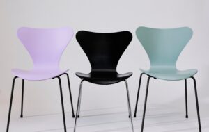
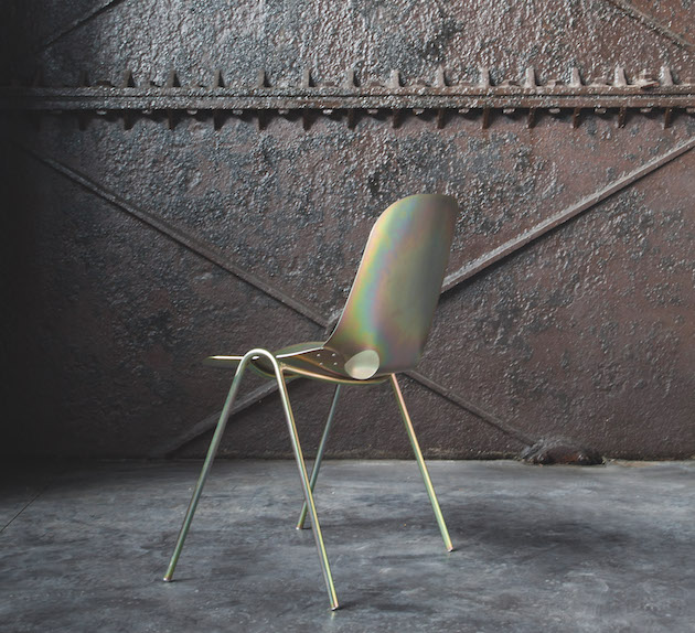
The tank room is flanked by two additional top-lit white cube spaces that have temporarily transformed into black boxes housing two films by the Argentine video artist Mika Rottenberg, whose surreal yet critical practice constitutes the inaugural exhibition. The new galleries are encased in a rough teal concrete facade that Assemble developed with corrugated cement board – a material more often seen on industrial sheds. A literal glow-up from industrial chic comes in the 20 cafe chairs designed in collaboration with Cake Industries. Made from folded sheets of steel predominantly used in mechanical fixings, their supple iridescent form resembles an Eames chair after an all-night rave.
On paper, the pliability of an iron-clad, 200-year-old bathhouse seems incredulous. But as Assemble has shown, even the meanest of metal can be transformed into a multi-layered venue that echoes the function of Goldsmiths CCA – a gallery intent on hosting a ‘diversity of exhibition-making, from historical surveys to new commissions with younger artists’, according to its director, Sarah McCrory.
The building’s chiselled past and playful new groove meld together in open anticipation of the future lives to come, proving that industrial art haunts need not be all clean concrete and minimalist cool.

