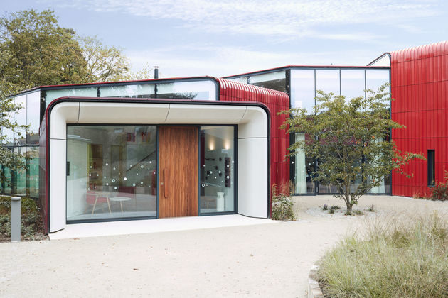
 Ab Rogers’ Design’s Maggie’s Centre, at The Royal Marsden Hospital, Sutton. Photograph by John Short.
The designer’s centre for cancer patients at The Royal Marsden Hospital in Sutton is a fine-tuned sanctuary, finds Joe Lloyd.
It’s impossible to talk about Ab Rogers Design’s new Maggie’s Centre without talking about its colour. Rogers’ building, designed with his company’s co-director Ernesto Bartolini, shines in lustrous red. Comprised of a quartet of tessellating forms spilling out from a central core, it is clad wall-to-wall in glazed terracotta tiles.
These were produced by Palagio Engineering near Florence. ‘We used about 800,’ says Bartolini, ‘though many more were broken along the way.’ Slick and smooth from afar, a closer inspection reveals some imperfections, with tiny fragments chipped away. Each of the building’s volumes displays a different tinge, from brilliant vermillion to restive burgundy. ‘When we met with Charles Jencks,’ explains Rogers, ‘we realised it was important for it to not look factory-made, to be almost rustic.’ In a further concession to the handmade, the façades are speckled with stencil sketches by the illustrator Sara Fanelli, with something of folk art about them.
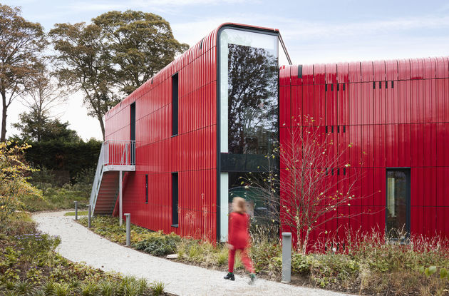 The centre is clad in red terracotta, made in Tuscany. Photograph by John Short.
Maggie’s was established by Jencks in 1995 with his wife Maggie Keswick Jencks. Diagnosed with breast cancer several years prior, Keswick Jencks was struck by the lack of psychological support, aids to wellbeing and practical advice on offer. Maggie’s was founded to remedy this problem. Open to all cancer patients, the centres provide classes and activities to patients, as well as a communal sanctuary for recuperation. There are now 22 across the UK and several abroad, each built by an internationally acclaimed architect. Richard Rogers, Ab’s father, won the Stirling Prize in 2009 for his centre at Charing Cross Hospital, a building which is also red, albeit of a more muted tone.
Red – the colour of anger, danger, violence and flesh – seems an unusual hue to find in hospital architecture. Rogers and Bartolini chose it in part because of its eye-catching exuberance. Plonked within a sprawling parking lot and a tangle of worn-out structures, it is soon to be joined by a bevy of new buildings, perpetuating the Royal Marsden’s place as a world-leading cancer research and treatment hospital. The Maggie’s Centre has to be an easy-to-find beacon among this morass. ‘It’s all about trying to be this beating heart,’ says Rogers, ‘we want it to be seen as this object that’s alive.’
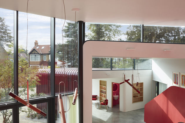 Inside, Rogers has orchestrated a smooth succession of connecting spaces. Photograph by John Short.
The centre’s nestled form proves canny inside, allowing for a diverse suite of rooms, some crisply white-walled and others in subdued shades of purple. All lead back to the double-height central atrium, so that the building’s layout is easy to comprehend. Sliding doors allow spaces to be combined for group activities and separated for privacy. Each room looks out to the surrounding greenery. Ample natural light transfers some of the crimson glow of the tiling on the centre’s white surfaces.
Maggie’s grant their architects a free hand, so long as the resultant building follows specific, patient-led precepts. Rogers’ open form doesn’t just allow for the flow of light but also sound: “you should always hear a voice,” he explains, “they don’t want sterility.” A non-hierarchical ethos is prevalent throughout. Rather than opening out to a reception, the Centre’s offices are tucked away discretely on the first floor. “To go through the door means that you’re accepting their help,” explains Bartolini, “which can be a very difficult moment.”
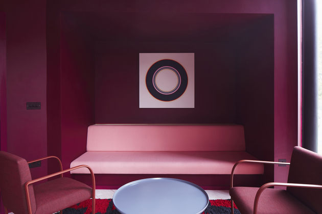 The rooms vary immensely, from a light-filled atrium to quiet spaces for private reflection. Photograph by John Short.
The project took 5 years to complete, and the attention-to-detail this allowed is everywhere visible. Each doorknob is unique: one is a pebble-shaped walnut wedge, another a warm leather strap. One toilet glows pink, another yellow. Baton-shaped lamps hang above the central atrium, their ends glazed by Rogers to resemble the exterior hues.
There are rugs designed by Blue Farrier and hand-woven by the all-woman Talint Handicraft Association in Morocco, Eduardo Paolozzi prints, and paintings by Vanessa Jackson and Carol Robertson. Vitrines commingle Paolozzi’s maquettes with tiny sculptures executed by Rogers himself. A miniature exhibition of models, videos and drawings pertaining to the centre itself is a well-earned tribute to the labour it involved.
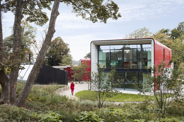 The garden was planted by acclaimed landscape designer Piet Oudolf. Photograph by John Short.
Rogers’ structure sits within a twisting garden designed by the acclaimed Dutch landscape architect Piet Oudolf, which interlays over 50 perennial plants in a dense patch. On a deep winter’s morning, it feels like a patch of the wilderness, in bracing contrast to the polite suburban lawns it abuts. ‘Piet is always excited,’ says Rogers, ‘by his grass sleeping in the soil.’ A garden house, which Rogers describes as ‘a shed growing into the ground,’ provides remarkable tranquillity. Despite being only a few metres from the main building, it feels like a remote rural retreat, a far cry from Sutton’s log jammed A-roads.
The Royal Marsden’s Maggie’s Centre cost £4.5 million, contributed by private foundations. This doubtlessly allows it to be more fine-tuned than the NHS’ publicly-funded, large-scale wards. Nevertheless, there is much that future healthcare architects can learn from Rogers’ lightness, warmth and clarity, a place of optimism through difficult times.

