|
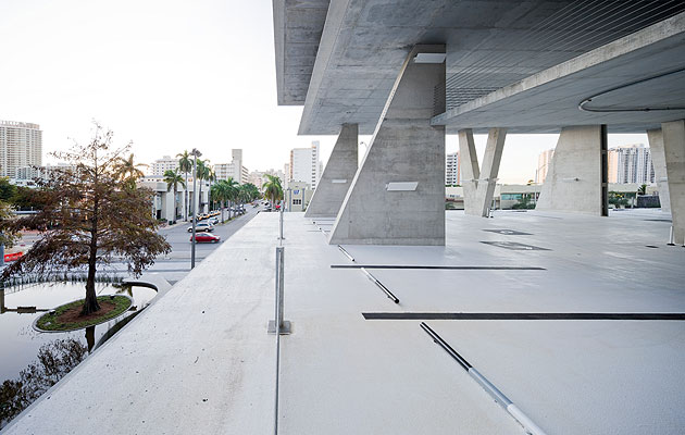
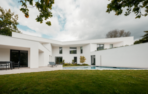
I spent a lot of time around the scruffy end of Lincoln Road. I had a bowl of noodles in the Yummy Chinese bar. I looked at the plastic shoes in the Payless Shoe Source. I had a coffee in the 24-hour Dunkin Donuts because the Bay Cafeteria wasn’t open yet. And I used the ATM at the drive-in Sun Trust bank, even though I was walking. It didn’t take my card. But most of all I wandered around the parking garage. It doesn’t sound much of a day, yet it was extraordinary. The car park, a stack of concertina-ed concrete slabs braced by zig-zagging columns, the darkness squeezing out between them, is the latest building from Herzog & de Meuron. The garage’s developer, Robert Wennett, proclaims this sculptural chunk of concrete a work of regeneration. I hung around to see if I could figure out what on earth he meant. Since when has a multi-storey car park done anything for the city? The building sits at the top of Lincoln Road, Miami Beach’s premier piece of pedestrianisation. The road has already gone through many manifestations since its pre-First World War inception as a route from city to beach. It went from being the city’s most chi-chi shopping street to decline in the 1950s, followed in 1960 by restoration by the master of Miami-modernist cheese, Morris Lapidus, and then on through protests and riots to its current state as a tourist street of mid-market stores and bland cafe terraces. The top end was, and still is, a bit rough. In a city of boom and bust development, this is where the boom bust, where pavement cafes collide with blacktop backlots and cheap drugstores, winding freeways and the Maurice Gibb Memorial Park (no dogs). The parking garage is an effort to turn the corner, to address the city using a building type that once seemed a radical prospect for modernity but more recently became a cipher for urban dystopia. Simon Henley covered its history elegaically in The Architecture of Parking (Thames & Hudson, 2007), from Melnikov’s plan to bridge the Seine in Paris with a multi-storey to Louis Kahn’s gasometer parking garage intended to replace downtown Philadelphia. But its subsequent history is better defined by Owen Luder’s cult Gateshead structure, which starred in the 1971 film Get Carter. The multi-storey parking garage quickly became shorthand for threatening darkness and urban alienation. Since their disgrace, parking garages – so ubiquitous in the downtowns of US cities – have been sheathed in shame, disguised as office blocks or buried deep in the ground. Herzog & de Meuron is on a mission to rehabilitate, to resuscitate the typology. 1111 Lincoln becomes a 21st-century equivalent to the grand US rail stations that the auto industry so effectively smashed. It becomes a place of interchange, of urban encounter, of transport infrastructure punching into the centre of the city and distributing drivers in its wake. This, of course, is no ordinary parking garage. It has a Taschen shop and a Nespresso boutique. It has another boutique half-way up its decks and a restaurant on its roof (as well as Wennett’s apartment). It has an artwork by Monika Sosnowska stuffed beneath a ramp and a Dan Graham pavilion (its amoeboid shape inspired, he tells me, partly by Miami modernism, partly by residential swimming pool vernacular) parked outside. That drive-in bank is HdM too: at first glance, mundane roadside modernism, white walls and glass; on further examination as cool as a house for a Swiss art collector. The architecture of the garage is, also, of course, exquisite. The decks taper to a slender edge, V-shaped columns create a dynamic, extraordinary profile that seems to refer to the sculptural concrete canopies with which Lapidus decorated Lincoln Road. It looks like a building that was abandoned because it looked too good under construction to clad, too cool for cover. What more could you do? The perspectives on the city from each deck are increasingly theatrical and, from the very top, it is filmically panoramic. A rhythm of compression and release in the heights between the floors makes a surprisingly engaging journey. But the reason I spent so much time hanging around on this December day was to try to get a feel for what, if anything, a building like this can do. The architects’ proposition is that the ramps become an extension of the public realm – streets in the sky. This, though, is Miami, the sunny, palm-lined, fiercely jogged streets are hardly unpleasant. The beach is a ten-minute walk away, the Delano and Sagamore loom above the Deco district and its endless cafes, bars and lobbies. Why would you spend time half way up a parking garage? It is intriguing, strange. This is a building very much in a modernist tradition of revealing function, of structural transparency, a building revelling in a curiously dated yet enduringly American autopia, an ambiguous vision of the ascendancy of the machine over the city. But it is also engaging, both sculptural and compelling, referring obliquely to the wonderful tropical concrete of Lina Bo Bardi and Paolo Mendes da Rocha. 1111 Lincoln addresses a forgotten typology and uses the planning and usage restrictions that would have otherwise choked the site to create value from seemingly nothing. That evening I went to a party in the garage. The tents and marquees sat on the decks like a 60s vision of the flexible superstructure, a stripped-down, Cedric Price-like fun palace. The cars poked their gleaming fenders to the edges of the slabs. No valet parking here, the whole point is to experience the car park yourself. The arrival is the building. Herzog & de Meuron is also about to build the Miami Art Museum across town. But in a way it is this strange commission, a drive-in bank and car park, which really shows what the practice can do. And it is so very good at what it does. |
Image Iwan Baan
Words Edwin Heathcote |
|
|
||
|
Slender V-shaped columns create a sculptural profile |
||


