|
|
||
|
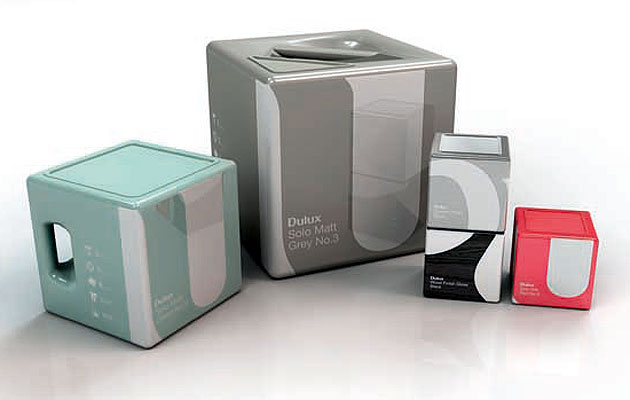
Having recently braved the turmoil of home decorating, the pain of standing in front of rows of soulless paint tins with no personality was fresh in our minds like a newly glossed skirting board. Therefore, when Icon’s Rethink brief arrived, that feeling of being a frustrated paint consumer became the focus of our attention. When people think of paint, I’m sure they think of Dulux (at least in the UK). We focused most of our attention on packaging, as this was the area in which we felt the greatest improvements could be suggested in a short time. The first thing you will notice is that our paint tins don’t look like paint tins. We’re sure there are many good reasons for keeping paint cans circular (we didn’t want that to spoil our fun), but there are also some very good arguments for changing cylinders to cubes – for one thing, this shape means the same amount of paint requires less storage space, which would cut down on transportation and reduce the product’s environmental impact.
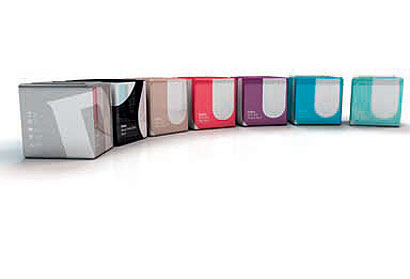
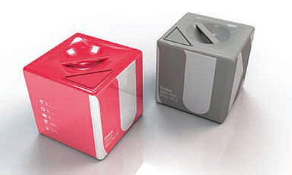
We wanted our design to offer a much stronger continuity between products and different ranges than the Dulux packaging does at present. In our version, the colour of the paint forms most of each package’s surface, making selection much easier. The paint finish is also reflected in the packaging – matt paint has a matt finish, gloss has a gloss finish (you get the picture). Special paints would be identified by material textures – metal or wood, for example. By using different crops of the logo, each paint or sub-brand can be given an individual look, but still remain quite clearly part of a bigger family. This would help achieve greater on-shelf impact and brand awareness. Most people use rollers to paint these days, therefore pouring the paint is something almost all consumers do. Our designs making pouring much easier and cleaner. We developed a different approach for each of the three different sizes of container so each one works as hard as possible for the user. The smallest container has no handle, as it doesn’t require one: easy. The medium-sized container has a vertical handle on the side, which is intended to make pouring very easy, but also to make it a pleasure to hold. The largest container has a handle built into the top, with the lid only forming a triangular portion of the top, to help control the flow of paint.
|
Image Founded
Words Founded |
|
|
||

