|
|
||
|
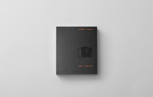
Nonobject is a collection of fantastical, impossible designs created by former IDEO member Branko Lukic. There are all-bristle toilet brushes, forks bent into right angles and crystal toilet bowls. It’s a fun sort of book – think of an updated Heath Robinson, or perhaps a monograph on industrial design by The Onion. It would make a fine humorous stocking-filler for the jokier design aficionado. One to keep above the bog. Except it isn’t. Wipe that smile off your face. We are not here to be entertained. This is serious. Nonobject “will change the way we think about design and designing” says Bill Moggridge in his foreword, which also contains the words “beauty … the hand of a great designer … masterful … thrilling designs …” Barry M Katz, in an introductory essay, manages to go even further, saying: “Nonobject may be the first approach to design that rises to the level of philosophy.” Blimey. Regular readers might recognise the name Lukic: we featured three nonobjects in Icon 080, the Fiction Issue. We’re in the territory of fictional design, a relatively new subset of critical or conceptual design that is as interested in impossibility as much as possibility, and puts more emphasis on narrative than function. Humour, a useful mental lubricant, is in use here, but the aim isn’t to make you laugh, it’s to make you think. This is design as cultural research, Lukic is not “imprisoned” (Katz’s word) by functionalism – totally free from constraints, he’s able to soar to new heights of design, exploring the space between the user and the object. And the entire endeavour comes carefully vaccinated against objections by Katz, who describes sceptics thus: “These are the same benighted souls who complained that Picasso painted two eyes on the same side of a woman’s head, and there’s not much that can be offered to them but our condolences.” Like I said, this is really, really serious. Nonobject does play a valuable role in critical design, even if that role is somewhat oversold in the introductions. Industrial designers produce little in the way of “paper architecture.” Unlike architects, who are regularly happy to put aside material or practical constraints and doodle away at megastructures and walking cities, moving professional theory forward as they do, industrial designers are in the vice of the cult of use. So in 10,000 spoons, there is little radical re-examination of spoon-ness itself, whereas Lukic has really pushed the spoon far beyond what were previously considered its limits. There’s a triple-decker spoon for big eaters, a spoon consisting of scores of tiny spoons to capture the essence of a single drop, a spoon bent in a right-angle designed to disrupt the social rituals of the table. Material constraints are also removed: Lukic wafts into being a substance called “thinium” that allows cutlery to be made with hair-thin handles that remain rigid. Why? Well, the stem of a spoon isn’t the width it is purely because it would buckle if it were thinner – there are other reasons, such as comfort in the hand. If slender is more elegant, surely the slenderest possible cutlery is the most elegant that’s possible? No, it isn’t. Each object confronts some aspect of design rationale and tests it to the breaking point. The results are quite mixed. Some objects are not all that impractical. It’s not hard to imagine Vertu putting the Rawphisticated mobile phone into production tomorrow, in sapphire. Other objects are quite seductive in their sheer iconoclasm, such as the Nucleus motorcycle, which is little more than a plain rectangle. But many are quite silly, and might be capable of raising a smile but don’t stimulate much else. Paleoware cutlery simulates the history of toolmaking by increasing in material sophistication from one end to another – flint to steel. Cute. Nonobject is at its best – both funniest and cleverest – when it is at its most critical. One of its highlights is the CUN5 mobile phone, every surface of which is covered in buttons. No matter which way up it is, it’s the right way up. Of course there’s no screen or anything else – the point is that there are limits to ease of use, it’s not an evolutionary track that stretches forever into the distance. Nonobject is like a Magic Eye diagram for design – you have to look past the surface to see what it is. When confronted with an unfamiliar artefact we naturally think “How does it work? How do I use it? That wouldn’t work.” It’s not always successful, but Nonobject hotwires that reflex and tries to give you a new way of looking at design – a really exciting mission for a book. It would have been helped in that mission if its explainers laid off the hyperbole. Nonobject by Branko Lukic. MIT Press. £22.95.
credit MIT Press |
Image MIT Press
Words William Wiles |
|
|
||


