Futuristic online aesthetics are shifting our perceptions of the way we use colour in art and our everyday lives, writes colour trend forecaster Jane Boddy
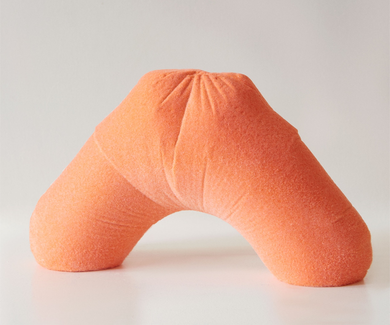 Photography courtesy of Lucy Hardcastle Studio
Words by Jane Boddy
The dawn of the digital age and the rapid advancement of technology has significantly impacted various aspects of our lives, including how colour is developed, applied and perceived. We have embraced the concept of the metaverse and the growing importance of artificial intelligence (AI). As these digital realms evolve, they inspire real-world creativity by influencing aesthetics and creating new and innovative colour directions. Futuristic online aesthetics, such as those found in NFT artworks, often feature vibrant colours that push the boundaries of imagination.
These are characterised by intense and vivid hues, which were initially associated with the illuminated screens and displays of digital devices. Their appeal and visual impact has transcended the digital realm and found its way into physical objects and spaces. I describe these colours as backlit brights as they possess a magnetic intensity that evokes a sense of awe and provides an avenue for escapism. The futuristic surreal aspect of these colours transports you into the realm of wonder and imagination.
For instance, digital artist Lucy Hardcastle uses these types of colours to connect the physical and digital worlds. ‘My use of colour that often combines muted pastels with hyperbrights provides another opportunity to challenge the hyper-realism or phygital [physical plus digital] element of my work,’ says Hardcastle. ‘The pops of vibrancy can cause the viewer to question whether something is real or virtual. Matching those colours that are initially created in the digital and applying them to physical objects feels like part of the process and a craft within itself.’
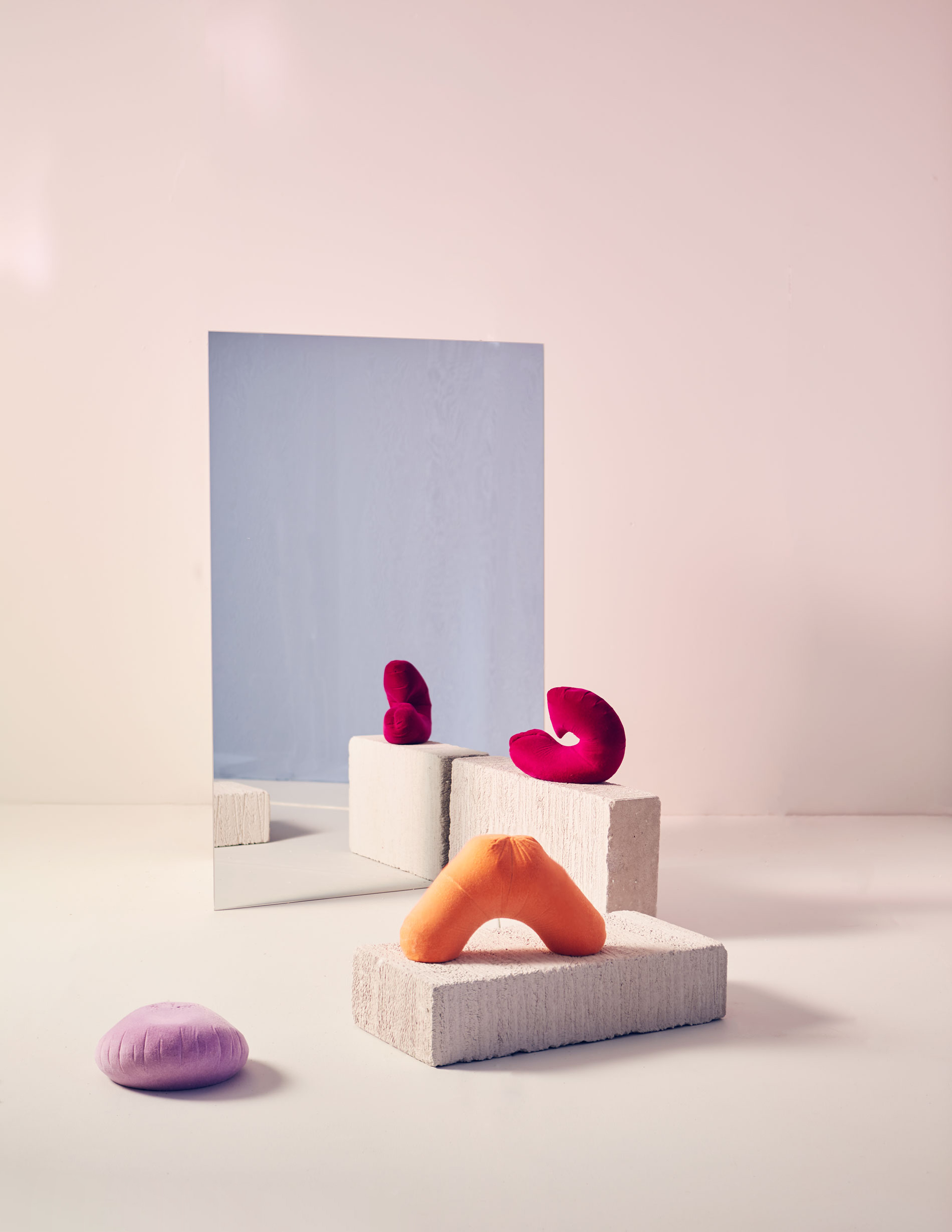 Photography courtesy of Lucy Hardcastle Studio
Colours crossing from the digital into the physical world follow two directions. One is hypersaturation, such as the intense orange tones in Pantone Marigold 15-1164. This yellow-infused orange has a carotene-type brightness that glows and radiates, whether on screen or even on a non-reflective matt physical surface. Or, as a fiery partner to Pantone shade Raspberry 18-1754. This profoundly saturated level of magenta holds a deep blue within it that enables it to have digital vibrancy in the physical world.
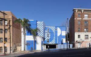
Blue is a widely recognised as a predominant colour in the digital sphere, classically used within branding or platforms looking to obtain the trust of their clients, such as banks or social media networks. As the colour of the sky, its overall sense of optimism makes it known as the colour of trust. However, these levels of digital blue, such as Pantone Blue Atoll 16-4535, are moving from generic to more trend-led colour choices. The pioneering fashion brand Off-white, known for its forward-thinking colour choices, for example, has pinpointed a colour in this realm as one of its brand identity colours.
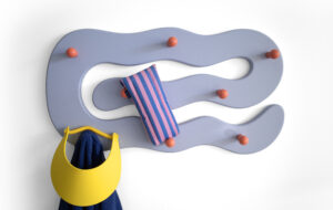
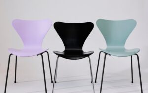
Looking at the other side of where backlit tones are moving from the digital to influence the physical are pastels, in particular tones such as Pantone Lavendula 15-3620 and pink shade Lilac Sachet 14-2710. These two colours are predominant in the work of pioneering digital artists such as Barcelona-based Andrés Reisinger, the founder of the eponymous studio Reisinger, who rose to fame on social media.
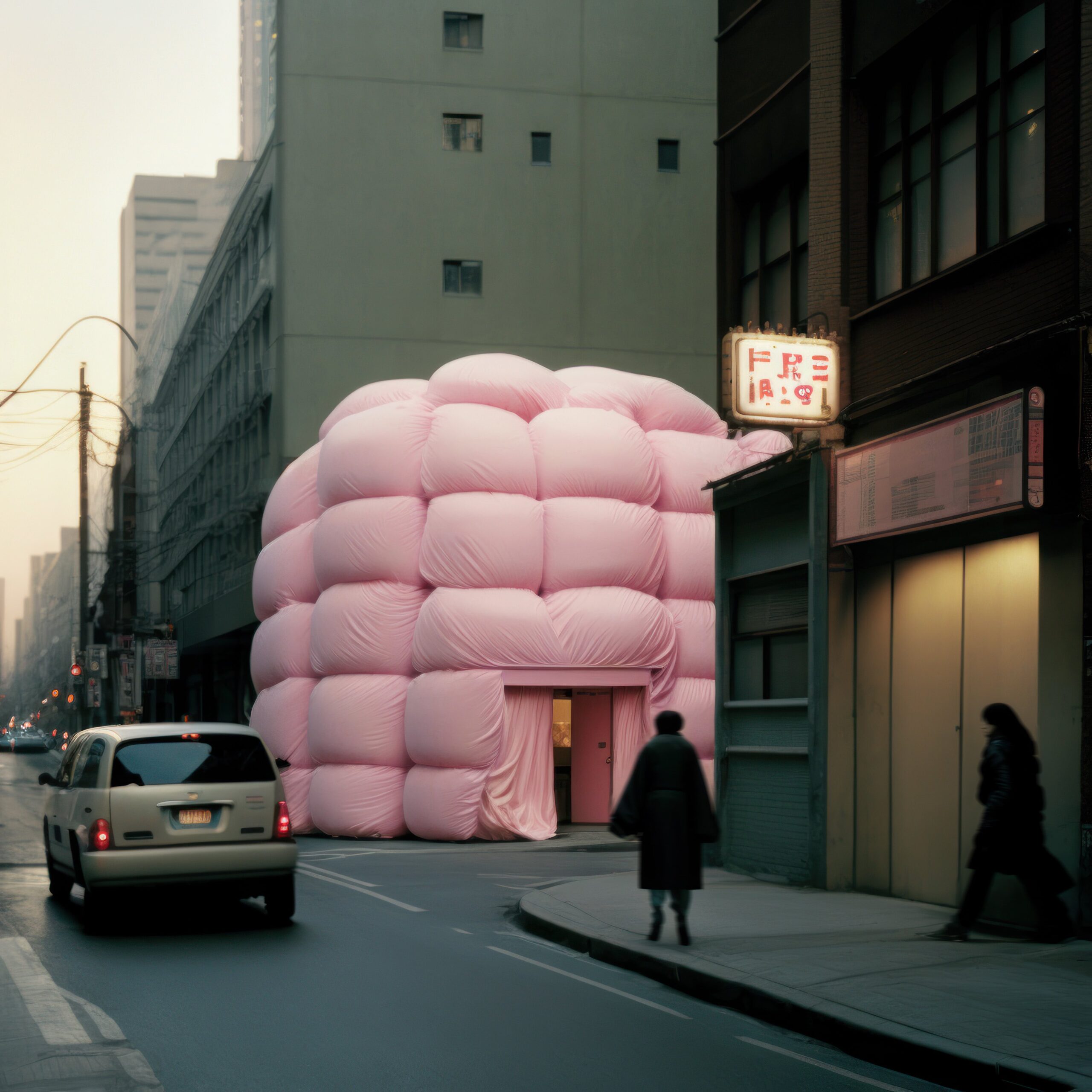 Photography by Andrés Reisinger
His hyper-stylised visuals and futuristic landscapes have gained popularity on Instagram in particular. Keeping colours such as pink a hot trend despite it being a trending tone for several years, Reisinger has pushed the boundaries of colour and design by reimagining major cities with fluffy pink drapes, taking his followers into surreal natural landscapes and even dabbling in architecture by creating a winter home in the metaverse.
Pastels, with their soft and delicate hues, evoke a sense of nostalgia, tranquillity and whimsy. Pantone Lavendula and Lilac Sachet embody these qualities, and their popularity in digital art further extends their influence into a physical design. By incorporating these pastel tones, designers can create visually soothing and harmonious compositions that resonate with contemporary design aesthetics.
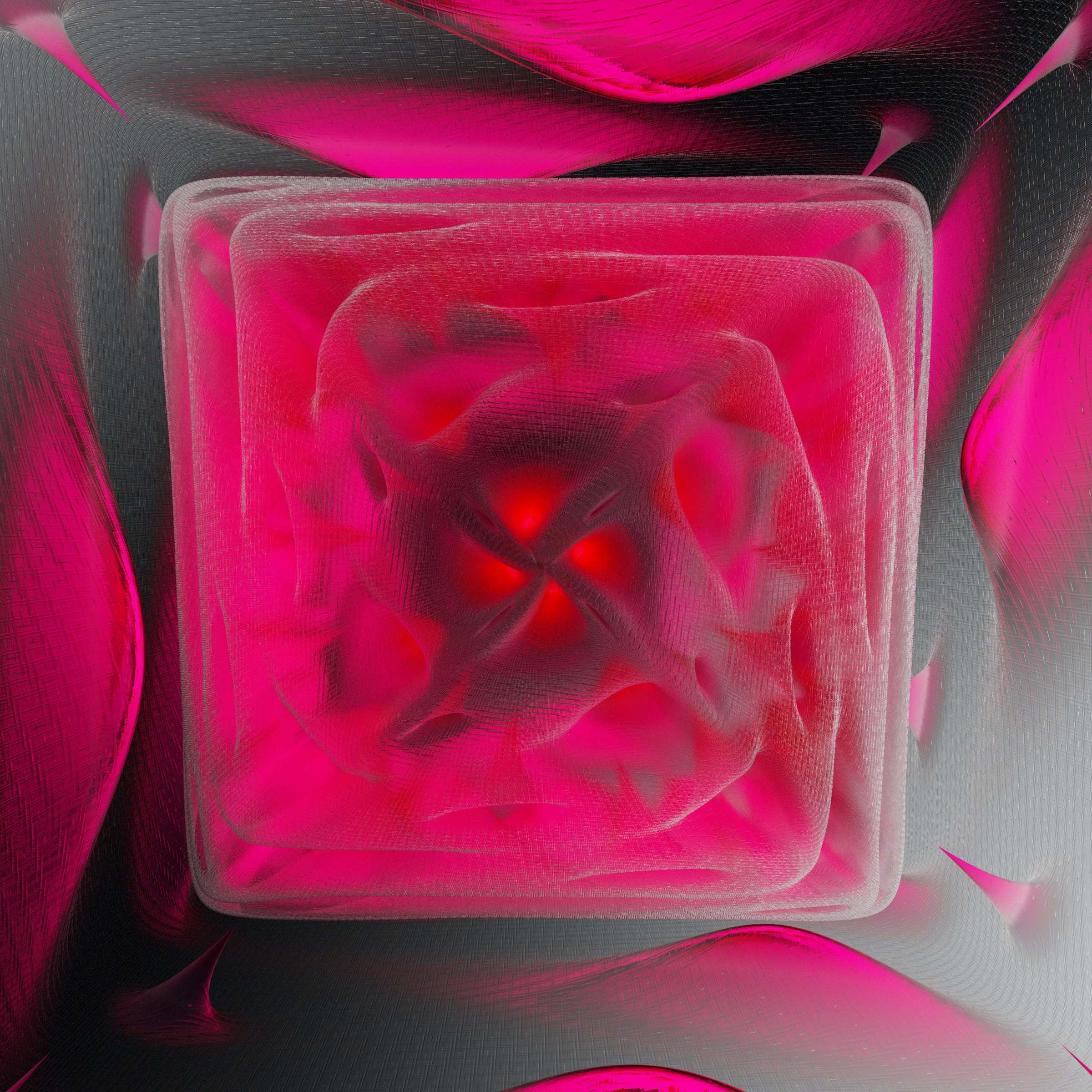
Looking forward, these transitions will continue to evolve. Coral and apricot tones are starting to emerge, blending the aspects of the pinks and oranges such as Pantone Fusion Coral 16- 1543. With its energetic and lively character, Fusion Coral has already set a precedent for the popularity of coral shades. This particular colour has garnered attention and recognition in the design world, and its influence is likely to continue to grow, and perhaps something we’ll see more of during Milan Design Week 2024.
 Photography by Rick Rothenberg
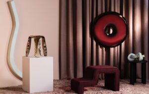
Another new and developing colour group are jewel tones, including Pantone Red Bud 19-1850. These shades have a rich and luxurious quality that can add depth and sophistication to any composition. Their intense and saturated hues make them stand out and evokes a sense of opulence.
Combining jewel tones with either pastels or hyper brights can produce captivating visual contrasts and unique effects. What makes these colours different is their blueness, as blue is a predominant colour in the digital sphere. Here even fiery tones have a cool edge. The blueness in these bright backlit colours adds an exciting and distinctive element to their overall appearance.
From youthful pastel tones to rich jewel hues, digital colours will play a major role for design going into 2024. Whether phygital retail or physical space, these colours connect to feelings of joy and inspiration, ultimately creating a connection between us, including the digital and physical worlds we occupy.
Get a curated collection of design and architecture news in your inbox by signing up to our ICON Weekly newsletter

