Built as a home for the creative industries, this new commercial district hosts a diverse array of buildings from eight architects
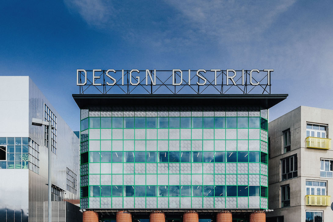 David Kohn Architects’ building announcing the Design District, flanked by structures from Barozzi Veiga (left) and Adam Khan Architects (right)
Words by Francesca Perry
The Design District, a new development on London’s Greenwich Peninsula dedicated to creative professionals, has now opened. Comprising 16 mid-rise buildings designed by eight different architecture practices, the district is part of the wider long-term transformation of the area by developer Knight Dragon, and intends to provide affordable workspaces for creatives, alongside educational, event and leisure spaces.
Masterplanned by London-based architecture and urban design firm HNNA, the district comprises two buildings each by: SelgasCano, Barozzi Veiga, Mole Architects, 6a, Architecture 00, David Kohn Architects, Adam Kahn Architects and HNNA (while the first two practices are based in Spain, all others are from London). The development landscaping is by Copenhagen-based Schulze + Grassov. Buildings are arranged as clusters of four, all surrounding a central ‘town square’ courtyard. Each cluster then has its own ‘back yard’ courtyard between the four buildings.
The most surprising, innovative and risky part of the masterplan was that architectural commissions were ‘design blind’. Practices – which were directly chosen by the district’s head of design Matthew Dearlove – were given the dimensions of two separate plots, basic floorspace and technical requirements, but no context. They were not told what the other buildings would be or look like, or what their buildings should look like. Inevitably this has resulted in a diverse mix of architecture across the site. While it might sound like a recipe for disaster, there are ‘moments of serendipity’ between buildings, says Dearlove.
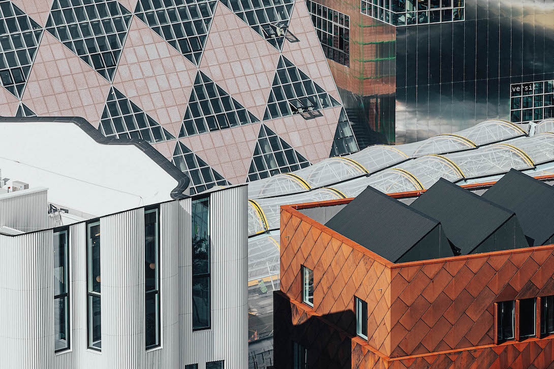 The Design District from above, including buildings by HNNA, 6a, Barozzi Veiga, SelgasCano and Mole Architects
The Design District officially launches on 15 September, though four of the buildings are not yet completed due to delays. Once finished and fully occupied, the district will accommodate 1800 people across some 13,935 sq m. Some of the first tenants to move in include LGBTQ+-led charity Queercircle, Ravensbourne University London and new members’ club and co-working hub Bureau.
There is a lot going on in the Design District. Both in terms of creative activity, and in terms of the built environment. 16 buildings is a lot to squeeze in to this area, and they do butt up against each other. Add to that the fact that their design is deliberately diverse and disconnected, it can feel somewhat like an incongruous hodge-podge of style and form – though it is fun. Walking around on a cloudy September morning, it seemed like this was a place for formal architectural experimentation; concept- rather than context-driven.
Open space across the district is minimal, though it is public. Stone paving ties landscaping together, with pockets of public seating and young trees, with more planting to come. There is nothing that qualifies as ‘green space’ though; the development team explains that this is a ‘working urban environment’ (though why such environments can’t have green space is another question).
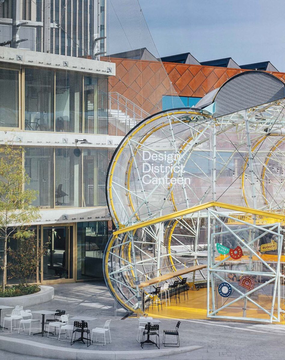 SelgasCano’s Canteen building, with structures from Architecture 00 and Mole Architects behind
The high-density layout of the district – necessary as the developer required a certain amount of floorspace to be built – inevitably results in small spaces between buildings, too, with narrow passageways that 6a director Stephanie Macdonald (positively) described as ‘almost medieval’ on our visit. One hopes that this somewhat maze-like quality won’t hinder public permeability of the site, but the masterplan seems to nudge the public to use particular spaces.
At the northern end of the district – adjacent to the Now Gallery and close to North Greenwich tube station – is the attention-grabbing Canteen building, designed by SelgasCano, which is fully public and accommodates food vendors, a bar and eating space. This acts as the public gateway to the project; from here visitors can walk through into the central courtyard, while the ‘back yard’ courtyards remain more private for tenants.
It is almost impossible to describe in detail the architecture of every building, and not all of them were able to be viewed earlier this month. SelgasCano’s Canteen is a caterpillar-shaped, yellow-painted metal structure covered in transparent ETFE. The practice’s other building (still under construction) will again use translucent materials and bright colour, as well as a series of winter gardens.
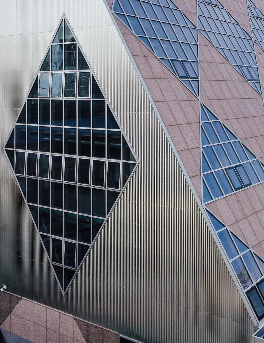 One of 6a’s slanted diagrid buildings
David Kohn Architects’ structures harness green-painted metal framing, glass blocks and red bricks to create buildings reminiscent of playful postmodernism; one of the structures bears the ‘DESIGN DISTRICT’ sign on its roof to act as a beacon. A touch of postmodernism can also be seen, differently, in 6a’s buildings, identifiable by their sharp slanted form and bold diagrid exteriors. ‘We were looking at the language of commercial industrial buildings,’ says 6a’s Macdonald, ‘especially the idea of thinness and layers.’ The buildings certainly seem like a creative take on the kind of sleek office architecture you might find in the City of London, but Macdonald also refers to it as a ‘pop warehouse’ style.
Mole Architects’ buildings are colourfully clad in metal (one in corten steel, the other with an iridescent painted finish). The internal structures, however, are timber, with exposed beams and ceilings. Timber has also been used for the top two stories of HNNA’s building (the practice’s other structure is delayed due to the local Silvertown Tunnel project). Here, CLT tops a concrete frame, and the building has been clad in a rippling white exterior. Used as one of the two buildings for members’ club Bureau, the interiors – robust with pops of colour – were completed by London-based Roz Barr Architects.
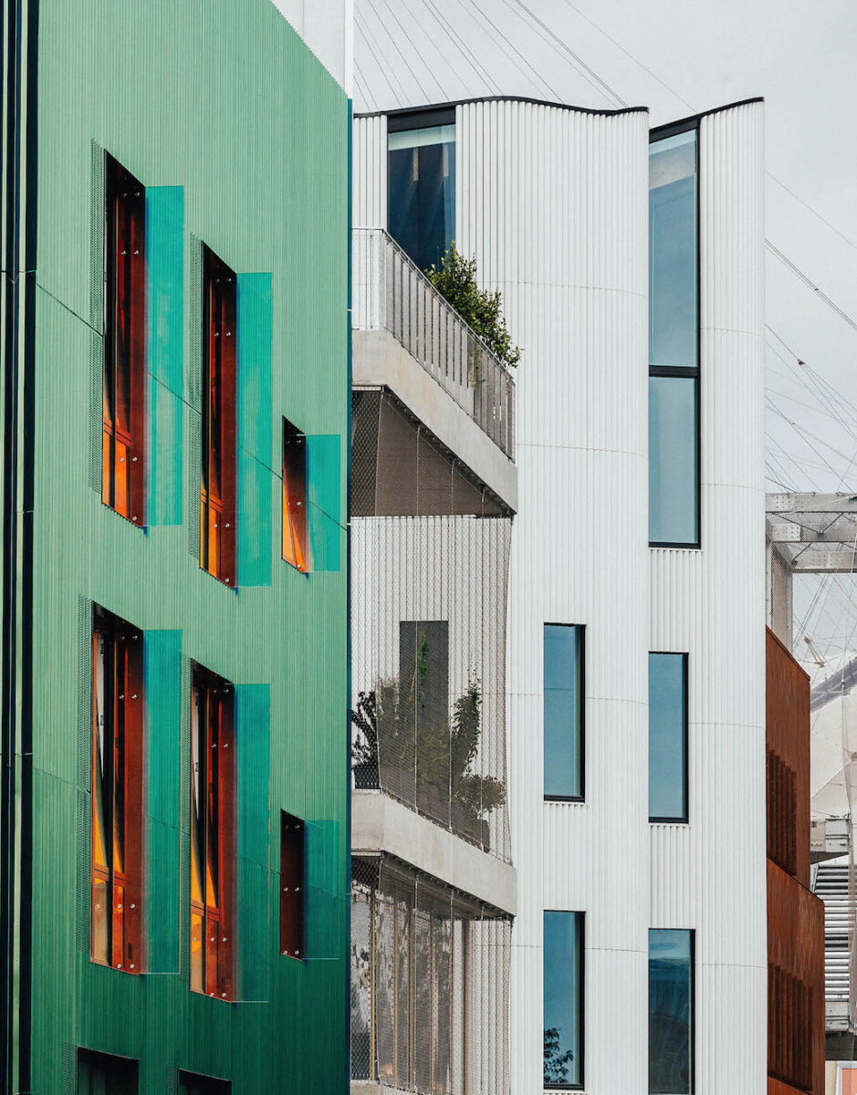 Buildings from (L–R) Mole Architects, Architecture 00, HNNA and Mole Architects
Barozzi Veiga’s sleek rectilinear buildings are clad in polished aluminium, with large glazed openings. Even on a cloudy day, the reflective quality is powerfully bright. Adam Kahn Architects has created a ‘monolithic concrete block’, while the practice’s other building is on hold due to the Silvertown Tunnel.
Architecture 00’s buildings are stripped-back, adaptable concrete structures covered in wire mesh – one of which is topped by a public basketball court. Formally, they recall Lacaton & Vassal’s Nantes School of Architecture (2009) and even London Zoo’s Snowdon Aviary built by Cedric Price (1964). This is bare-bones, loose-fit architecture, and as an idea it is certainly fascinating and propositional – but building such concrete-heavy structures in a climate crisis seems a little too much like concept at the expense of context.
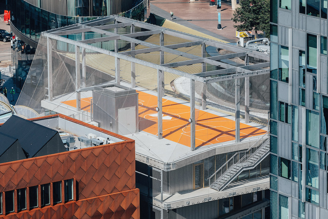 Architecture 00’s building with a public rooftop basketball court, next to Mole Architects’ corten steel-clad structure
One of the biggest selling points of the district is that its workspaces are ‘affordable’; starting at £7 per sq ft, rents will be scaled depending on the workspace to be rented and the size and needs of the tenant, and will be regularly reviewed. The district aims to deliver a site-wide blended-rent target of £25 per sq ft – though who knows how this will change over time.
As is a familiar tale in cities like London, ‘creative’ districts – home to artists and other precariously-paid professionals that need cheap workspace – typically pique the interest of developers who build market-rate or luxury housing, which in turn raises local rents and price out those very creatives, as well as long-term residents.
At the Design District, we see a post-gentrification take on the situation: the surrounding North Greenwich area has already been extensively developed, including large amounts of luxury property. Affordable workspaces are thus only made possible by the rest of the development’s profit. Of course, it’s great that such workspace can be created, but it speaks to the problematic nature of land values and real-estate markets in cities like London that inclusivity can only be funded by exclusivity.
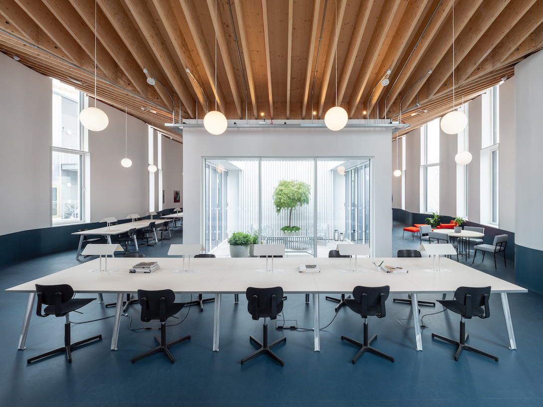 Bureau’s workspaces, inside HNNA’s building. Photograph: Alex Upton
The Design District was conceived of in 2012, before the climate crisis started making regular headlines. Though the buildings are all designed to BREAAM Excellent standard, it was notable that sustainability was not mentioned once on the three-hour press visit. The presence of certain low-carbon timber structures is welcome, but it feels counterbalanced by the sheer amount of concrete and other high-embodied-carbon materials (aluminium, steel, ETFE) as well as blanket hard landscaping, which contributes to surface runoff and the urban heat island effect.
There have been a lot more changes and developments over the last decade, since the district’s conception. Some – the growing need for flexible working – are well accommodated by the the design’s built-in flexibility. Others – the heightened fight for racial equality – seem to be glaringly overlooked by the dominance of white architects and designers hired on the project.
Ultimately, the Design District is good for creative professionals, and it is fun (even a developer representative referred to it as a ‘playground’). But these days, fun isn’t always enough.
All photography by Taran Wilkhu, unless otherwise stated
This article was corrected on 16 Sep 21 to clarify the rent pricing model. The information was originally provided incorrectly in sq m rather than sq ft


