A new book surveys the design of railway graphics – from logos to advertising – in 20th-century US
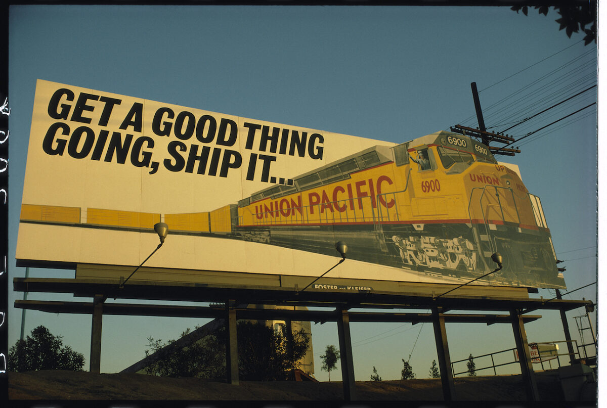
Designer Ian Logan and journalist Jonathan Glancey have released a new book, Logomotive: Railroad Graphics and the American Dream, as a visual tribute to the graphic design of railroads in mid-20th-century US.
Logan, who had previously designed fabrics for Mary Quant and Jeff Banks in London, arrived in the US in 1968 and became fascinated by the logos and slogans he saw painted on the sides of trains and freight cars. He began to photograph them, as well as buy old train timetables and other ephemera in antique shops, amassing an extensive collection.
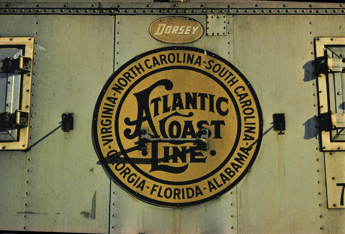
In the early and mid-20th century, railways and trains in the US were still symbols of modernity and aspiration. Such a perception soon began to fade, however, and multiple railroads went bankrupt; it is hard to imagine a country now so dominated by cars celebrating railways as it once did.
Logomotive documents and embraces the visual manifestation of this heyday, through bringing together the logos, advertising, graphics and other design elements of the American railroad craze.
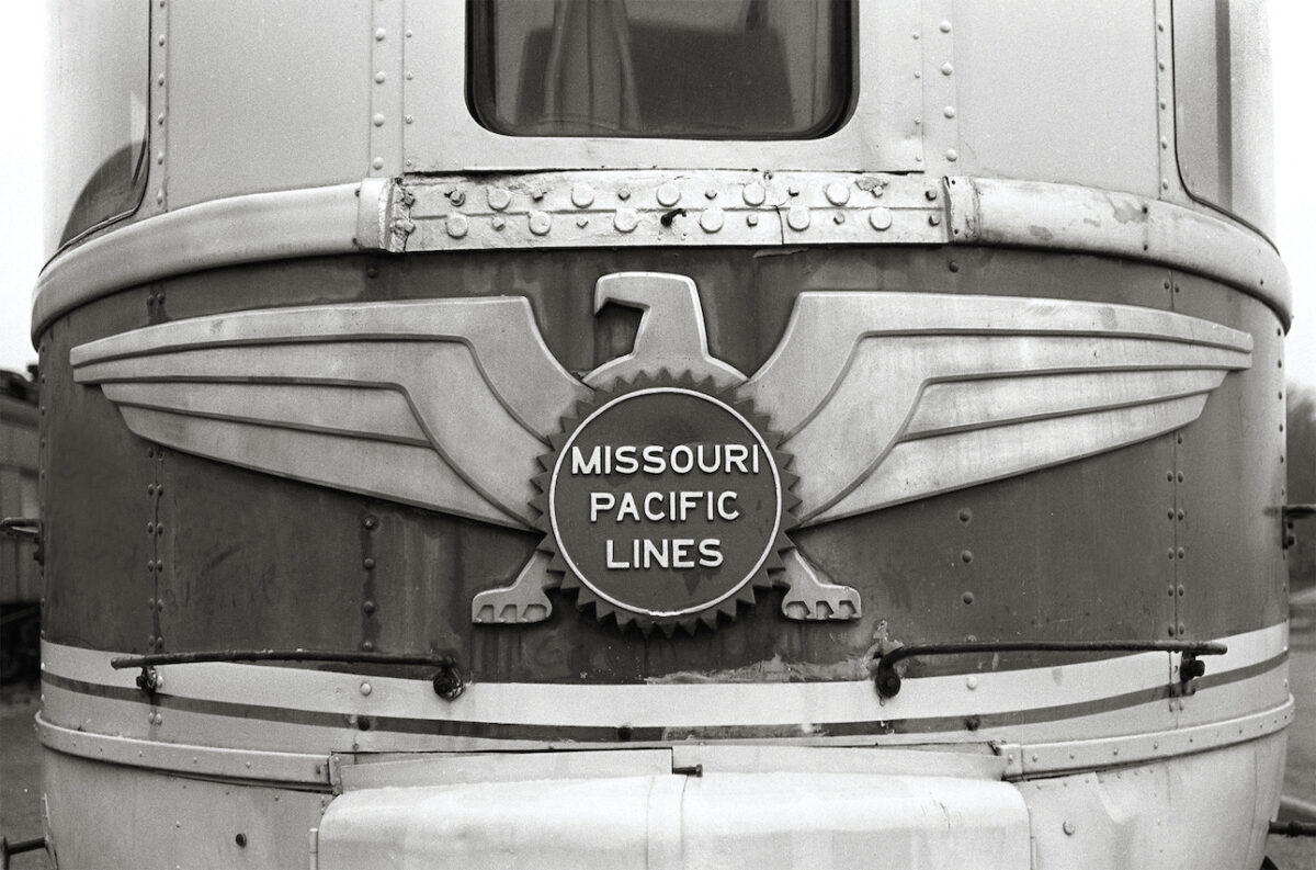
Woven throughout this visual compendium, Jonathan Glancey tells the story of the companies that commissioned such logos and graphic design. He describes how every aspect of the railways – from the locomotives and rolling stock to architecture, advertisements and timetables – was designed to project an image of speed, efficiency, adventure and the American dream.

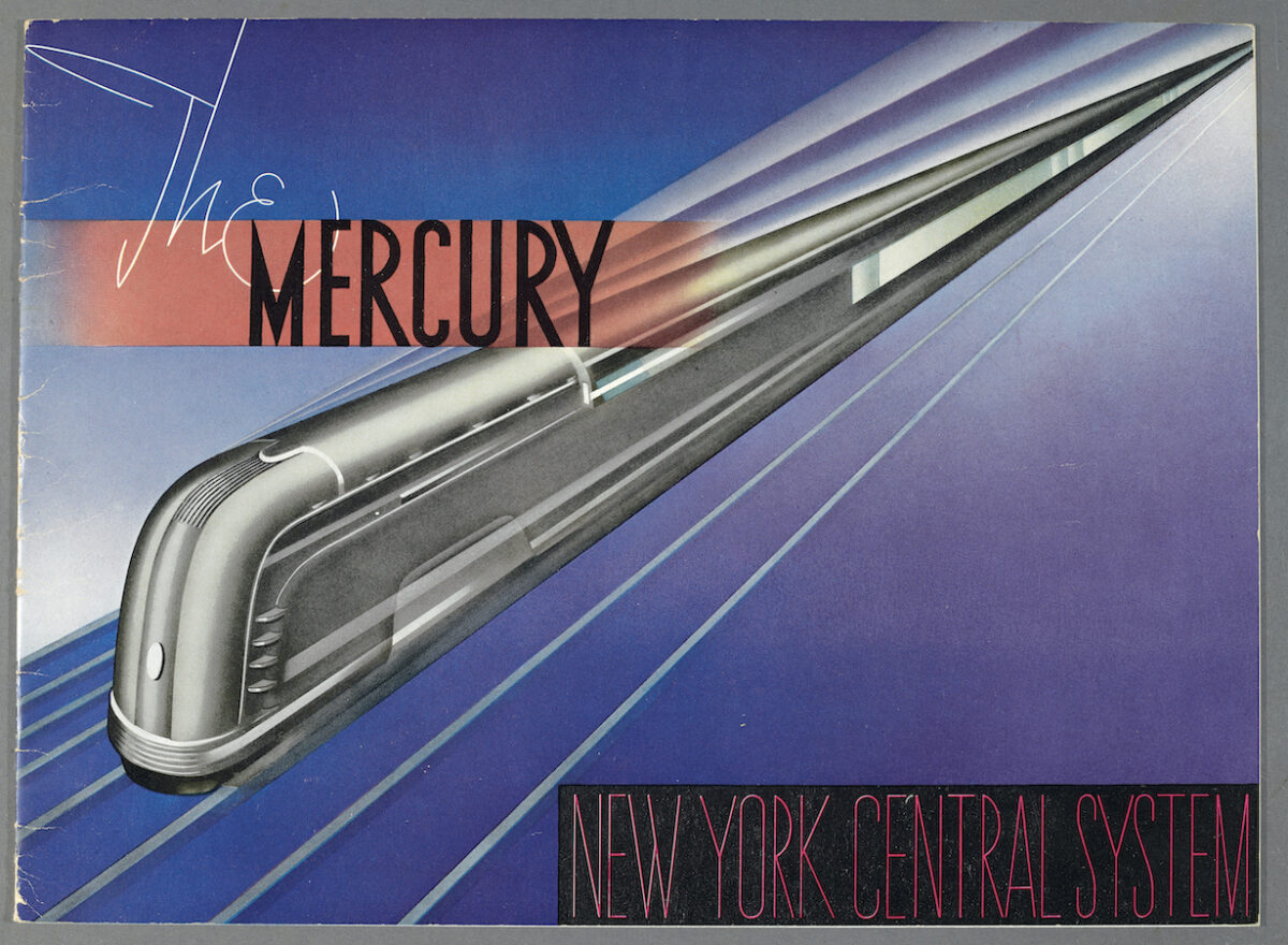
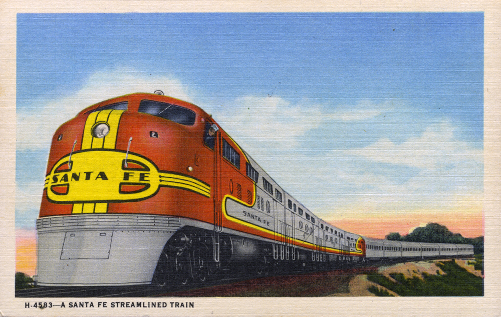
Images, top to bottom: Union Pacific Railroad billboard, Atlantic Coast Line Railroad logo, Missouri Pacific Railroad Eagle observation car, brass door handle at Cincinnati Union Terminal (1933), The Mercury Train operated by New York Central Railroad (ran 1936-1959), a Santa Fe railway postcard
Logomotive: Railroad Graphics and the American Dream is published by Sheldrake Press


