|
|
||
|
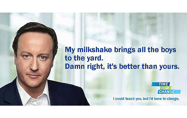
The Conservatives’ new poster campaign is pure 21st-century politics: the perfect fusion of medium and message, says Sam Jacob I can’t quite describe the visual effect that struck me while driving around the Vauxhall one-way system. Suddenly, on a gigantic billboard, a huge, glowing image of David Cameron burst into the landscape. Through my windscreen, his massive fleshy face stared at me with a Mona Lisa smile that seems to both care and sneer. His visage, with £50,000 of photoshopping, appeared three-storey huge. Suit and shirt but no tie and a slight tilt to the head. A touch of ruddiness to his cheek suggesting the Englishness of Home Counties outdoor activity. A hazy background suggesting a public-private initiative-type space: AHMM education or Penoyre & Prasad healthcare. A few simple elements: just face and whiteness and simple type that reads, Jenny Holzer-style, “We can’t go on like this” (the kind of thing you say compassionately to a lover you no longer love, but don’t want to hurt). Cameron’s image seems instantly clear. But also entirely foxing. The image marks the start of the Conservatives’ pre-election campaign. And it’s a strange campaign that seems to distill the current state of British politics. Traditional political rhetoric has evaporated into soundbites, focus groups and neoliberal consensus. Politics has become an aesthetic project rather than a verbal one. Positions are not set out in words, but expressed through hyper-sophisticated images. In Cameron’s face, the distinction between form and content seems to have collapsed. There is no message apart from the medium. The form is the content. Here, the differences between the politics of design and the design of politics dissolve into one another. In contemporary politics, there is an absence of argument. In its place we have image. Politics has become totally aestheticised. Cameron’s poster presents what seems a transparent window to the image of a real live human being. But it’s not really a picture of his face, and not really a picture of a human being. It’s an ideological construct played out in flesh and airbrush. Face here is not a function of biology or physiology. It’s pink, fleshy semiology. The poster has a blank quality, flat and still as though it were a pool reflecting the world back at itself. Its image is slippy like ice, so that it falls from your hand when you try to grasp it. Its effect is a ghostly haze; an apparition of meaning that vanishes if you fix your gaze on it. It possesses an intense but unfocused sincerity. To set this poster in relief, we might note how it differs from other recent forms of political communication. For example, Shepard Fairey’s celebrated posters for Obama’s election campaign used a retro technique that explicitly recalled counter-cultural image-making from previous generations. The nostalgic visual language is overcoded with red, white and blue patriotism and slogans that are banal-positive with an Orwellian touch: “Hope”, “Change” and so on. Form and content head in opposite directions. In Cameron’s massive and mass-produced visage we see image-politics matured to a point where it is confident to express no slogan, policy or allegiance to any ideology, or even any sense that he is the leader of a particular political party. Empty of traditional politics, it fuses techniques of image-making in a way that strangely seems to synthesise art and life. Design and politics become the same thing – as complete as any constructivist could dream of. We are as suspicious of design as we are of contemporary politics. In both, the perfect surface – the image – represents the artificial and the superficial. But in the collapse of one onto another, it’s just possible that two wrongs might fuse into a right. Instead of mourning the loss of wordy political rhetoric or design as a zombified aestheticism machine serving the military-industrial complex, we might recognise that profound and very real political discourse has shifted to the image world. In doing this we might recognise design’s potential as a radical surface to act out the politics of the 21st century. And that, ironically, this vector might reconstruct design as the political agent its modernist forefathers told us it could be. |
Words Sam Jacob |
|
|
||

