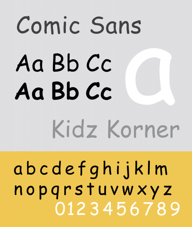
 Comic Sans. Image by GearedBull via English Wikipedia
Almost anyone who has ever used a computer is familiar with Comic Sans. Much loved and equally loathed, there may be no font that has ever divided opinion so sharply.
Designed by Vincent Connare in 1995 for Microsoft, the pleasant and reservedly rounded font was designed for young computer users. Connare had seen a software animation in Microsoft Bob, a program designed to make computers more accessible for young people. It featured cartoon dog called Rover, whose speech bubbles were written in Times New Roman. The designer found the use of this formal type incongruous and designed Comic Sans for the software instead.
Connare took inspiration from comics and graphic novels like The Dark Knight and Watchmen, which used hand lettering that had a more ‘human’ and fun look than fonts like Times New Roman. He moved deliberately away from straight-lines, casting aside the highbrow rules of traditional typography.
Comic Sans had an unequal visual weight – it didn’t balance the q’s with the p’s, for example – and communicated a sense of personality and playfulness when used in Rover’s speech bubbles.
Comic Sans wasn’t ready in time for the launch of Microsoft Bob, and instead was released in the main Microsoft package in 1995. It was included in the systems fonts for the Windows 95 alongside only four other fonts: Arial, Courier New, Times New Roman and Wingdings. It was also used as the default font for Microsoft Publisher, which was used worldwide by people creating their own company branding material. The font was seen as non-confrontational for office messages.
The unsophisticated font appealed to everyday users. It felt casual and wasn’t easily associated with anything like newspaper fonts. Users gravitated towards its informal look. Comic Sans is one of the fonts favoured for use with people with dyslexia because of its wide letter-spacing and legibility.
So love it or hate it, Comic Sans is here to stay. Often the butt of type-geek jokes, it is nevertheless unforgettable.


