|
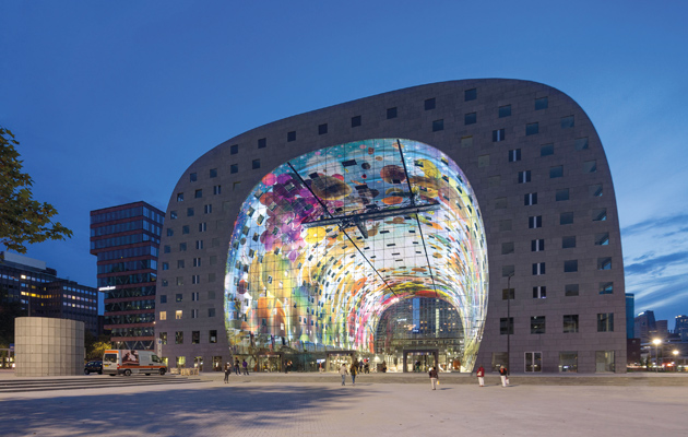
Eleven storeys of housing arch over a market with 100 stalls |
||
|
Ten years in the making, MVRDV’s grand gesture in its home city wraps a grey slab of housing around a tasty filling Rotterdam holds an unofficial title as the architecture capital of the Netherlands, a result of the widespread urban renewal that followed the destruction of its inner city during the Second World War. Lately, that status has led to the city being touted as a “must-visit” destination, partly thanks to its ever-expanding list of landmark projects by the who’s who of Dutch architecture. In October, Market Hall (or Markthal in Dutch), a combination of housing and food market by MVRDV, joined that roster. It’s familiar territory for MVRDV, which, like Rem Koolhaas’s OMA, is based in the city. “Rotterdam constantly changes its urban ideals,” says MVRDV principal Winy Maas. “To keep up with that during the ten-year process from competition to realisation was a challenge.” The building’s location at the south end of the wide Binnenrotte boulevard puts it at the crossroads of local architecture and planning following wildly different principles: it’s in the company of Piet Blom’s iconic cube dwellings from the mid-80s, Carel Weeber and Jaap Bakema’s high-tech central library, Hans Kohllhoff’s neo-traditional housing towers, a sleek staggered office block by KCAP, and a steel and glass flying saucer that leads to the Blaak underground station.
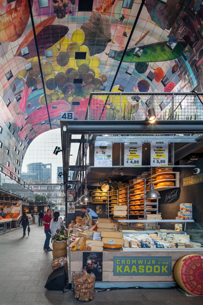
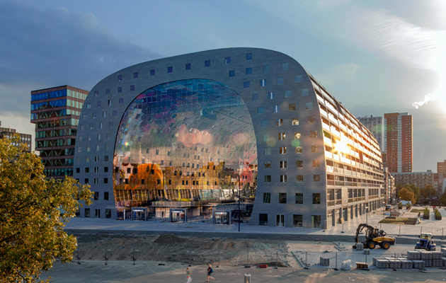
The inside of the arch is printed with a painting by Arno Coenen and Iris Roskam Market Hall dominates this incoherent urban fabric. An eleven-storey arch of 238 apartments draws the public into its huge barrel vault with an explosion of colour. Like a postmodern version of the Sistine Chapel ceiling, the interior is adorned with supersized vivid paintings of fruit, vegetables and flowers – a contemporary cornucopia by artists Arno Coenen and Iris Roskam. On its floor the huge building houses 100 stalls, and in its flanks 15 food shops, eight restaurants and a cookery school. The apartments above look directly onto the market, and although windows on this side can’t be opened, the architects have managed to conceal vents in the joints of the artwork’s 4,500 aluminium panels. Small perforations in the panels help to absorb excess noise, allowing an interchange between the life of the market and the residents without each being troubled by the other’s presence. Clad in grey stone, the exterior of the building merges with the pavement and the often-murky sky. Along its sides, the facade’s modulation soberly follows the layout of the apartments within and the fenestration – set back, in places deep enough to accommodate loggias – adds depth to this behemoth.
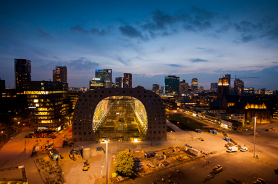
The Marthal at night Maas’s aim was to densify the area, constructing more taller buildings that “embrace this inner city airstrip and turn it into a contemporary equivalent of a main street or plaza.” Whether the addition of another statement piece to this playground of icons does that is not yet clear, though possible development of an empty plot to the north might help better define the public space. Market Hall also half-stands on a small pedestal, counteracting the idea of a seamless transition between building and public space. However the glitches don’t detract from an intelligent and above-all beautiful exercise in the firm’s experimental “building-as-diagram” ethos. It’s a magnificent and rather clever thing, if a little awkwardly positioned. Maas says the process of realising such a singular vision as “taking a logical approach, being argumentative, clear, seductive and convincing” – a description that could applied to the building itself. Interview: Winy Maas on high density living |
Words Peter Smisek |
|
|
||
|
|
||

