|
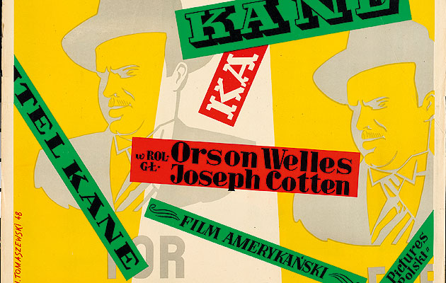
Citizen Kane, 1948 (images: Courtesy of Filipa Pągowskieg) |
||
|
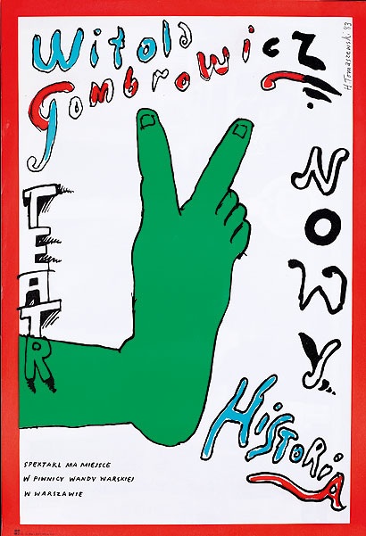
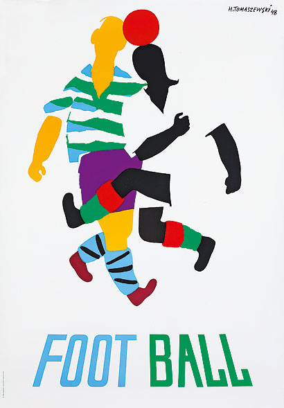
Henryk Tomaszewski’s posters make him one of the pre eminent figures of post-war graphic design, says Agata Pyzik Henryk Tomaszewski is one of the most outstanding figures in post-war poster design. To understand how a Polish graphic designer became so renowned, we have to look at the phenomenon that was the Polish school of poster design, which flourished in the thaw after Stalin’s death in 1953. Designers such as Roman Cieslewicz, or the younger Andrzej Klimowski who migrated to the UK, took socialist realism’s simplification of visual codes, and added a new lightness to invent a style drawing in equal measure upon surrealism and dada. The great strength of Tomaszewski, and of others associated with this movement, was that he could match every message to an easily understood symbol; his visual language could be read at every latitude. Politics features prominently in Zacheta Gallery’s excellent retrospective to mark the centenary of the Tomaszewski’s birth – but not in the form of a text commentary; it’s conveyed by the posters themselves. When the Stalinist Communist Party took over in postwar Poland and took on the task of literally rebuilding a nation destroyed by the Nazis, it needed visual artists to play an openly social role. Tomaszweski’s early projects express this reconstructionist spirit: his posters from the late 1940s make calls to vaccinate against tuberculosis (the disease “slows down the reconstruction”) or to celebrate May Day. In architecture and literature a style that was “socialist in content and classicist in form” was beginning to dominate but the poster, thanks to its visual intelligence and shorthand, escaped the same heavyhandedness. Tomaszewski’s Picassian decorations for the Festival of Youth in Warsaw in 1955 were an important moment. Then modern jazz and contemporary films and forms of life arrived and fused with pre-sots-realist illustration in his work with a new sense of play. He and his contemporaries expressed the new optimism in strong, bright colours and minimalist forms. Whether designing a poster for a film by Eisenstein, a lifestyle magazine, a book cover, or an exhibition of British design – their interpretations are often symbolic, a genius simplification that makes us see the subject anew while deceiving us with their childlike and charming forms. Tomaszewski’s secret was that he could make a propagandistic dove of peace as gripping as an abstract combination of brush strokes. One of his signatures is the leaving of unfinished elements – a weird element that would hang there – on his entirely handmade, cut-out or painted designs. The handmade originals are the greatest treat of the show, revealing how it was all improvisation. He wasn’t a fan of complicated photographic techniques – everything was a direct confrontation with white cardboard; he left brush strokes worthy of a surrealist painter and allowed himself to make mistakes. His designs were understood all over the world and perhaps there’s another way to interpret this. Because we used to live, even despite the Iron Curtain and the Cold War, in a world which had much more in common politically and was much more equal than now, visual codes could talk to each other more easily. This was the language of a political system that has died. Perhaps these magnificent posters convey this message, too. I’ve Been Here; I Hope the Same for You. Henryk Tomaszewski, Zacheta National Gallery, Warsaw Until 10 June 2014 Witold Gombrowicz’s Historia, 1983
Foot-ball, 1948 |
Words Agata Pyzik |
|
|
||

