words Beatrice Galilee
If you don’t like one-liners, look away now.
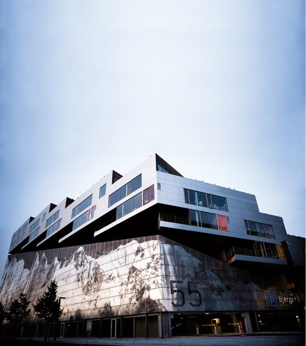
On the outskirts of Copenhagen a new apartment block named the Mountain Dwellings has scaled the giddy heights of its own metaphor, reached the summit, planted the flag and conquered it.
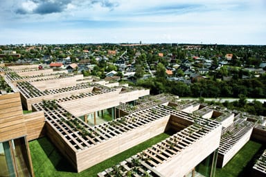
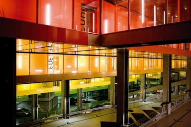
This is a building that is not afraid of being literal – a vast multi-storey car park with timber-clad housing perched on top, the whole thing branded with a huge likeness of the Alps formed from shiny perforated metal sheeting. In its concrete belly, next to the parked cars, there are murals depicting mountain goats standing on top of heaps of crushed Lamborghinis. A diagonal “ski-lift” gives access to the corridors, which are painted in plastic rainbow colours and lead to apartments with lawns of plastic grass. A professional abseiling wall completes the catalogue of mountain-based puns. Or the visible ones at least.
The building was commissioned and designed in 2003 by Plot, the Danish practice that created the neighbouring VM Housing with its famous pointy balconies and V- and M-shaped plans, and it was for the same client, Per Høpfner. But when the office split in 2006, this project was completed by Bjarke Ingels without ex-partner Julien De Smedt.
Ørestad is a weird place. It was the subject of a heavily subsidised government masterplan, which was created to provide housing for the many young people who couldn’t afford the high rents of the city centre. It’s just 20 minutes outside of Copenhagen by metro, and severely suburban. The Mountain Dwellings together with the VM Housing create a fantastic skyline – an image of modernity towering over the mundane little boxes. The real concern is that there is little else here. The streets are quiet, just rows and rows of bungalows and newly built, brightly coloured and slickly finished apartment blocks. There are no shops to speak of, just a solitary ice-cream and milkshake bar with a seemingly permanent queue running around the corner. The essentials are provided for: a big mall and a speedy metro service to downtown Copenhagen and the airport. But the pacey urban lifestyle that the Mountain Dwellings promises is not to be found here.
In 2005, the original brief was to provide a huge parking block of 500 spaces for the neighbourhood and separate housing, not the single hybrid mass that has evolved. “We proposed to put the housing on top of the parking, stacking the cars and transforming all the apartments into penthouses,” says Ingels. This is more radical than he makes it sound; Plot turned a car park into a housing project. It’s a solution that says much about Plot’s roots in Rem Koolhaas’ OMA, where programme – in a business sense – dictates form, and witty pragmatism triumphs over idealism.
Superficially the modular concrete boxes of Moshe Safdie’s Habitat 67 housing complex may come to mind, but this isn’t a project about showcasing the modular. In fact, it’s far more about embracing the suburban, with these wood-clad boxes, cosy grassy areas, window boxes overflowing with vines, and generous decking prepared for barbecues. Jørn Utzon, the Danish architect who created the Sydney Opera House, was the inspiration behind the L-shaped plan of each apartment. Ingels explains that they looked closely at the Kingo Houses, which were stacked but avoided overlooking neighbouring apartments.
There are 80 apartments here, around half are unique, half with identical plans. Ingels says he learned not to overdo it from Plot’s last housing scheme where they had hundreds of different apartment types. They are accessed from colour-coded corridors with poured plastic floors. The 11 shades are exact matches of those used by Danish designer Verner Panton in his furniture.
The apartment icon visited on the fourth (orange) floor was fully furnished. David Zahle, associate partner of BIG, moved in last week and the boxes were just about unpacked the afternoon we joined him. The apartment feels roomy, not luxurious but certainly desirable. The doors slide, the windows open in two directions onto a generous outdoor space – surfaced, bizarrely, with fake grass. Ingels shrugs off any surprise. “It’s actually a really good solution,” he says cheerily. “There’s no maintenance!” They tried to use various options, but because the structure is so lightweight, the only way to get some green was to fake it. There is also covered decking area for barbecues. “You should be able to walk around naked when you’re on the wood, but when you’re on the grass you should expect to be seen.”
It’s actually quite intimidating, this angular mountain of suburbia. What effect does it have on its residents? Ingels himself once lived in the penthouse of the neighbouring M house, but left after a year, presumably in search of much-needed culture. The target audience for these apartments is people in their mid-20s to mid-30s and it’s only because of them that this flippant humour works.
Denmark, as elsewhere in Europe, is suffering a housing market slowdown. Mountain Dwellings is an expensive block to live in and there’s no social housing prerogative in place. In fact it seems to have no social function – it’s certainly not tackling the problems of diversity or immigration, for instance. With its generous government subsidy this is a project that is not subject to market demands. If it were, it probably wouldn’t have been built, Ingels admits. The client promises that cafes and restaurants will be arriving soon to give the project a sense of social space. Meanwhile there’s the expensively provided metro to whisk residents to the lifestyles they must feel they deserve.
The car park, complete with murals, colour and rough concrete, must be the coolest anyone around here is ever likely to see. It begs to be used in car commercials and photoshoots – the next Bourne movie, perhaps. It feels dramatic and powerful and does a great job of glamorising the car. This is a little ironic given that the reason for the remoteness of the shared parking and the provision of a super-efficient metro link was to promote walking and public transport. So, is the scheme beautiful? Not really. But it’s simple and clever and witty – qualities that the young Plot team was famous for. The client, developer Per Høpfner, is delighted with it and is commissioning BIG to complete several more projects, including a giant figure-of-eight-shaped block just 2km away. “They see things differently,” Høpfner purrs over the phone. “With a lot of architects they’re stuck on one idea, but with them, there is always a solution.”
Back to the climbing wall and the massive projection of a mountain, the colourful, graphic car park. Are these elements about added value? Are they about selling the homes or just making a day’s work more fun for the BIG office? It’s doubtless a happy mixture of both. Ingel’s own philosophy is “Bigamy – you can have both”, and here it comes with added value, a sense of humour and some extreme sports thrown in for good measure. “Yes is More.”
All images: Ulrik Jantzen
